Preview image. Unlock full-res
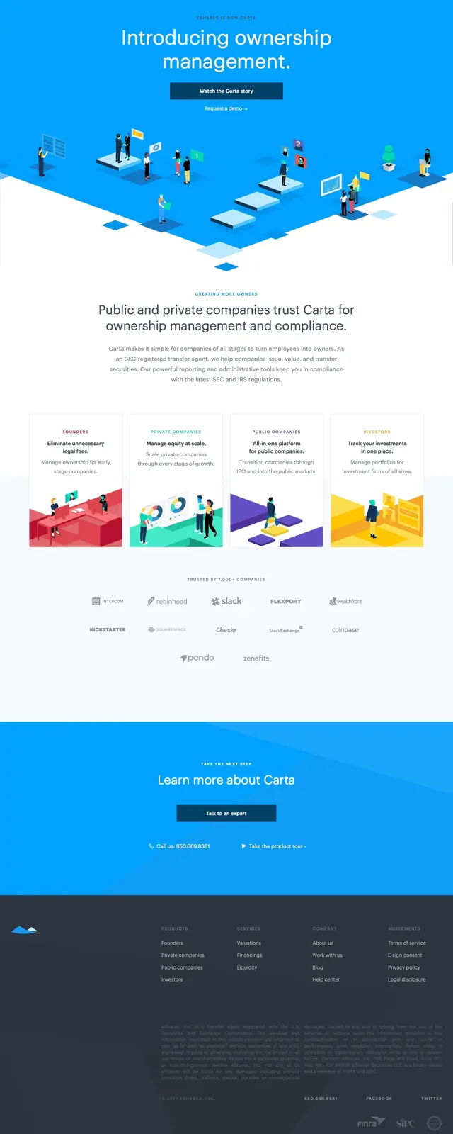
A bright SaaS-style hero for Carta with centered messaging, dual calls to action, and an isometric illustration spanning the fold.
Summary
A bright SaaS-style hero for Carta with centered messaging, dual calls to action, and an isometric illustration spanning the fold.
Visual description
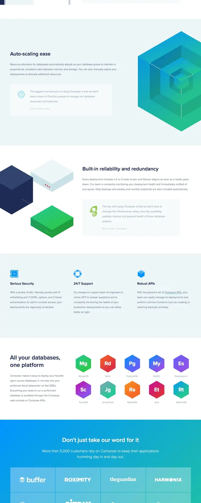
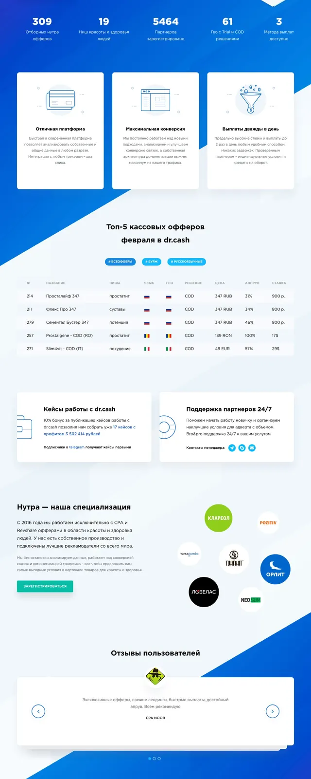
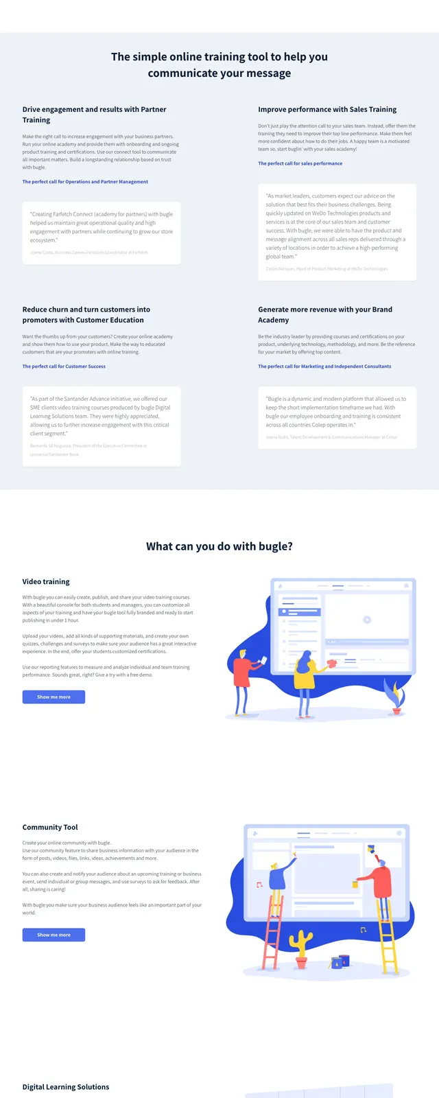
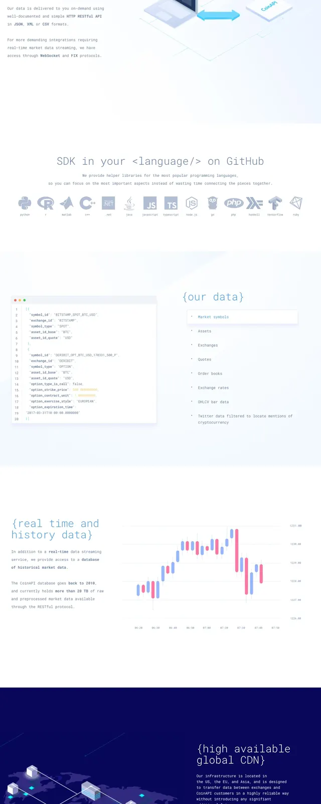
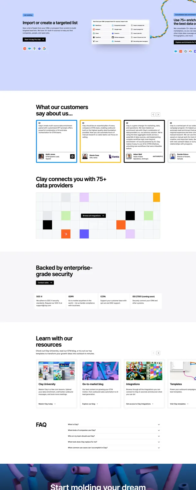
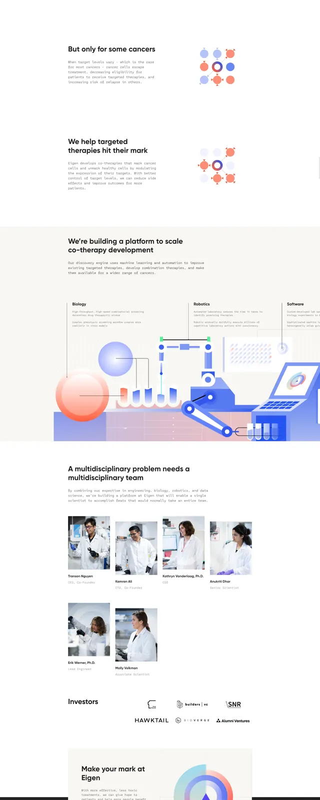
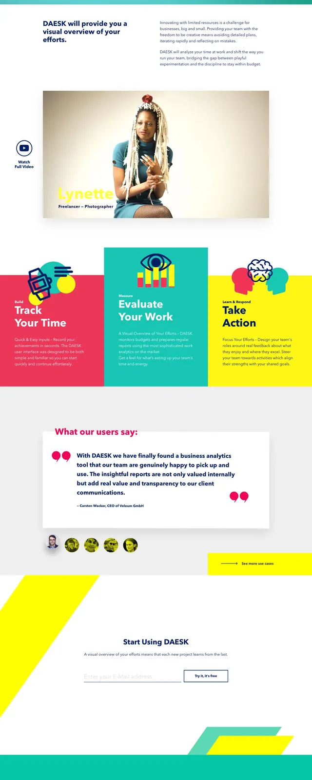
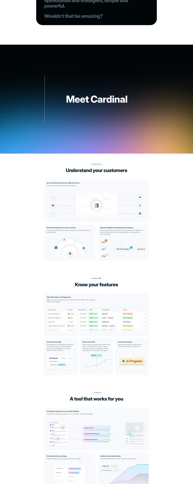
The page opens with a full-width bright blue hero, a top navigation bar, and a centered headline reading 'Introducing ownership management.' Two CTA buttons sit beneath the headline, followed by a large isometric illustration of people and interface elements arranged across the lower half of the hero. Below the fold are a white content section with explanatory copy, a four-card feature grid, a row of company logos, a secondary blue CTA band, and a dark multi-column footer.
Key takeaway
The main reusable idea is the strong blue brand field paired with a centered hero and an expansive illustrated scene that makes a complex B2B product feel approachable. The structure also shows a clear conversion path: primary CTA, supporting proof, feature cards, logos, then a lower CTA.
Reuse notes
Useful for B2B or fintech landing pages that need to explain a regulated or technical product without feeling dry. It works best when the brand can support a vivid single-color hero and custom illustration system.