Preview image. Unlock full-res
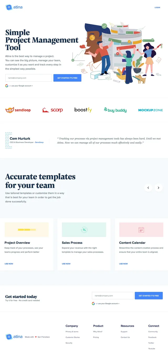
A bright SaaS landing-page hero for video training and knowledge sharing with a left-aligned headline and a large illustrated product scene on the right.
Summary
A bright SaaS landing-page hero for video training and knowledge sharing with a left-aligned headline and a large illustrated product scene on the right.
Visual description
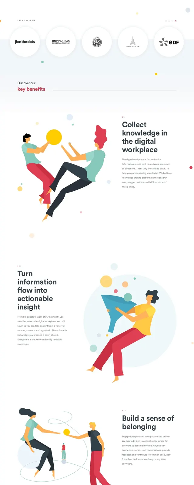
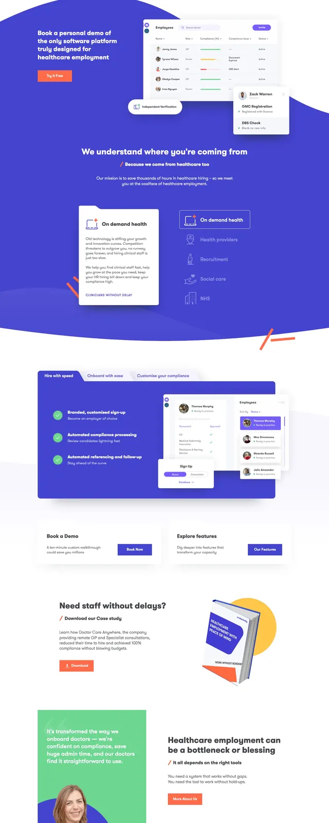
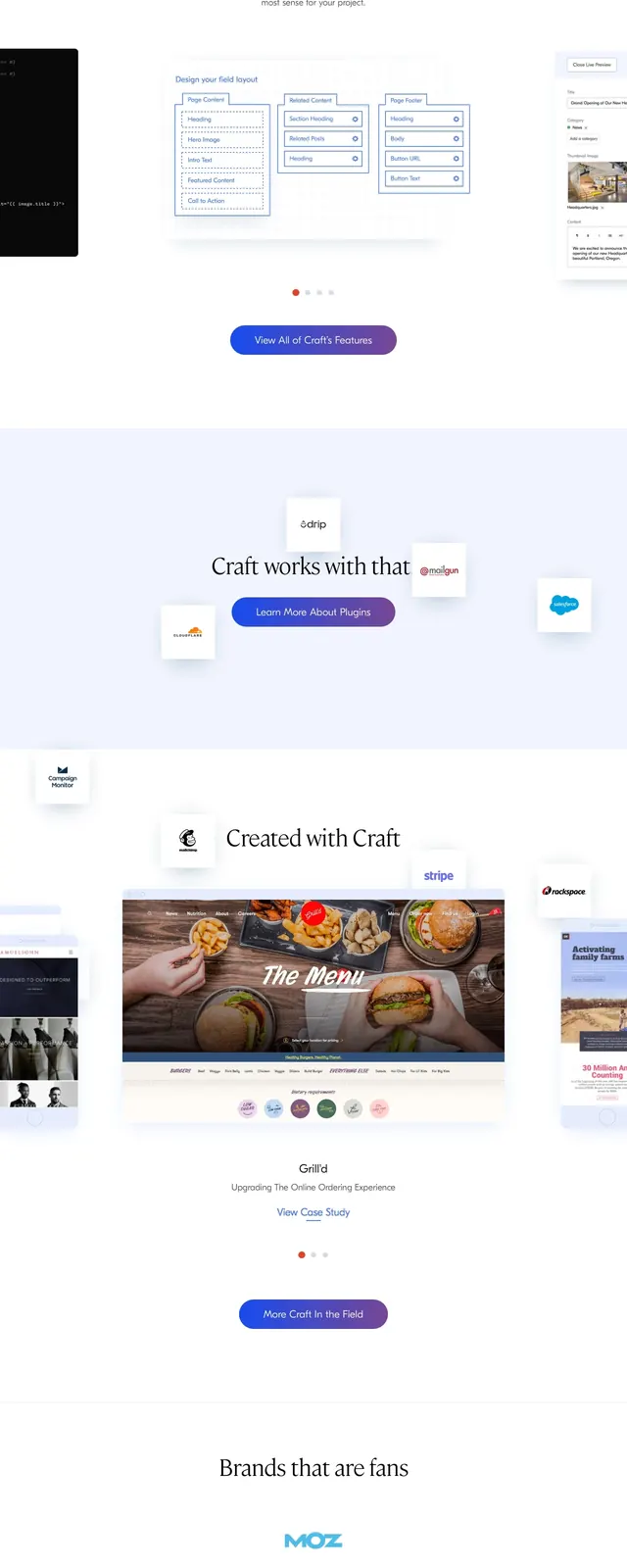
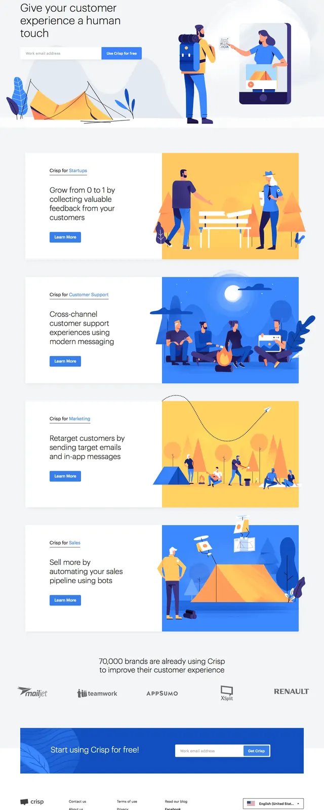
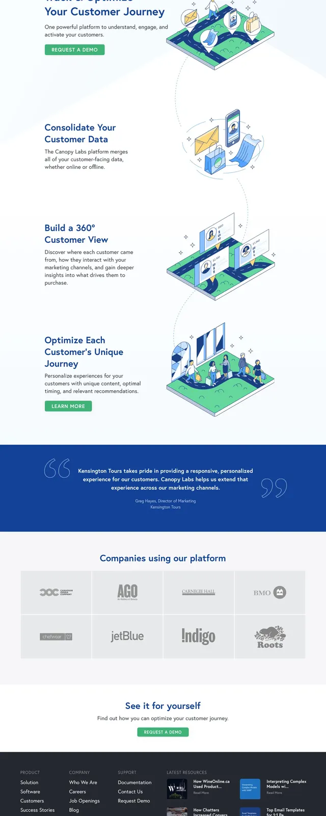
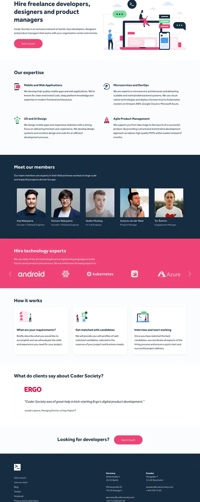
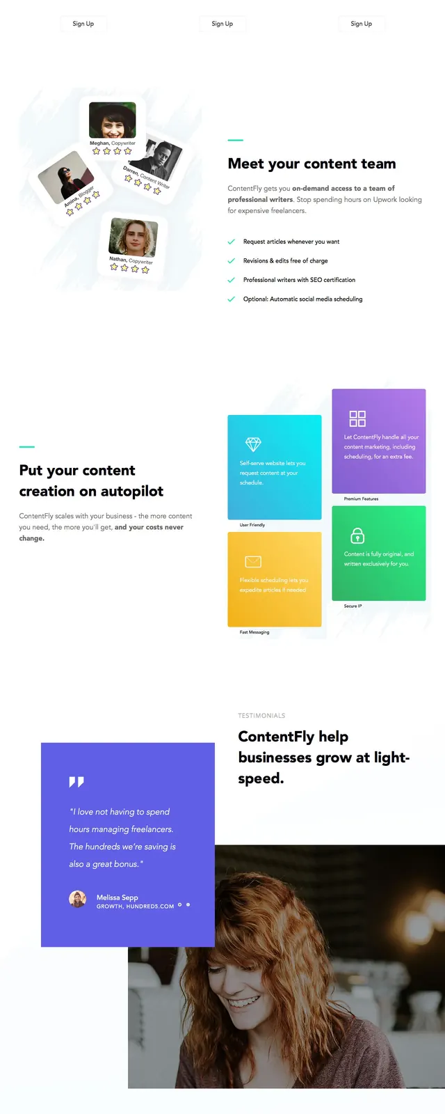
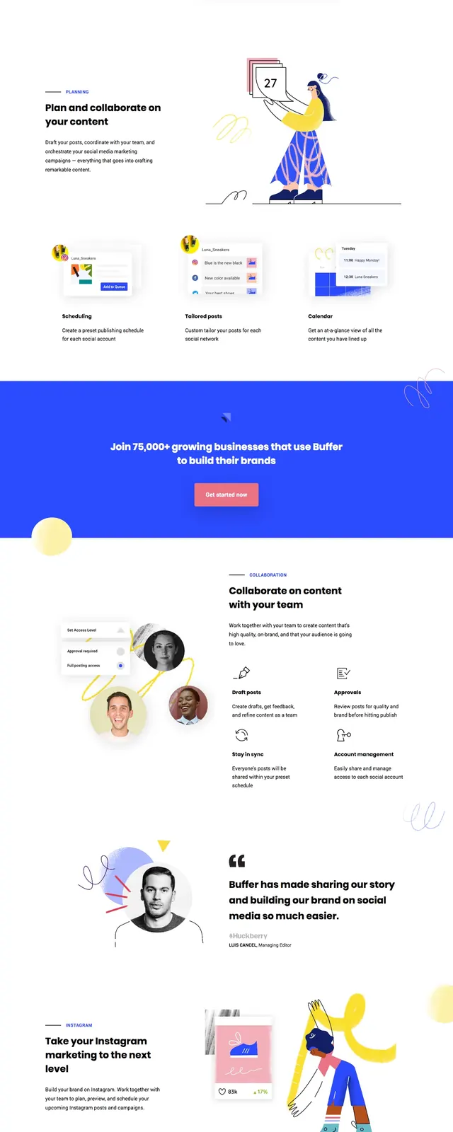
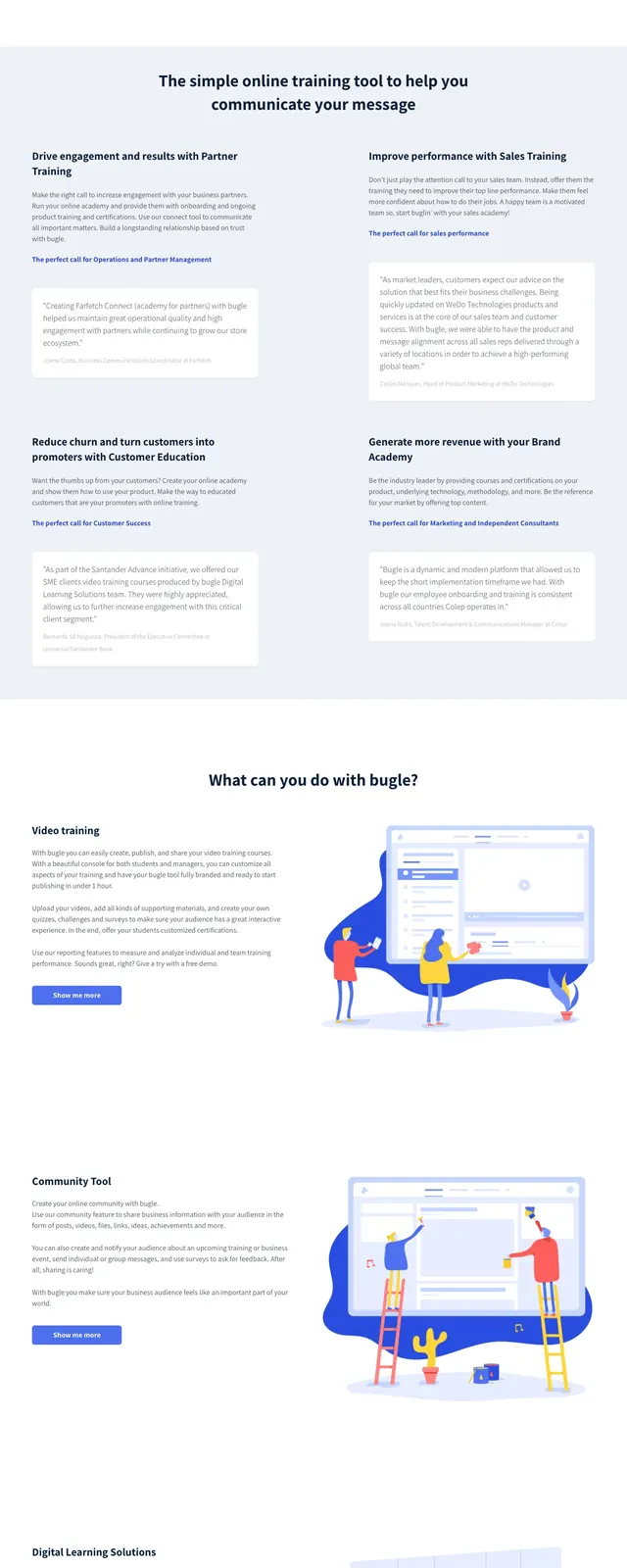
The page opens on a spacious white hero with a small logo and thin top navigation, a large bold headline on the left, and a coral primary CTA below the supporting copy. On the right, a large blue abstract shape frames an illustrated workspace and floating app-window mockups. Below the hero, the page continues into a pale testimonial band and a feature section with text blocks, illustrations, cards, and secondary blue buttons.
Key takeaway
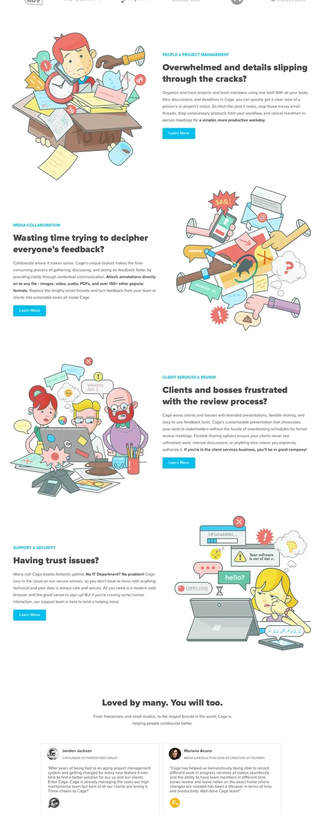
The strongest reusable move is the contrast between a clean white editorial layout and vivid, friendly illustrations. The page keeps hierarchy simple while using color blocks and oversized whitespace to make the product feel approachable.
Reuse notes
Use this structure for SaaS or education products that need to explain a complex offering quickly without looking dense. The illustrated split hero and soft testimonial/feature bands work best when the brand can support bright accent colors and playful visuals.