Preview image. Unlock full-res
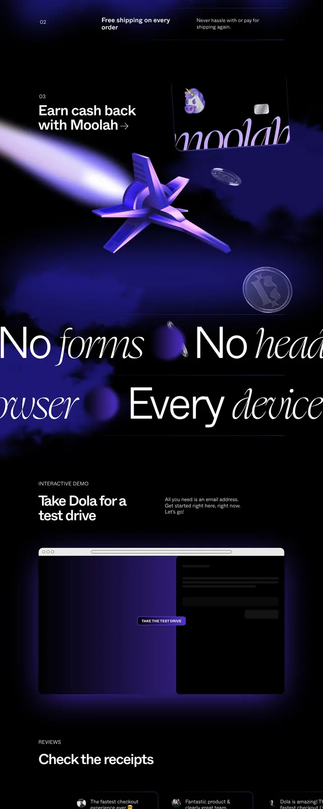
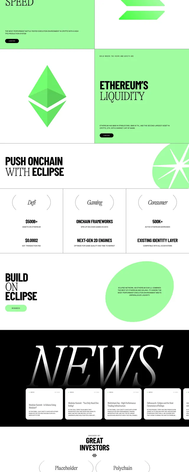
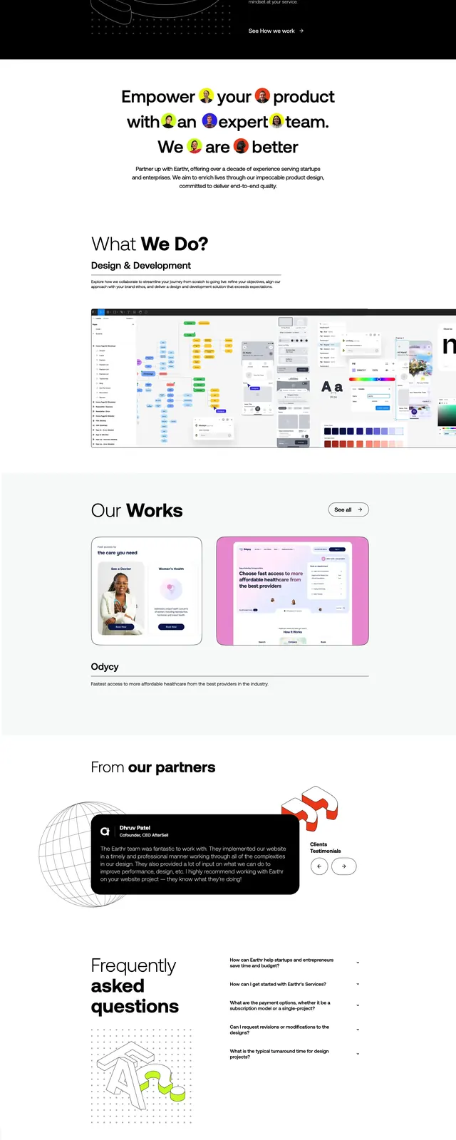
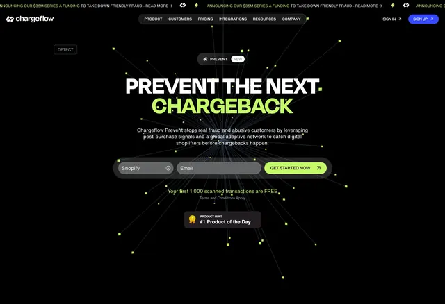
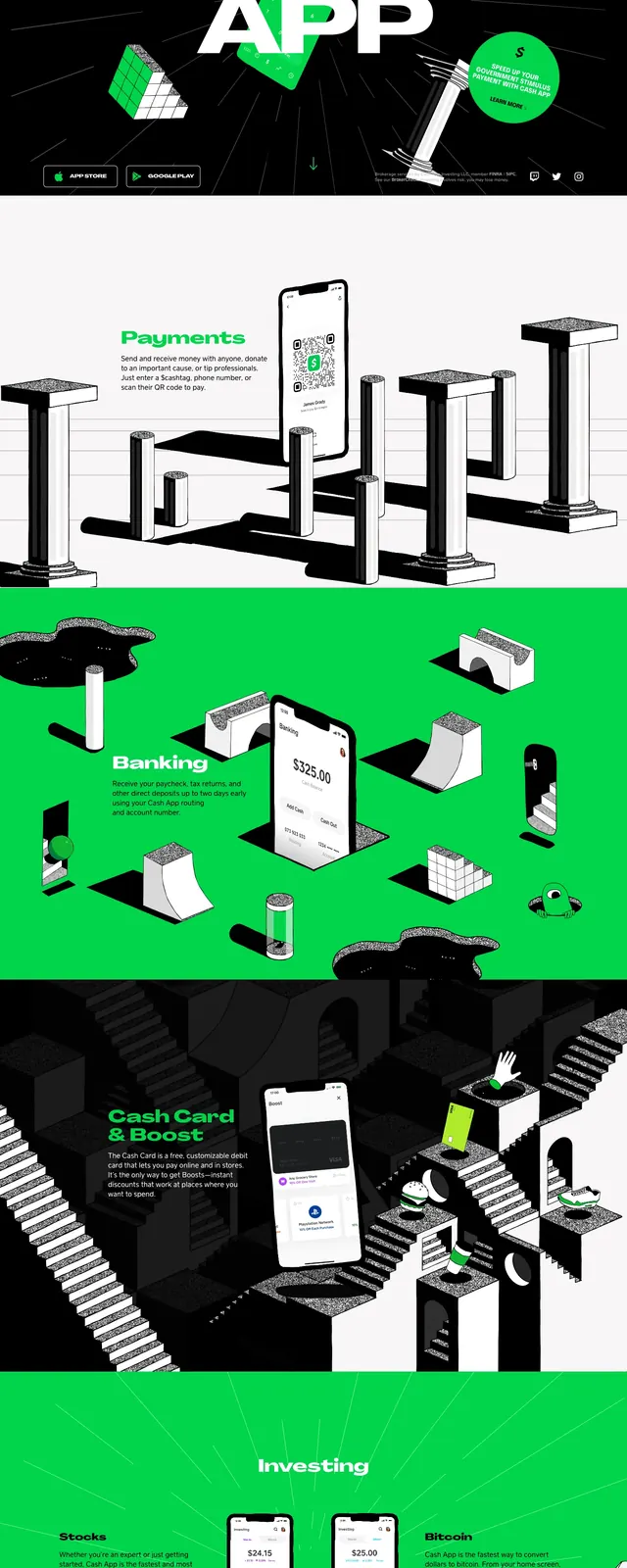
A tall, high-contrast Cash App landing page built around oversized typography, neon green accents, and surreal 3D-style product scenes.
Summary
A tall, high-contrast Cash App landing page built around oversized typography, neon green accents, and surreal 3D-style product scenes.
Visual description
The screenshot shows a full-page Cash App homepage with a black hero at the top, huge centered white lettering, and a bright green phone mockup layered over the headline. The page uses floating 3D geometric objects, small top navigation links, and app download buttons in the hero. Lower sections switch between white and saturated green backgrounds, with large product illustrations, phone screens, and bold section labels like Payments, Banking, and Investing.
Key takeaway
The main move is the collision of oversized type, neon branding, and playful 3D object scenes. Each section feels like a branded stage set rather than a standard product marketing layout.
Reuse notes
Use this approach for consumer-fintech or app marketing pages that need strong visual identity and high memorability. It works best when the brand can support a very loud, graphic system with simple CTA structure and large product visuals.