Preview image. Unlock full-res
A bold agency landing page with oversized split typography, dark section breaks, and modular showcase blocks.
Summary
A bold agency landing page with oversized split typography, dark section breaks, and modular showcase blocks.
Visual description
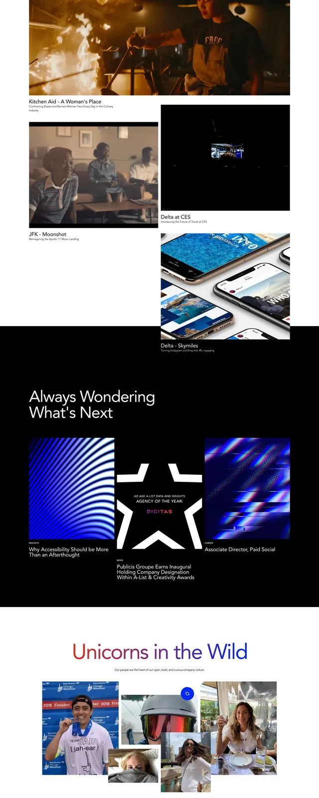
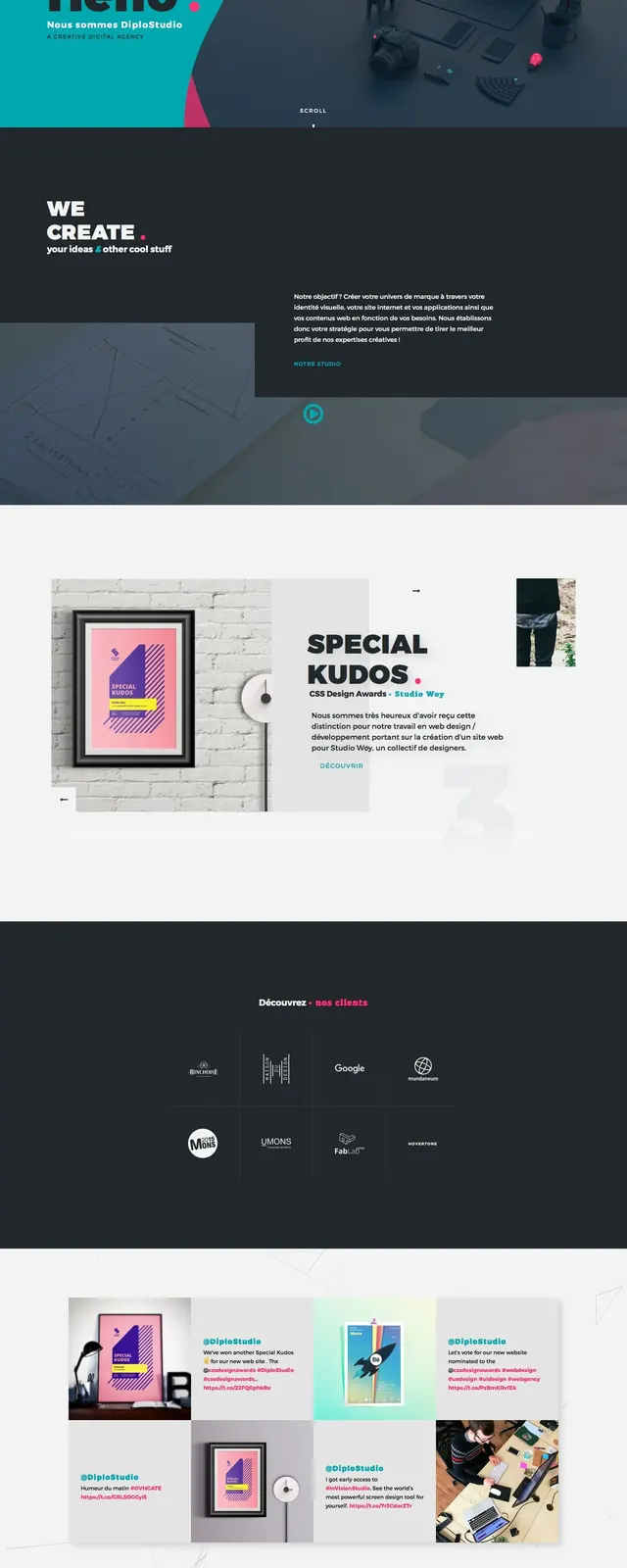
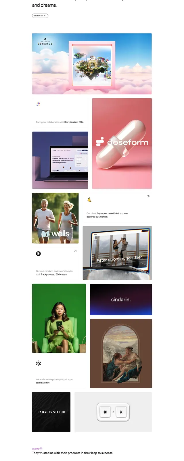
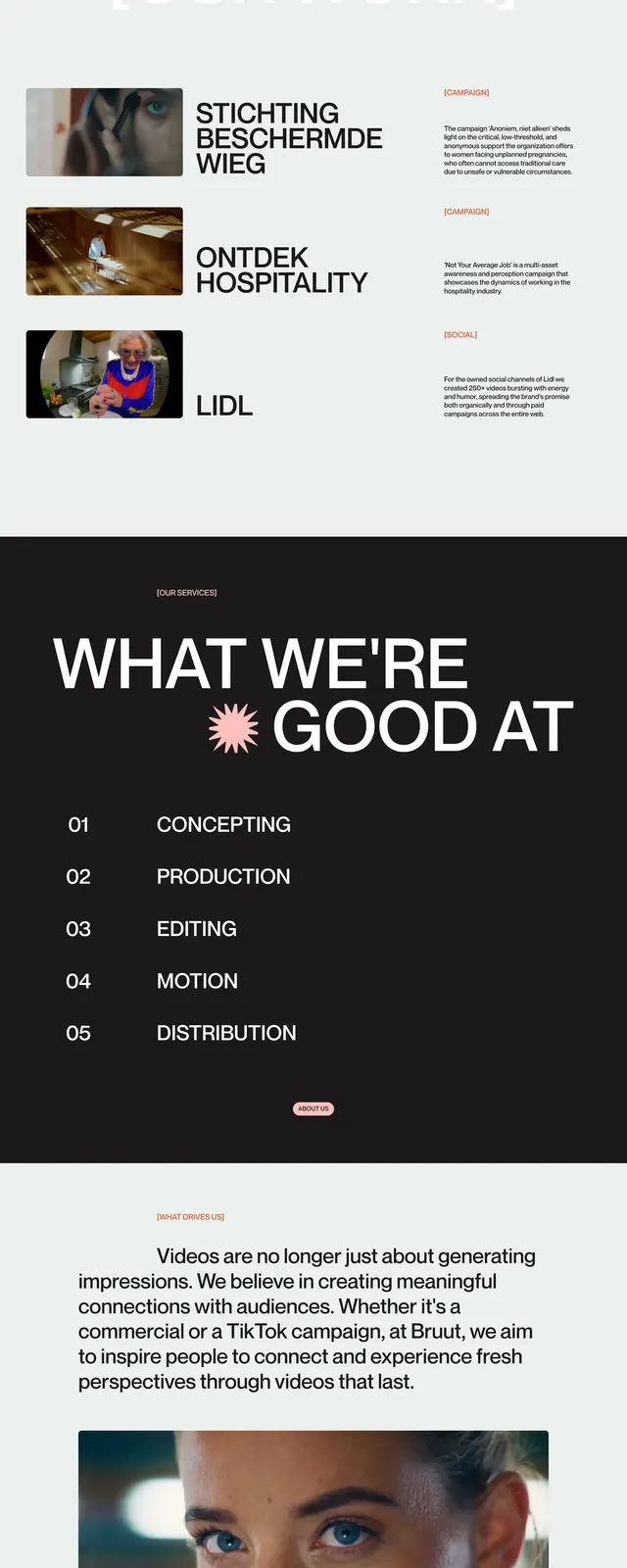
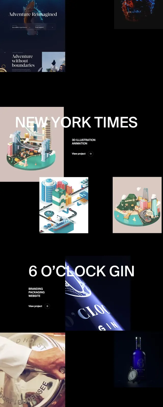
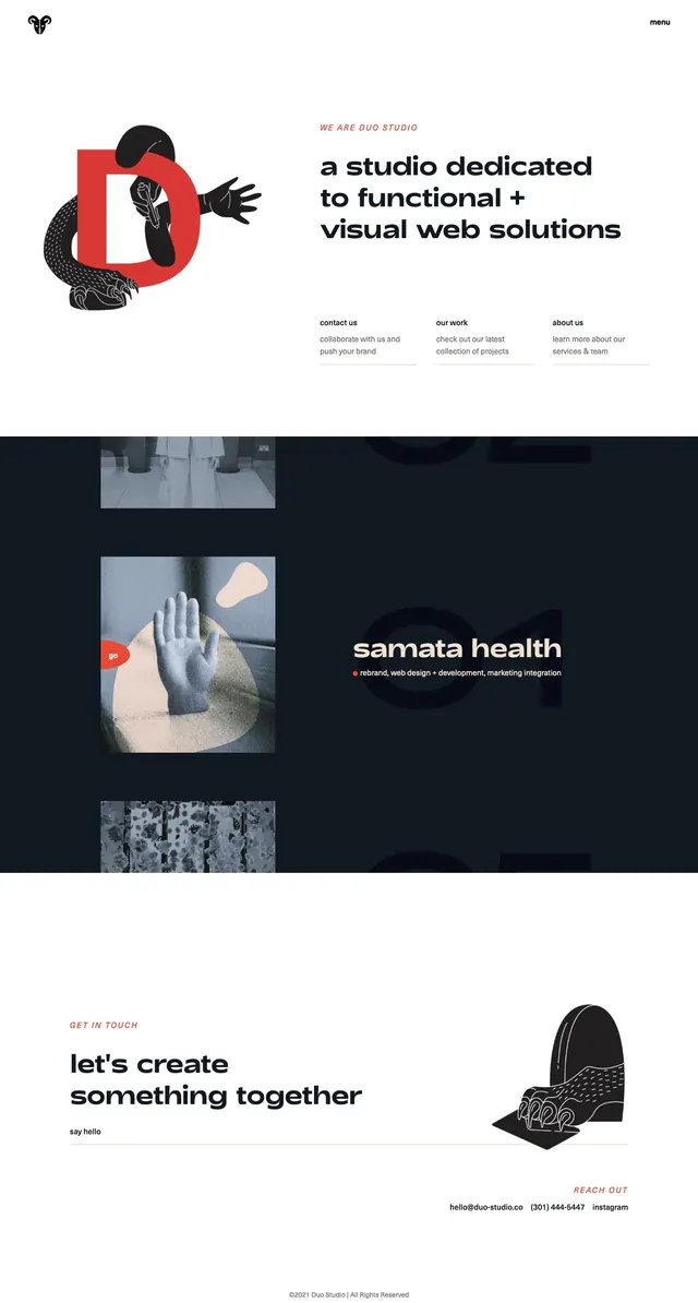
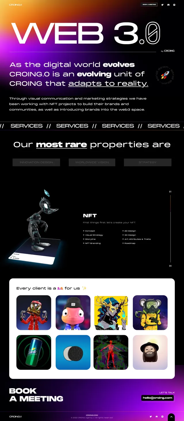
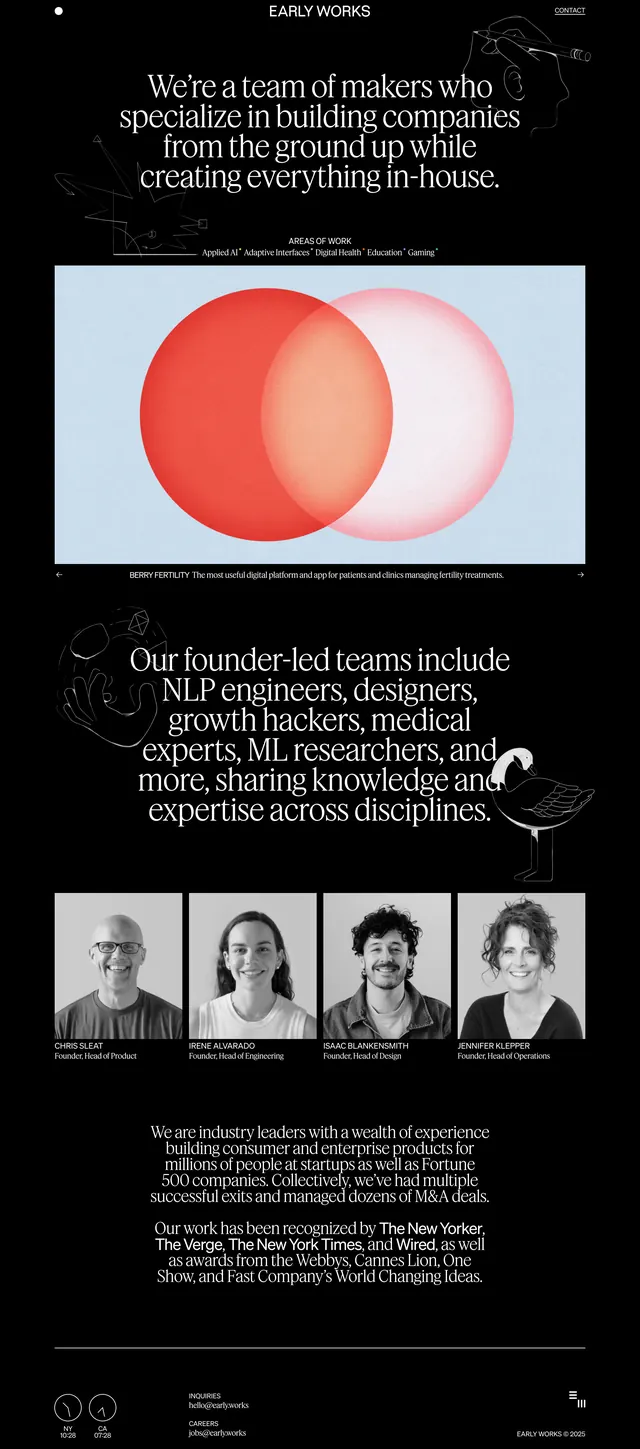
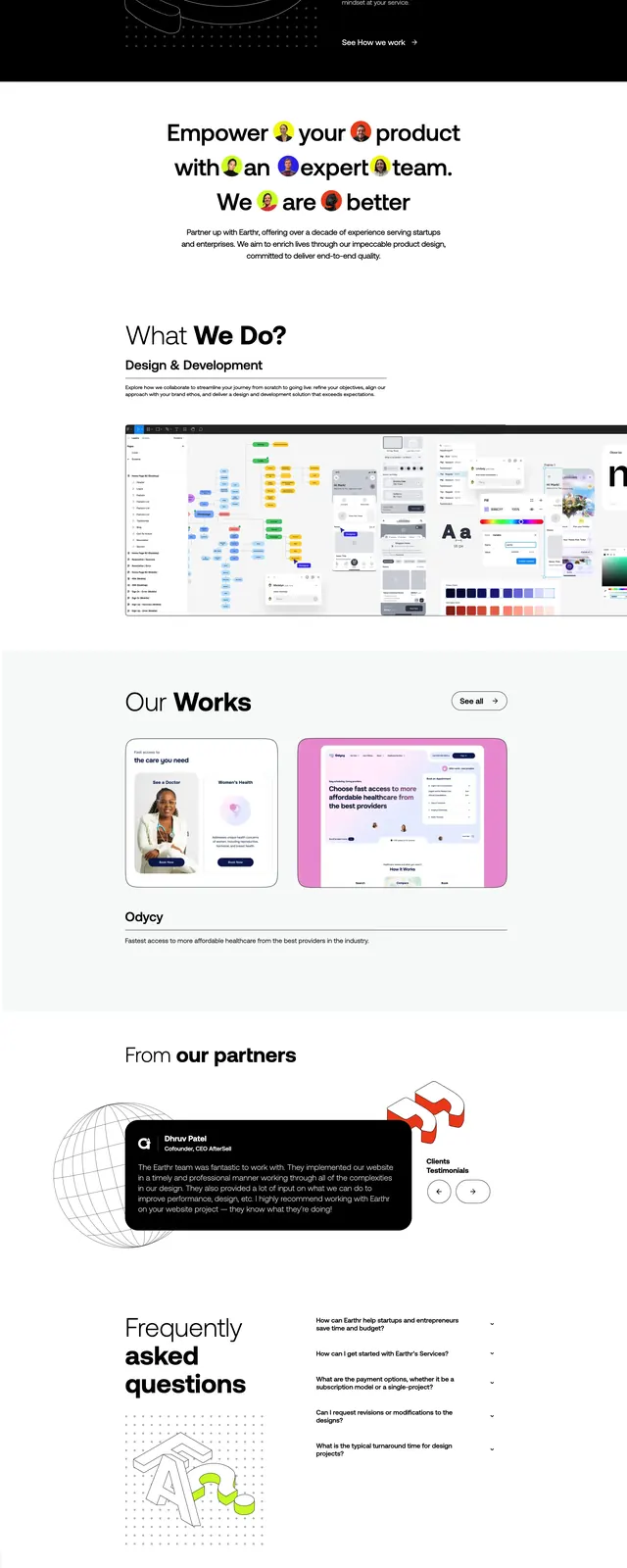
The page opens with a white hero featuring a small top nav, a huge layered headline reading like a design studio introduction, and a compact CTA beside a globe image. Below it, a wide black feature section uses a line-art ring illustration and a short value proposition, followed by a dense image strip that looks like process or work samples. Further down, a light portfolio section shows two large project cards, then a partner area with a small decorative graphic and a grid of branded tiles, ending in a bright red repeating talk banner and a dark footer packed with contact and navigation links.
Key takeaway
The strongest idea is the contrast between airy white editorial spacing and hard black showcase bands. Oversized type, small utility labels, and modular cards create a polished agency feel without heavy ornament.
Reuse notes
Reuse this for creative studios, branding agencies, or no-code service sites that need a premium but energetic presentation. The structure works best when you have strong case-study visuals, partner logos, and a concise CTA hierarchy.