Preview image. Unlock full-res
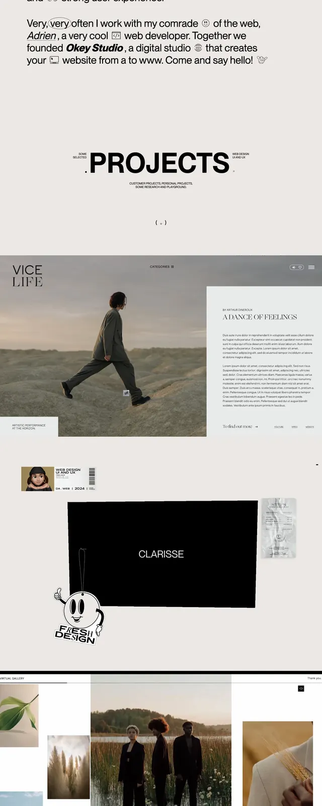
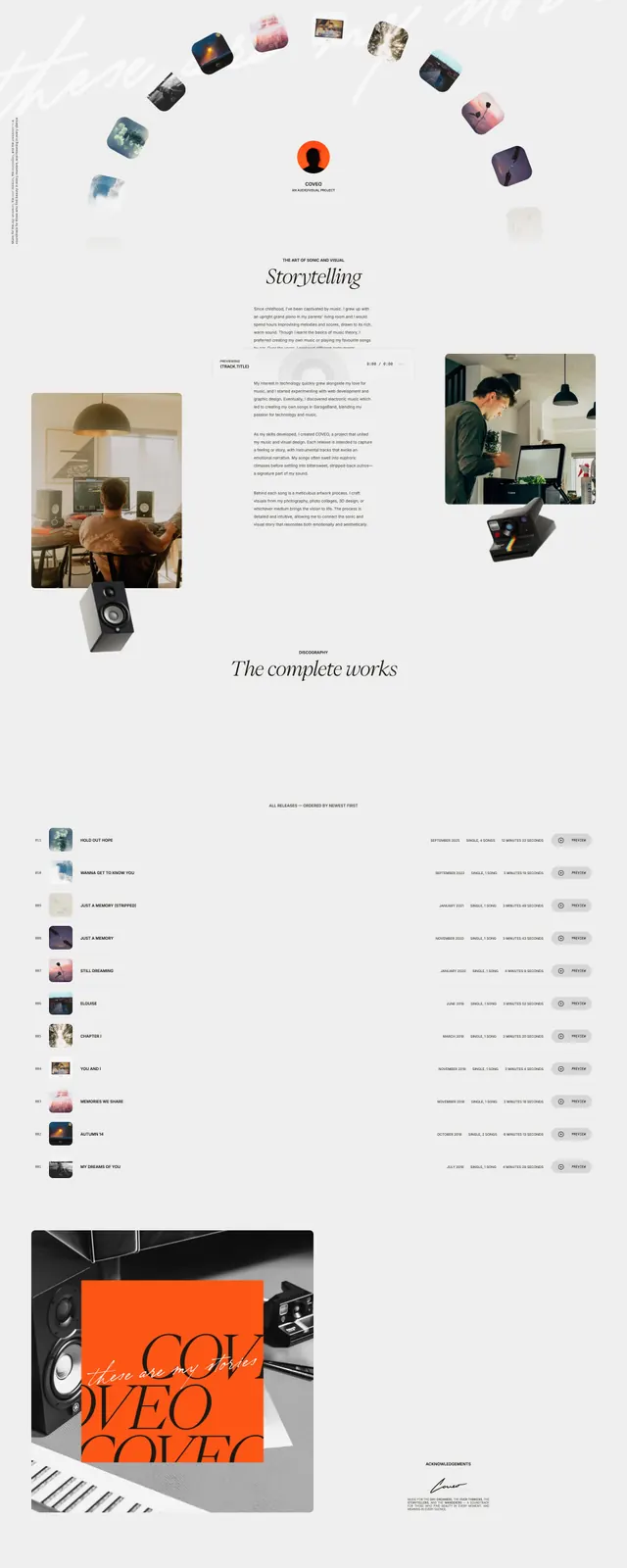
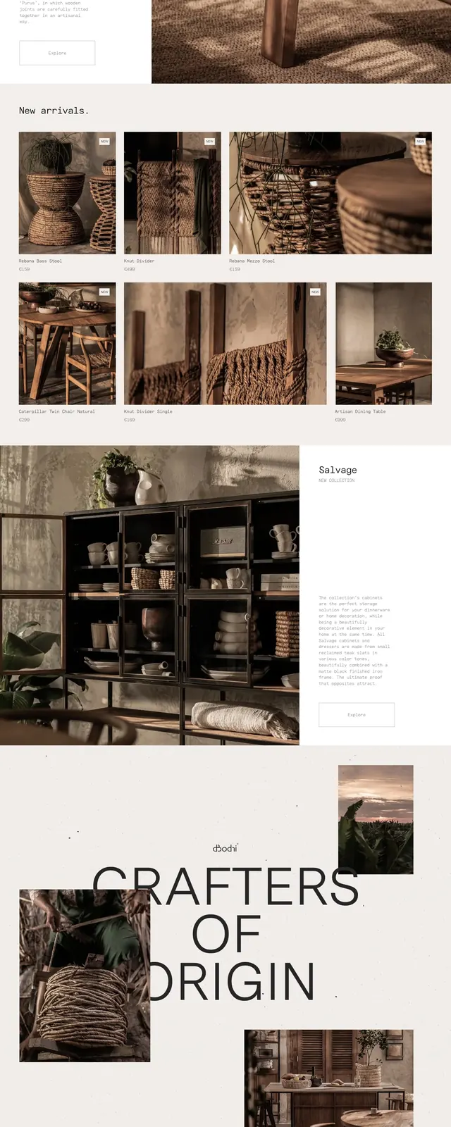
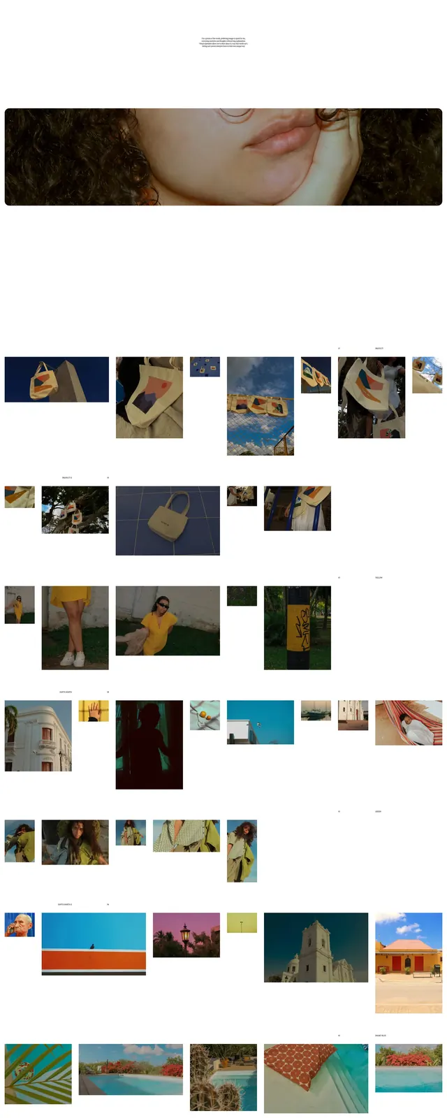
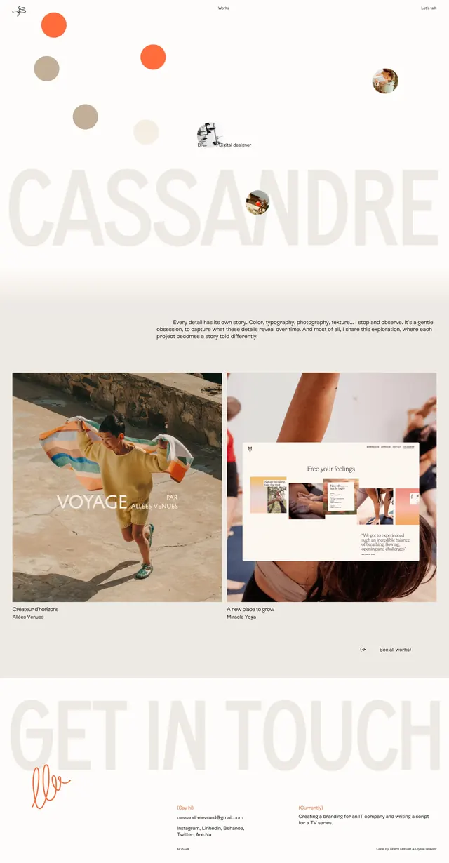
A light, minimalist portfolio homepage with oversized name typography, floating circular imagery, and grid-based project previews.
Summary
A light, minimalist portfolio homepage with oversized name typography, floating circular imagery, and grid-based project previews.
Visual description
The page uses a pale cream background with very large, translucent name text spanning the width of the screen. Small circular images and dots float across the hero area, with a minimal top navigation and tiny centered label text. Lower sections switch to wide two-column project previews with large photographs, short captions, and generous whitespace between repeated content blocks. The footer area returns to the oversized typography treatment with contact details and a handwritten accent mark.
Key takeaway
The strongest idea is the contrast between monumental branding type and delicate, scattered imagery. It creates a refined editorial portfolio feel without relying on heavy UI chrome.
Reuse notes
Use this structure for personal portfolios, creative studios, or artist sites that want a soft but memorable first impression. It works best when the imagery is curated and the page can afford a lot of negative space.