Preview image. Unlock full-res
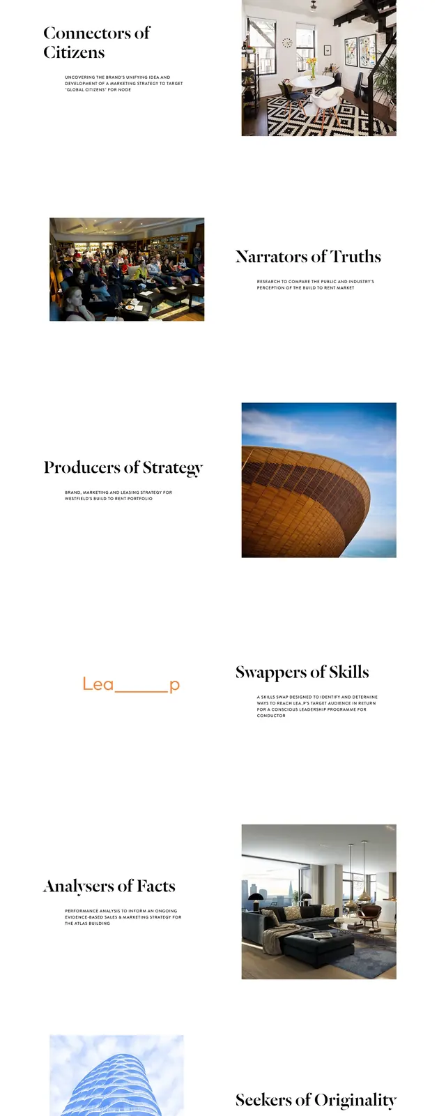
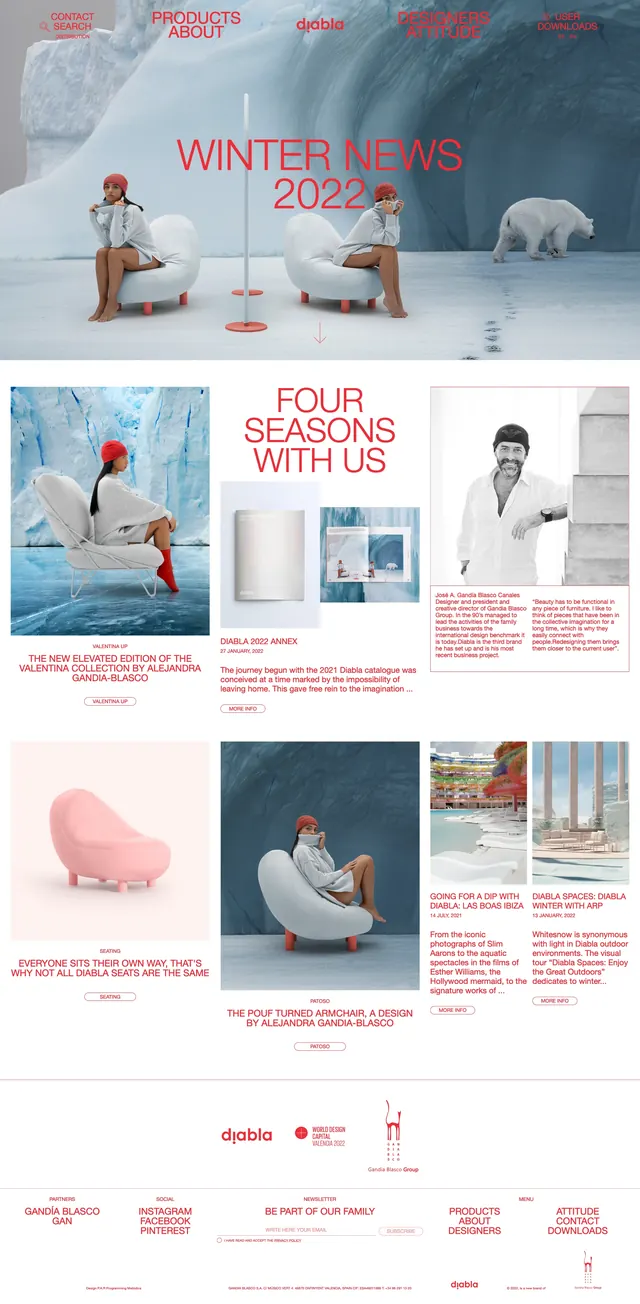
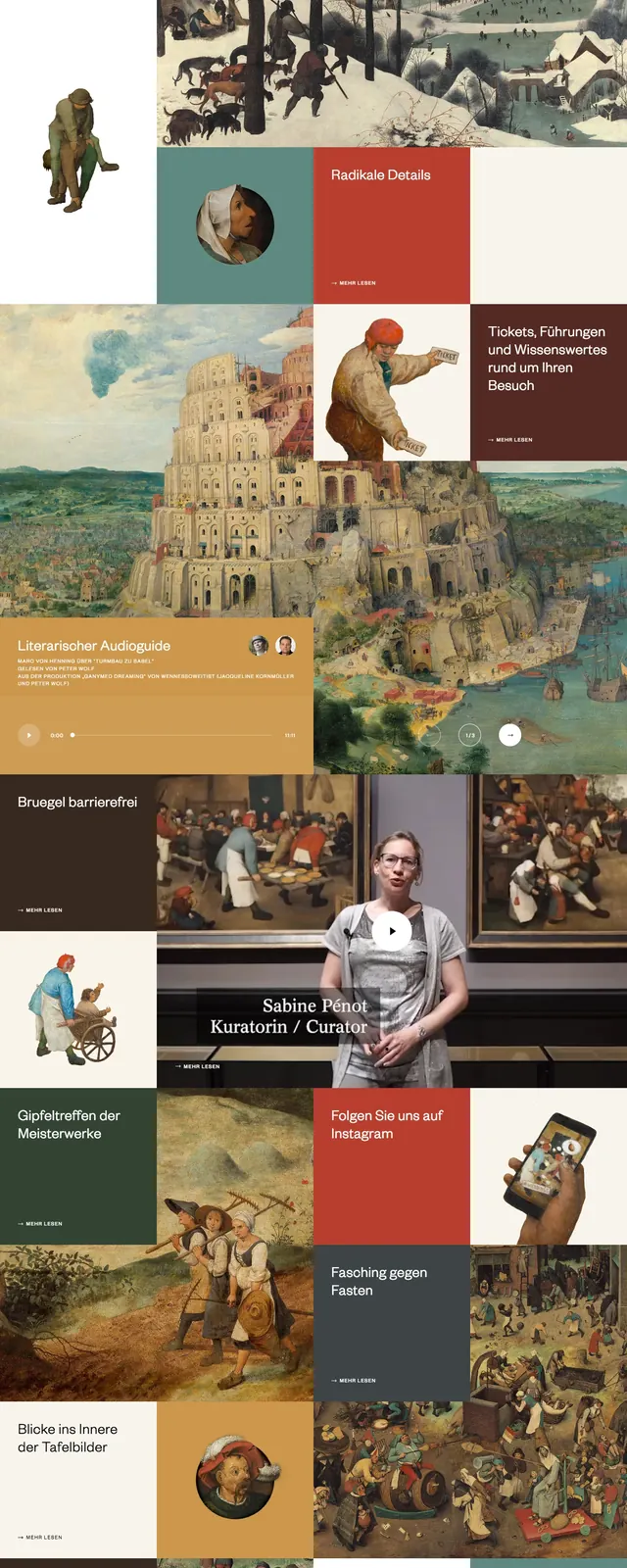
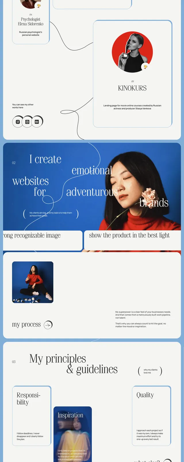
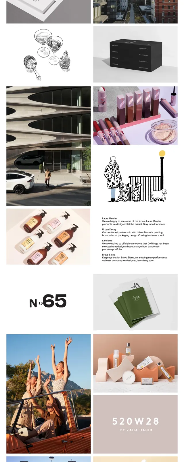
An airy agency homepage with a giant serif wordmark, sparse navigation, and a masonry-style portfolio grid of colorful project imagery.
Summary
An airy agency homepage with a giant serif wordmark, sparse navigation, and a masonry-style portfolio grid of colorful project imagery.
Visual description
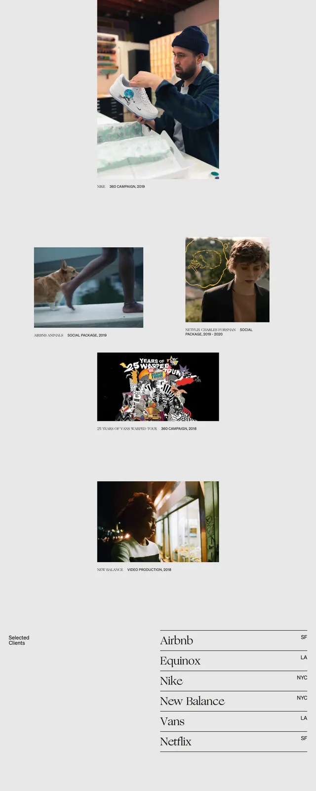
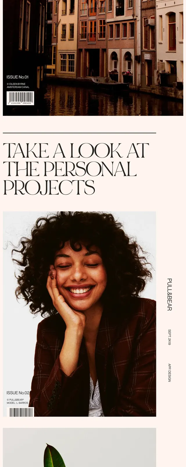
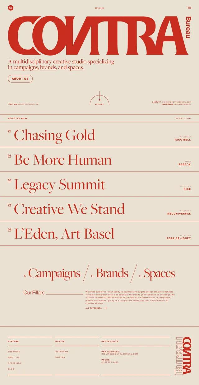
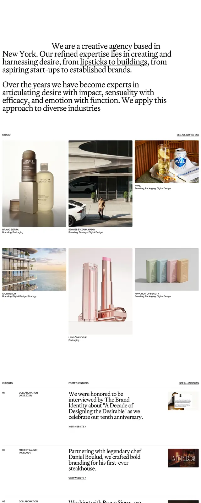
The page uses a clean white background with a small text intro at the top left and a simple top-right navigation. A very large serif headline reading "Dothings" dominates the first screen, followed by an asymmetric portfolio grid of imagery, logos, and project snapshots. Lower sections continue the collage-like layout with mixed image sizes, short project blurbs, and a restrained footer with contact details and social links.
Key takeaway
The design relies on strong typography, generous whitespace, and varied image scales to feel refined and agency-led. It is useful as a reference for portfolio or creative studio sites that want an editorial, high-end presentation without heavy UI chrome.
Reuse notes
Reuse the oversized serif hero headline, sparse navigation, and asymmetrical image grid to create a polished creative-agency feel. The structure works well for showcasing client work, brand partnerships, or case studies in a visually expressive way.