Preview image. Unlock full-res
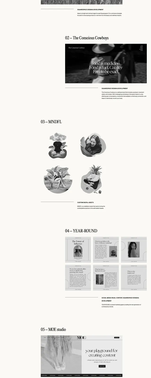
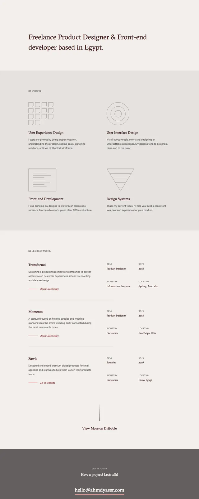
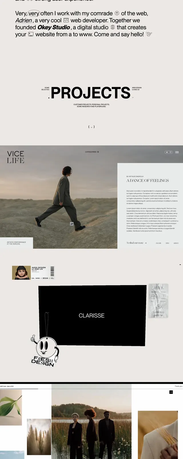
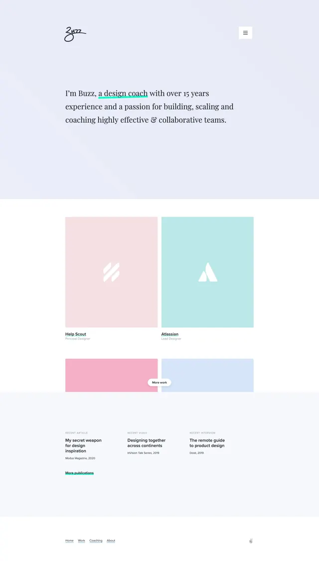
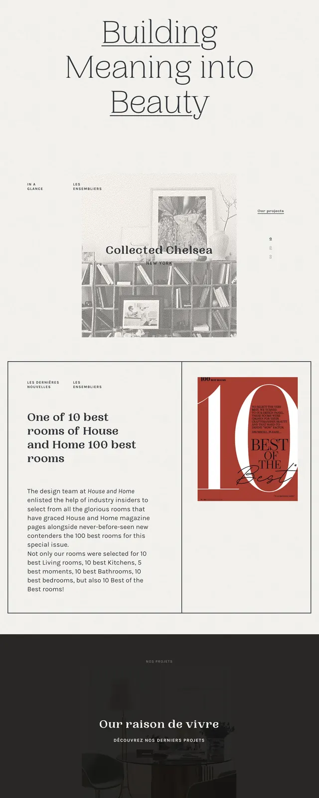
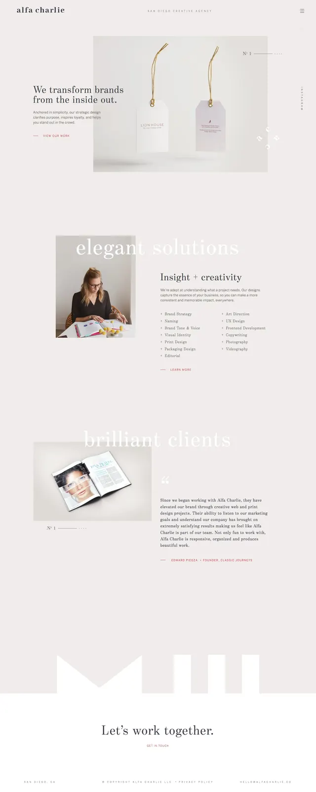
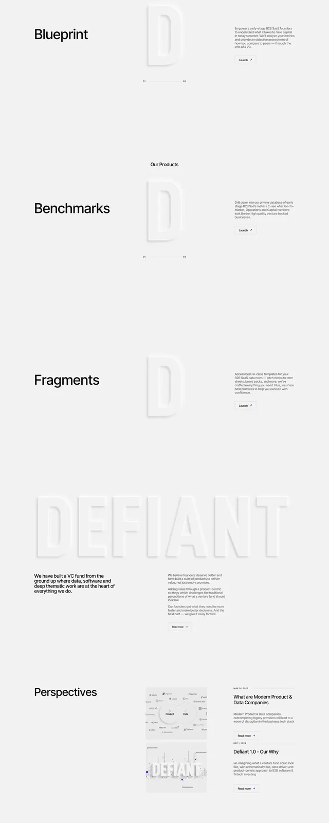
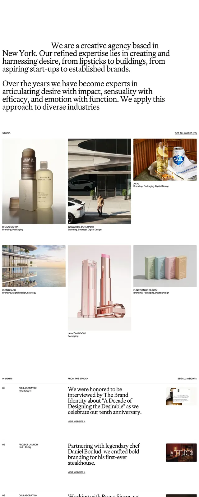
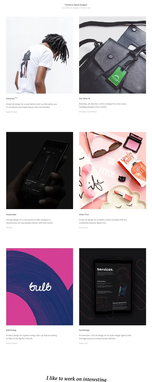
A minimalist portfolio homepage with a large slanted serif headline, sparse navigation, and a clean grid of project thumbnails.
Summary
A minimalist portfolio homepage with a large slanted serif headline, sparse navigation, and a clean grid of project thumbnails.
Visual description
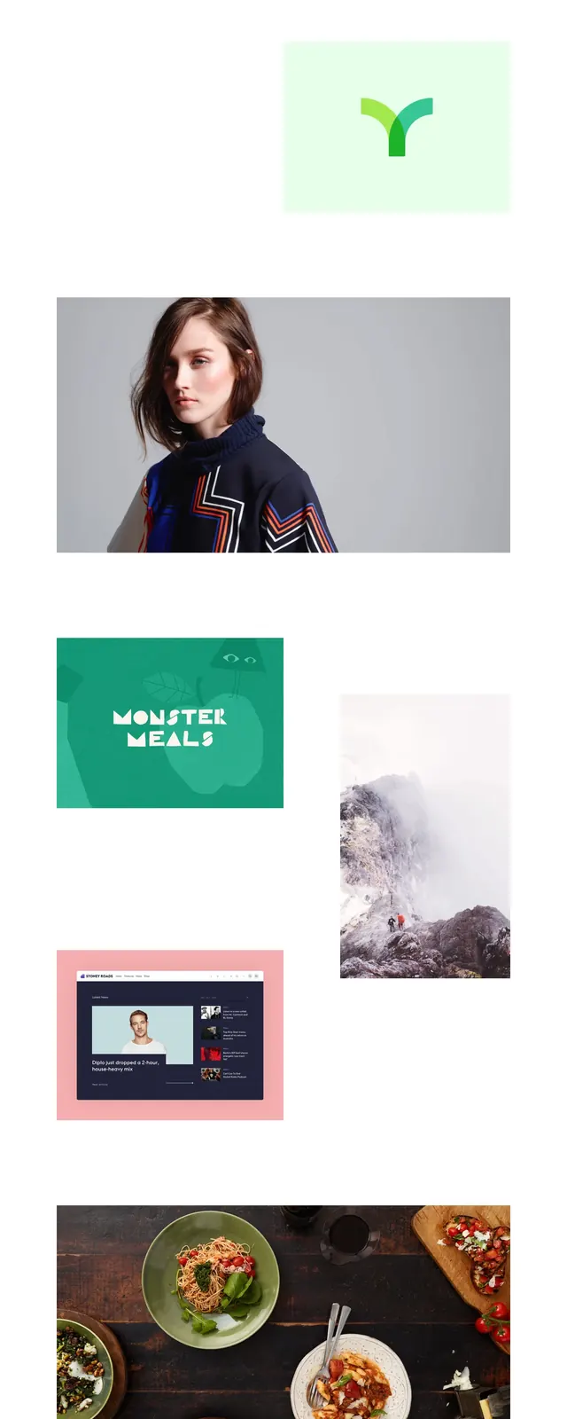
The page opens on a white background with a small wordmark at top left and simple text links at top right. A large italic serif headline sits centered in the upper half, followed by a small two-line descriptor and a two-column grid of large portfolio images. Farther down, additional project tiles continue in the same grid structure, and the page ends with a centered italic call-to-action line above a small footer of social links.
Key takeaway
The design relies on extreme whitespace, restrained navigation, and a strong editorial serif headline to make the work feel curated. The repeated two-column project grid keeps the portfolio simple and easy to scan.
Reuse notes
Use this pattern for personal portfolios or boutique agency sites where the work should dominate the page. It works best when the imagery is strong and the brand voice is understated rather than highly promotional.