Preview image. Unlock full-res
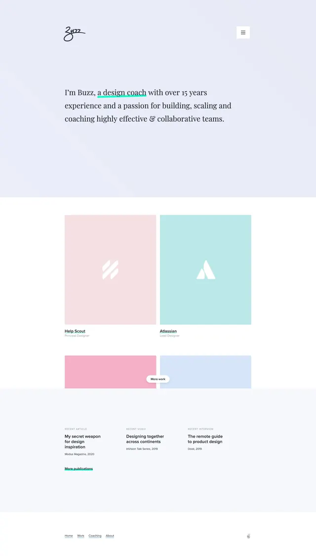
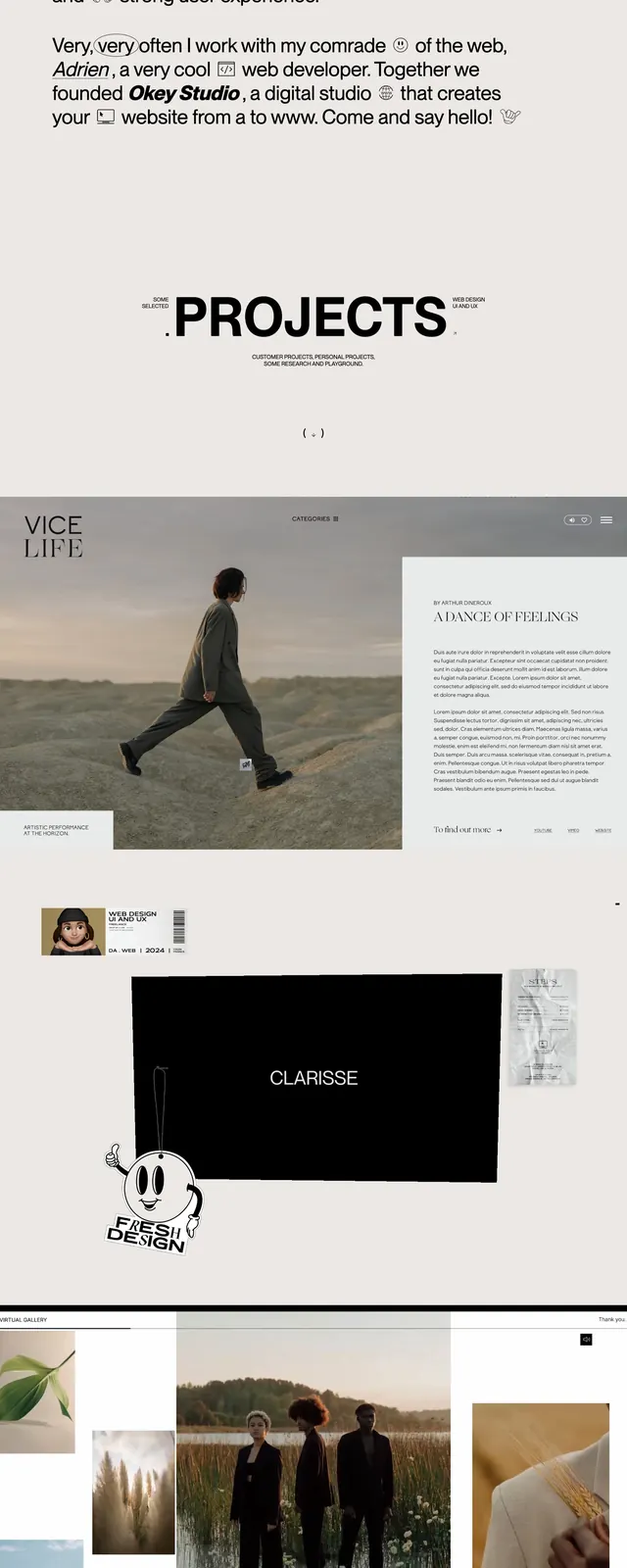
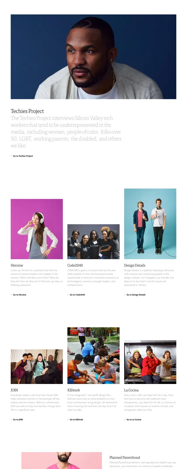
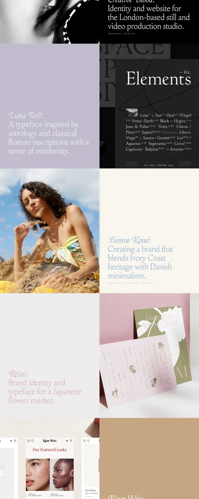
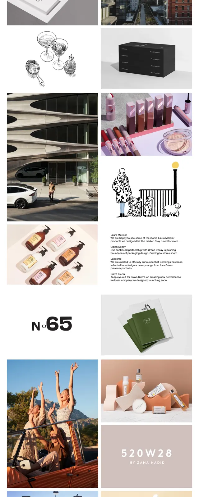
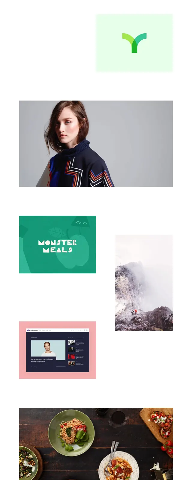
A sparse personal portfolio homepage with a light editorial layout and large image-led project showcase blocks.
Summary
A sparse personal portfolio homepage with a light editorial layout and large image-led project showcase blocks.
Visual description
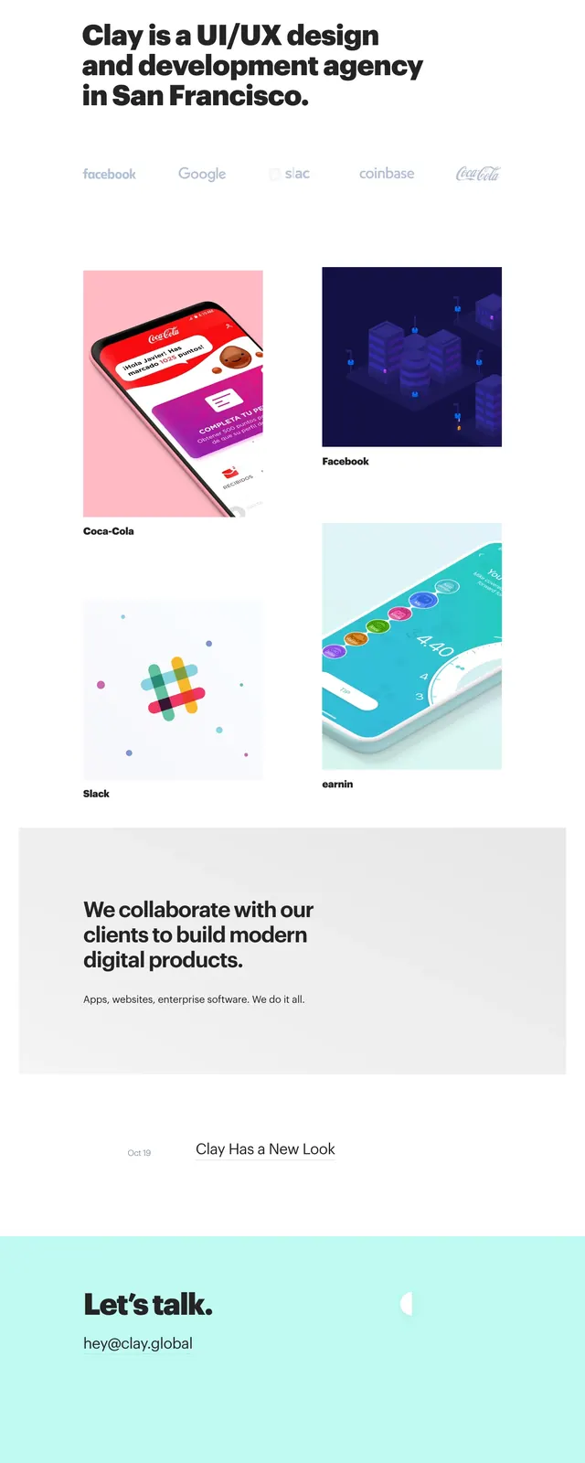
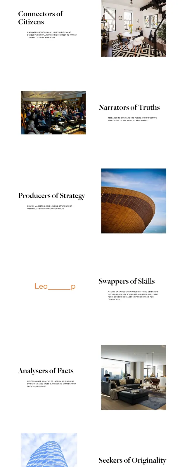
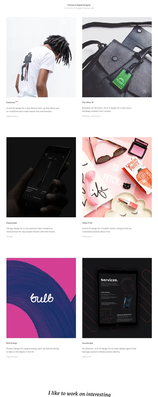
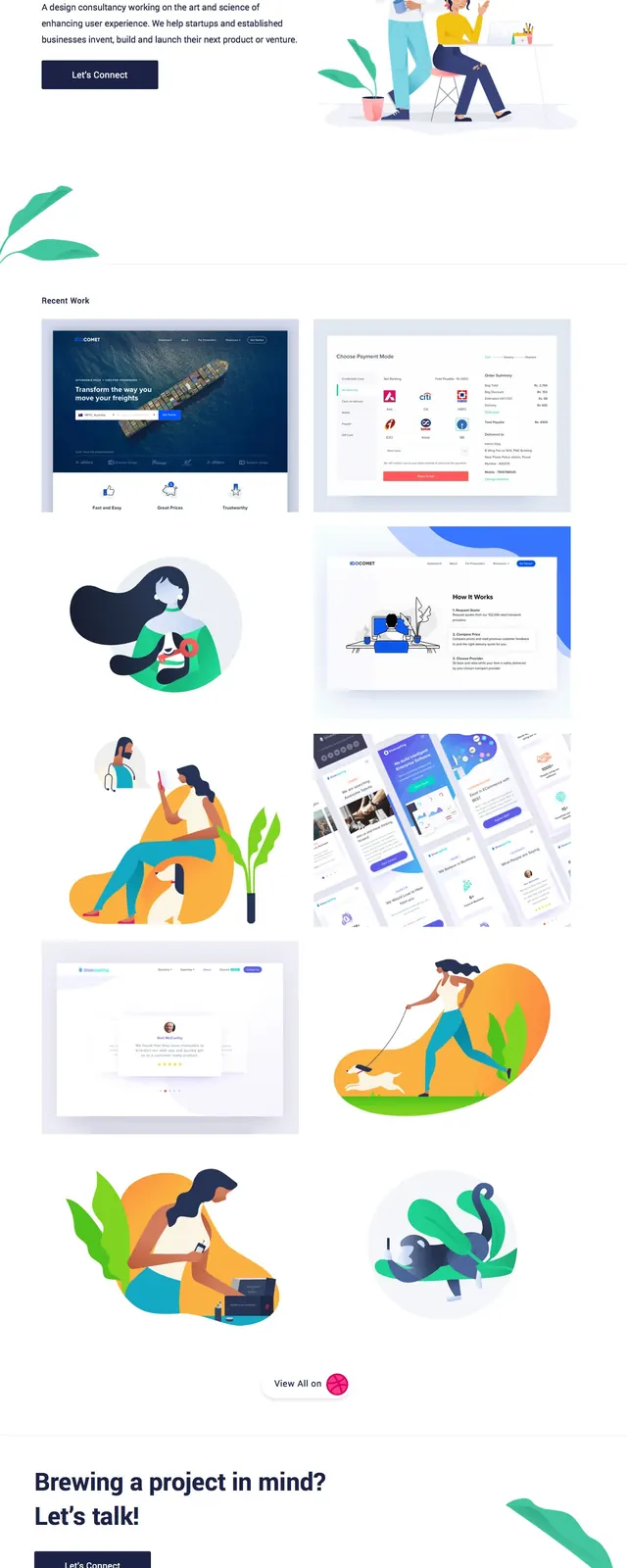
The page opens with a minimal personal header for Daniel Sammut and a restrained vertical navigation treatment along the left edge. Below, large portfolio thumbnails are arranged in an airy asymmetric grid with generous white space between image blocks. The visible sections feature mostly standalone project imagery, including product mockups, branding graphics, and lifestyle photography. The overall composition feels like a curated visual archive rather than a content-heavy homepage.
Key takeaway
The strongest pattern is a clean editorial portfolio grid that lets imagery do the work. It is easy to reuse for a designer, artist, or creative studio that wants a refined, image-first presentation.
Reuse notes
Reuse the oversized whitespace, subtle typography, and scattered project tiles to create a calm premium feel. The layout works best when each card or image is visually distinct and can stand on its own without heavy supporting copy.