Preview image. Unlock full-res
A minimalist, editorial fintech homepage with oversized headlines, soft white space, and bright pink-to-cyan brand accents.
Summary
A minimalist, editorial fintech homepage with oversized headlines, soft white space, and bright pink-to-cyan brand accents.
Visual description
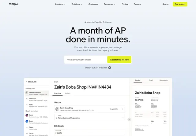
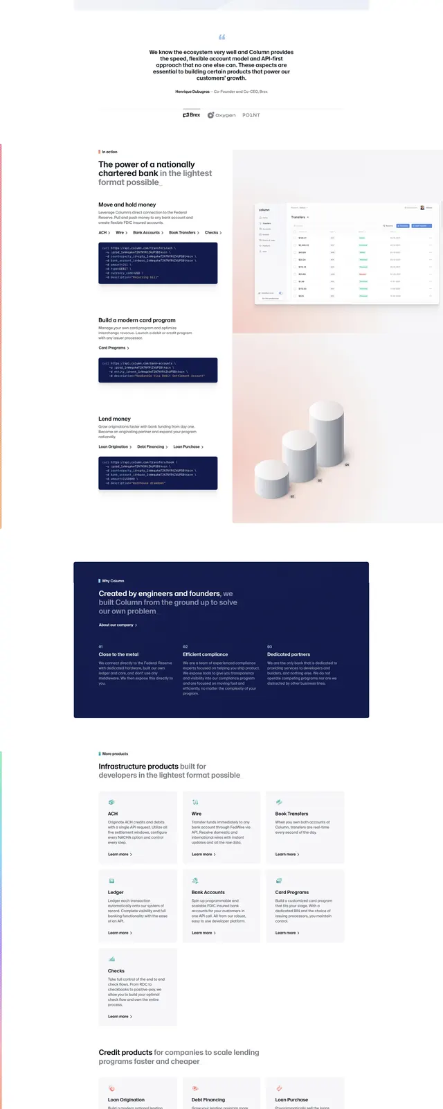
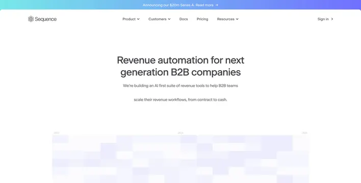
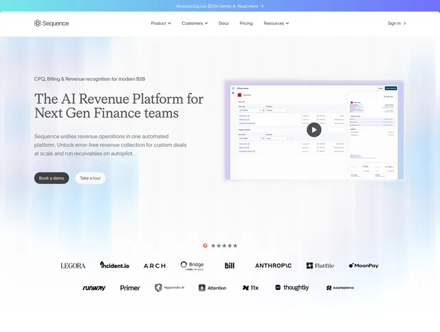
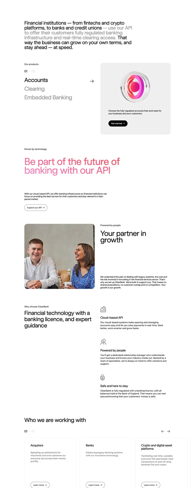
The page opens on a sparse white header with a small wordmark at top left and a compact navigation plus bright pill CTA at top right. Below, a large left-aligned hero headline sits beside a small dark CTA, followed by a wide rounded product illustration panel with abstract pink, red, and white ribbon-like forms on a pale gray background. Further down, the page stacks a row of client logos, a large pink gradient statement about banking API access, a split image-and-copy section, three light feature cards, a wide collaboration banner with another abstract ribbon graphic, and a dark multi-column footer.
Key takeaway
The strongest move is the contrast between severe whitespace and saturated gradient illustration, which makes the financial brand feel modern without becoming busy. Oversized typography and compact CTAs keep the hierarchy clear across a long scroll.
Reuse notes
Useful for fintech or B2B API landing pages that need credibility, polish, and a premium launch feel. Reuse the rounded abstract hero art and restrained layout when the goal is to make technical infrastructure feel approachable and high-end.