Preview image. Unlock full-res
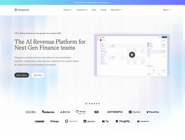
A polished fintech/developer homepage with a centered hero, layered product screenshots, and dark navy content bands.
Summary
A polished fintech/developer homepage with a centered hero, layered product screenshots, and dark navy content bands.
Visual description
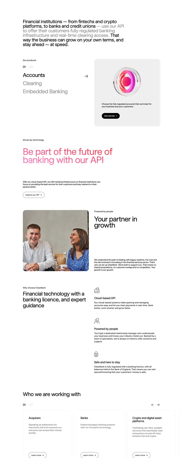
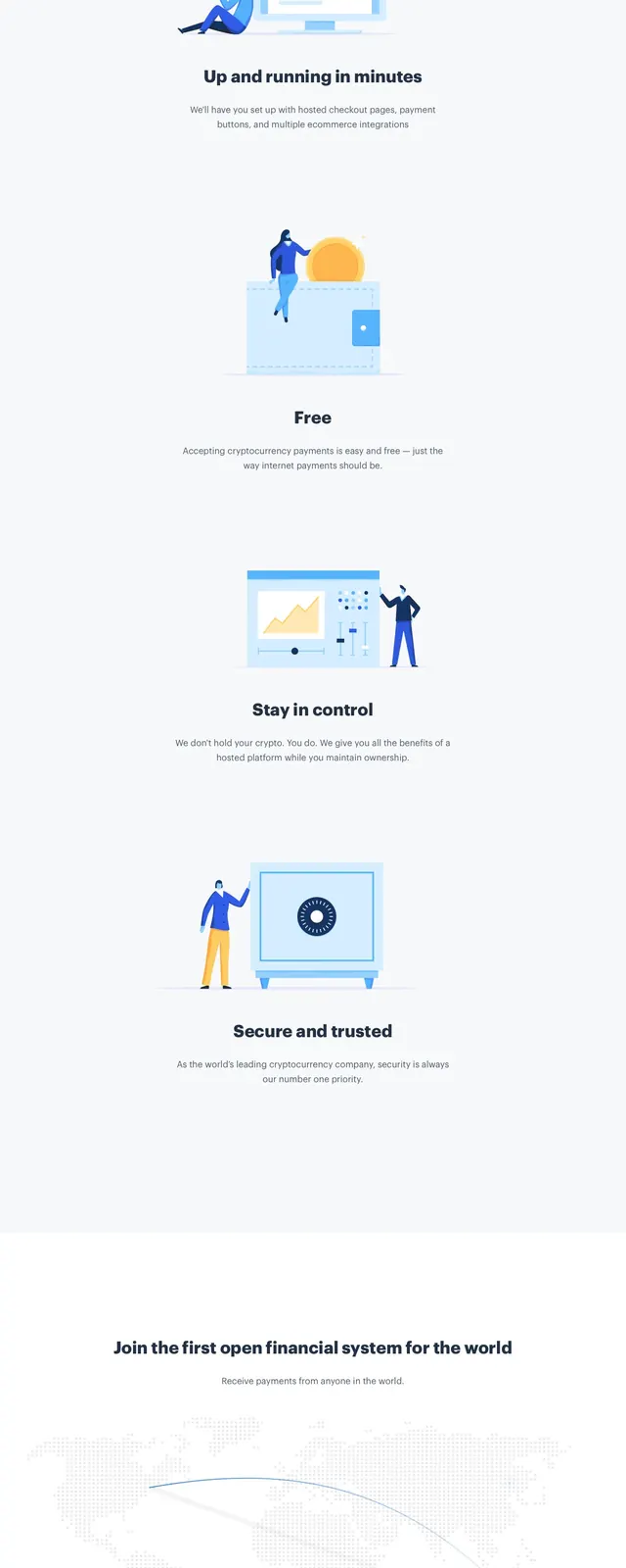
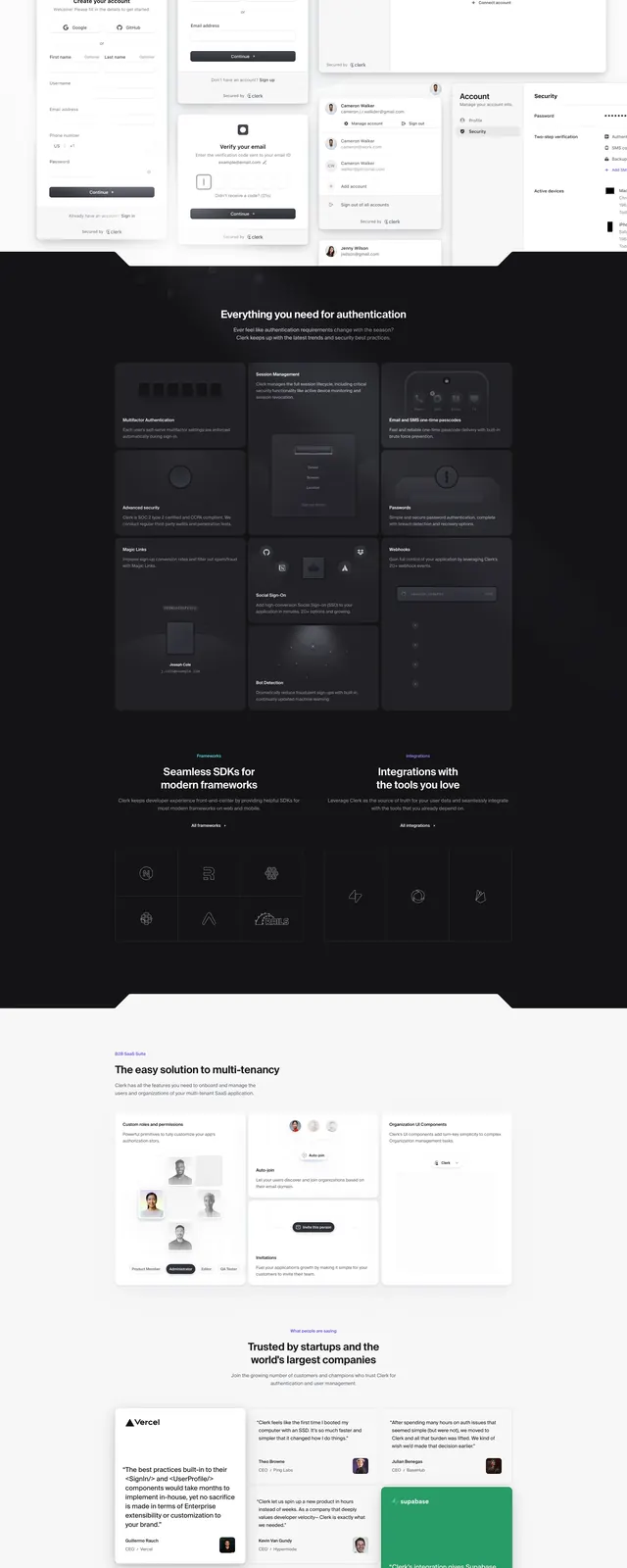
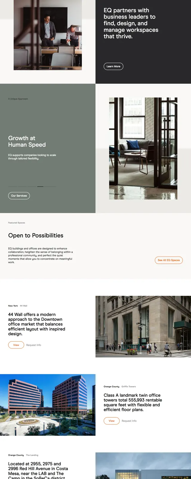
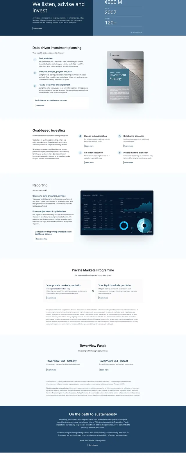
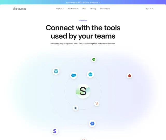
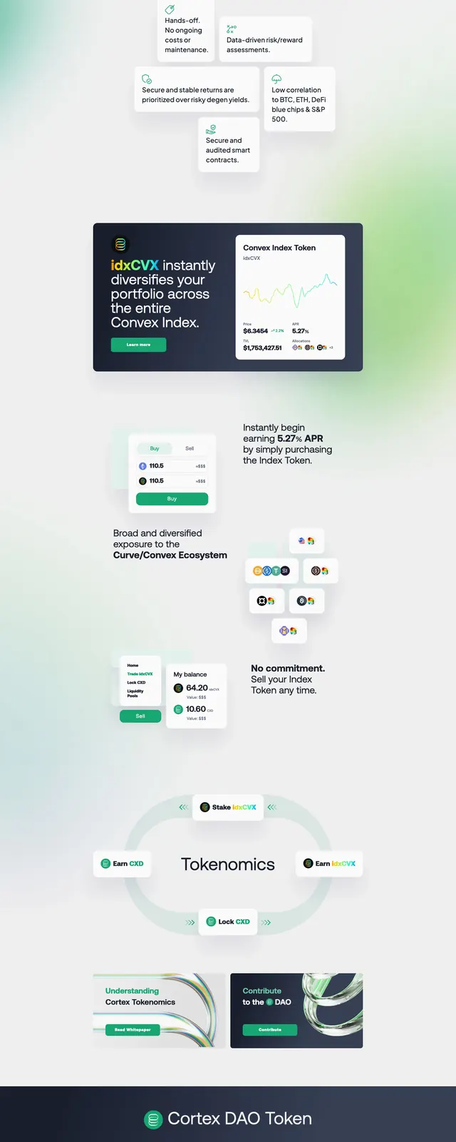
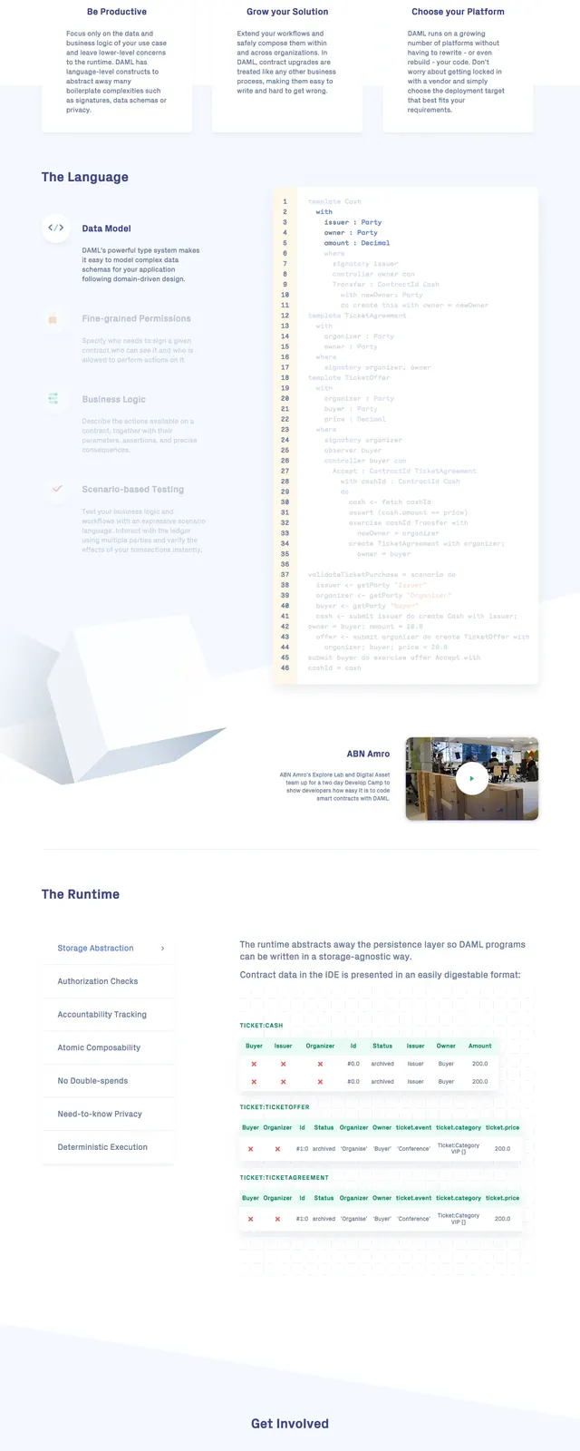
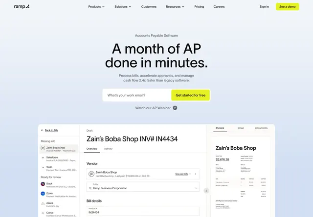
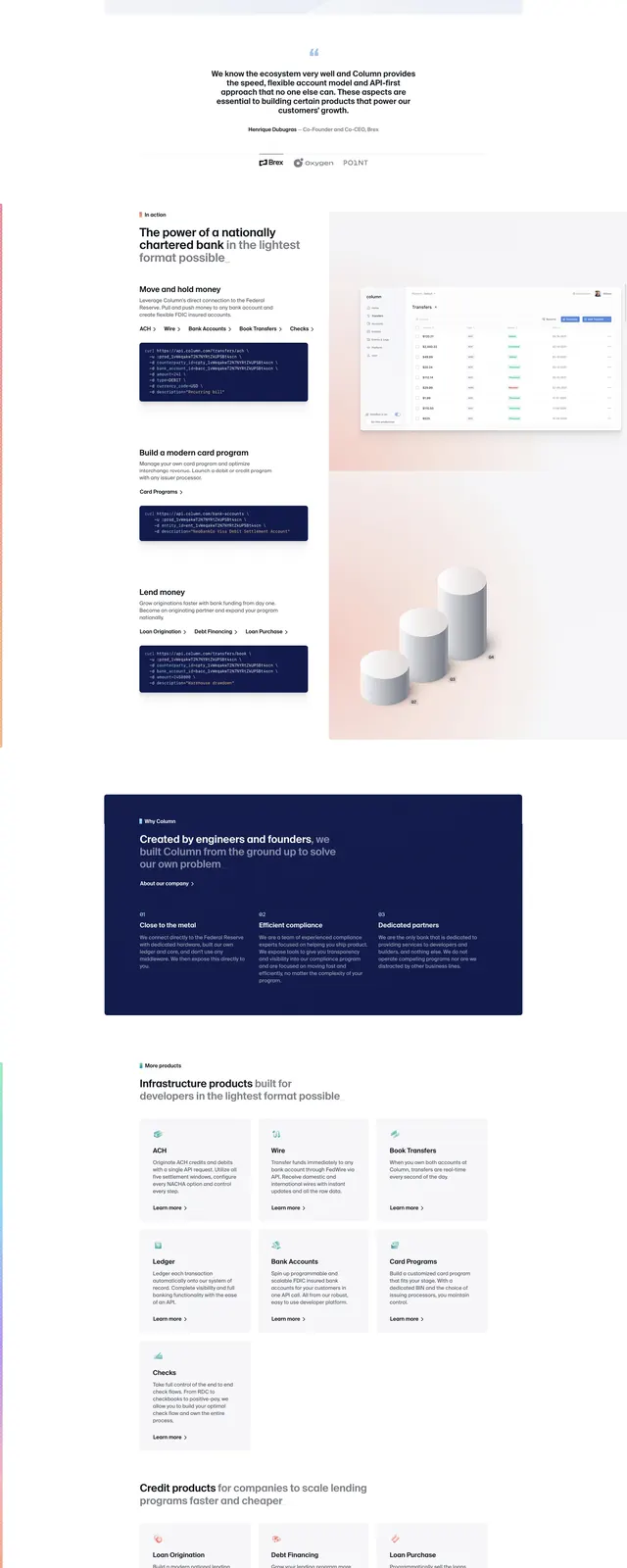
The page opens with a top navigation bar, a small badge, a large left-aligned hero headline, and two call-to-action buttons above a prominent product interface screenshot. A floating dark code-card overlaps the product preview, and a row of partner logos sits beneath the hero. Lower slices show alternating content sections with large editorial headings, light gradient backgrounds, dark navy information blocks, simple illustrated/3D-style visuals, and a final footer-style CTA and link grid.
Key takeaway
The strongest move is the combination of clean SaaS structure with fintech credibility cues: oversized type, product UI, code snippets, and trust logos. The alternating light and dark section treatment gives the page strong rhythm without losing a corporate feel.
Reuse notes
Use this pattern for developer-first fintech, API, or infrastructure products that need to feel credible and premium. It works best when paired with a real product screenshot, concise supporting copy, and a restrained palette with soft gradient accents.