Preview image. Unlock full-res
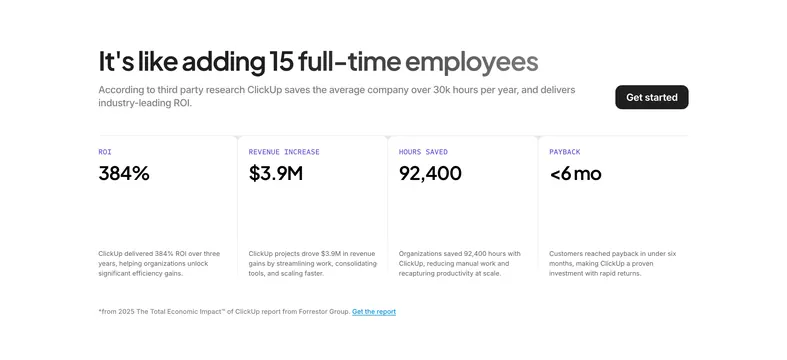
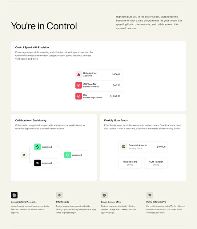
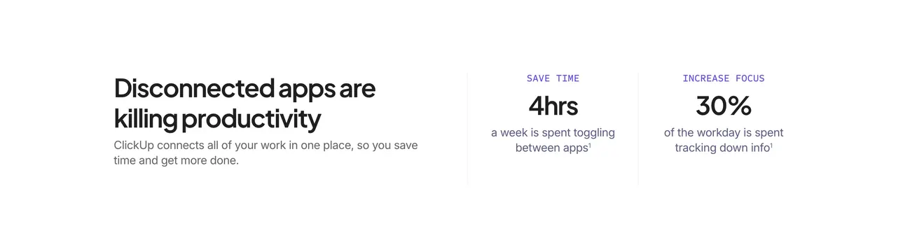
Light three-column section pairing a problem headline with two purple-labeled productivity statistics separated by thin vertical rules.
Summary
A white metrics band arguing disconnected apps hurt productivity, with one narrative column and two stat columns labeled SAVE TIME and INCREASE FOCUS.
Visual description
Plain white background divided by light gray vertical lines into three columns. The left column carries a large black headline "Disconnected apps are killing productivity" and gray supporting copy about ClickUp connecting work in one place. The middle column shows a small purple all-caps label "SAVE TIME," a huge "4hrs" figure, and gray caption about toggling between apps with a superscript footnote. The right column mirrors the structure with "INCREASE FOCUS," "30%," and copy about tracking down info. Typography is clean sans-serif with strong size contrast between labels, numbers, and body text.
Key takeaway
Using one editorial column plus two hard numbers keeps the section scannable while still telling a story. Purple micro-labels above stats create rhythm without adding color everywhere.
Reuse notes
Works for any consolidation or platform story where you have credible third-party stats. Best on light backgrounds with ample horizontal space; narrow mobile stacks may lose the divider elegance.