Preview image. Unlock full-res
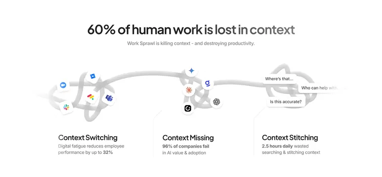
Light infographic tracing a tangled gray line through three context pain points with app icons and speech-bubble frustrations.
Summary
White problem section headline "60% of human work is lost in context" illustrated by a meandering line connecting switching, missing, and stitching failure modes.
Visual description
White canvas with centered bold headline and gray subhead on Work Sprawl killing productivity. A thick light-gray tangled path runs horizontally across the section, knotting at three labeled stops. Left stop "Context Switching" clusters Zoom, Slack, Jira, and Teams icons with stat about 32% performance loss. Middle stop "Context Missing" groups AI tool logos with 96% AI adoption failure stat. Right stop "Context Stitching" shows three speech bubbles ("Where's that...," "Who can help with...," "Is this accurate?") beside 2.5 hours daily wasted copy. Minimal color beyond logo marks.
Key takeaway
One continuous line metaphor carries the eye through multiple pain points without separate cards. Mixing app logos with chat-style frustration bubbles humanizes abstract productivity loss.
Reuse notes
Effective early-page problem framing before a platform solution. Stats must be sourced; the line graphic needs horizontal space and may compress awkwardly on mobile.