Preview image. Unlock full-res
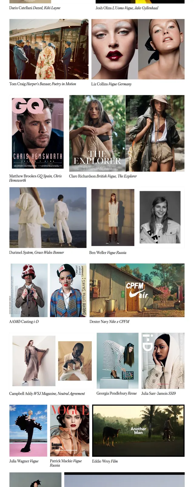
A fashion-focused agency homepage with a giant serif wordmark, sparse navigation, and a dense editorial image grid below.
Summary
A fashion-focused agency homepage with a giant serif wordmark, sparse navigation, and a dense editorial image grid below.
Visual description
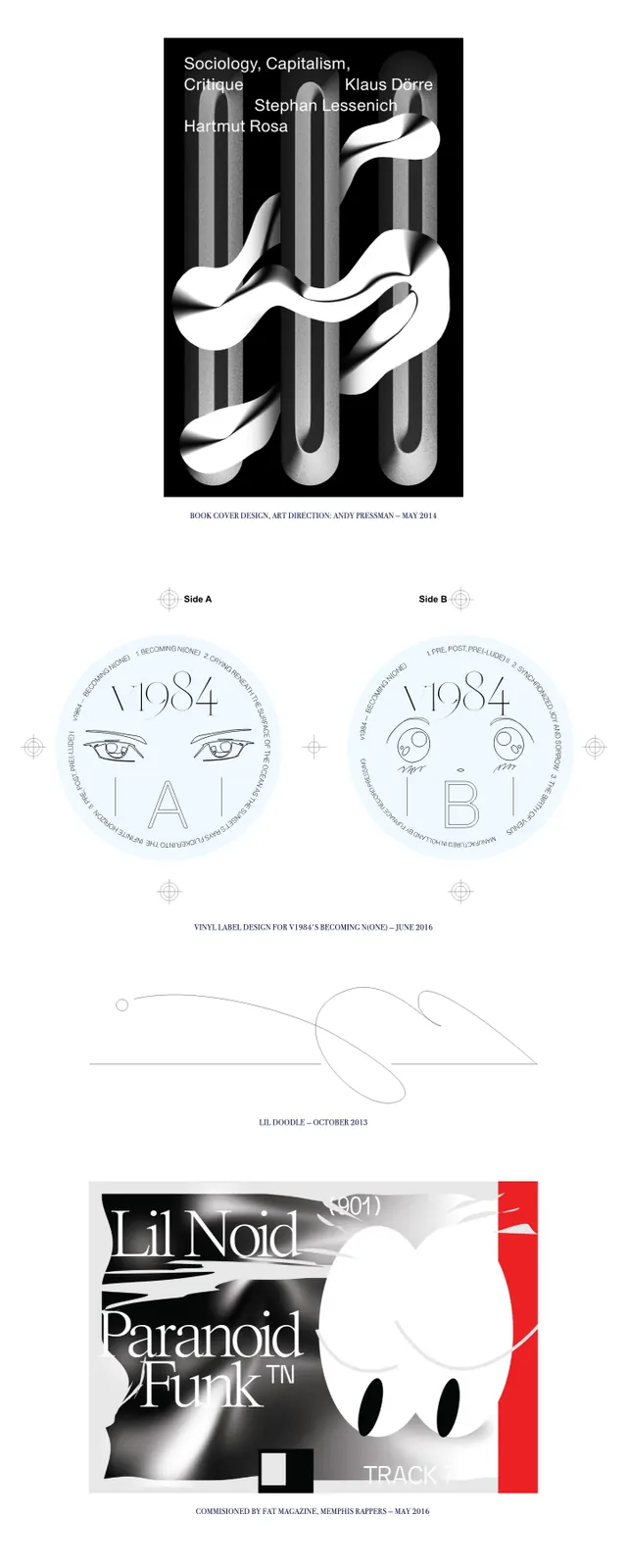
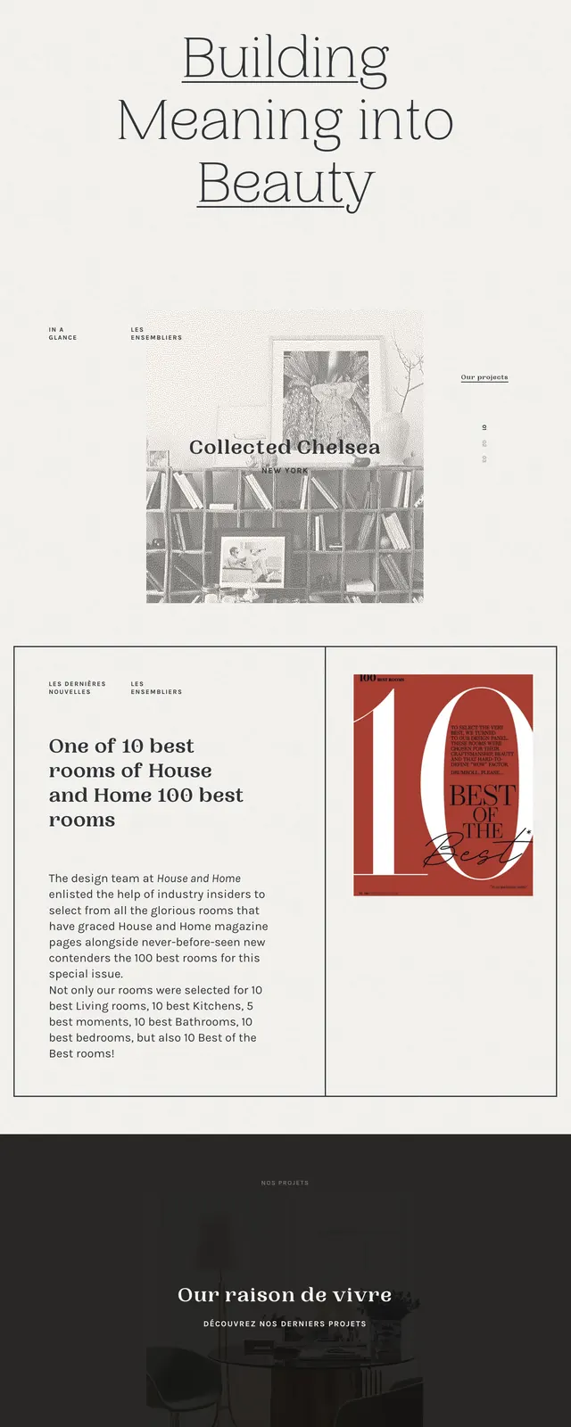
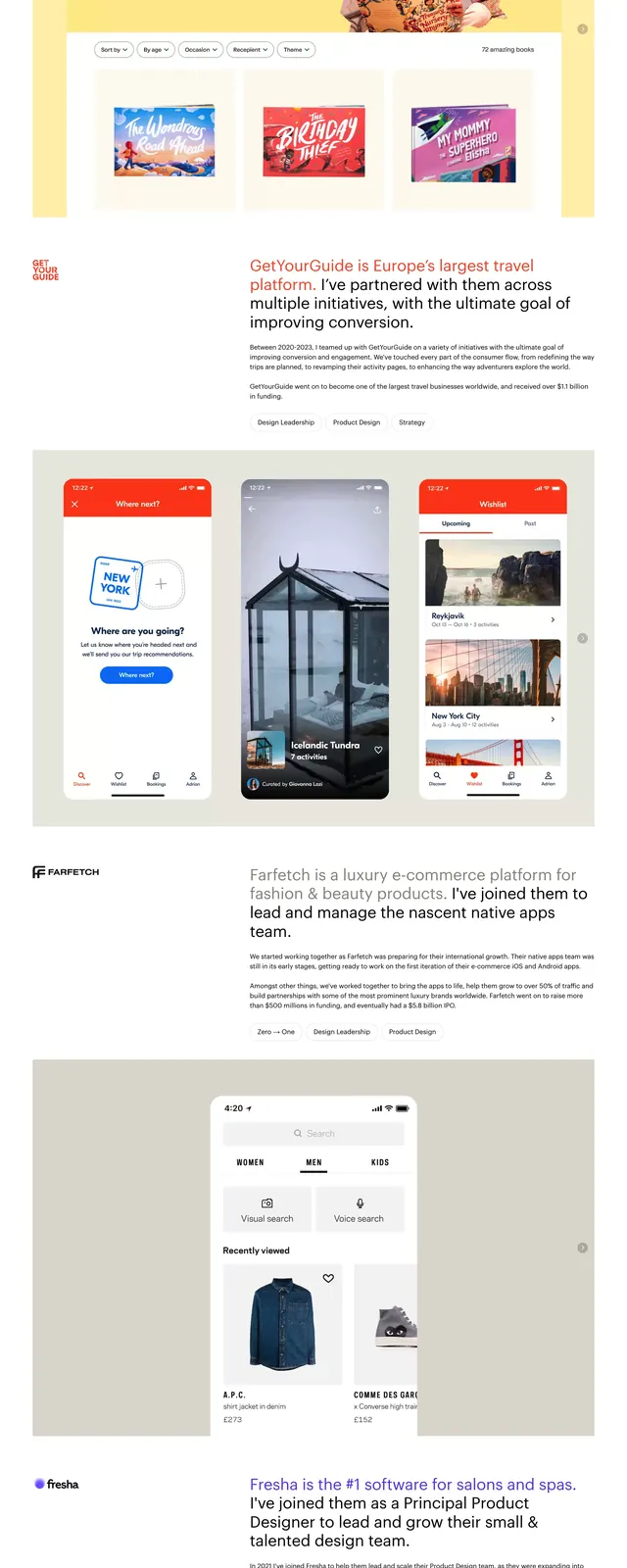
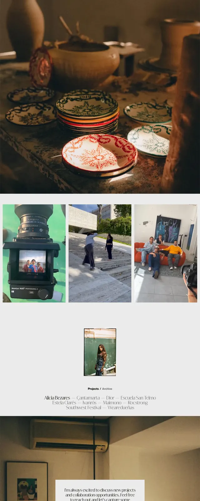
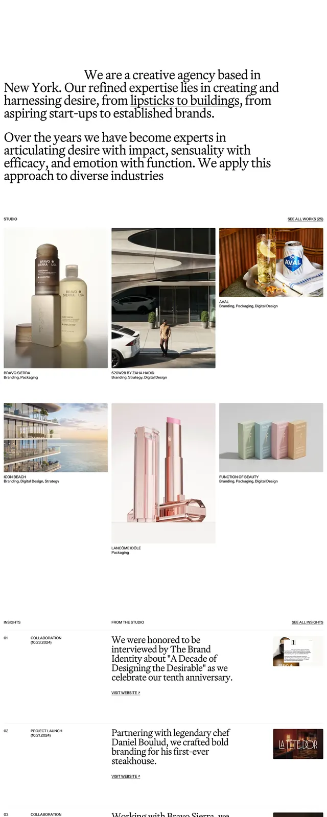
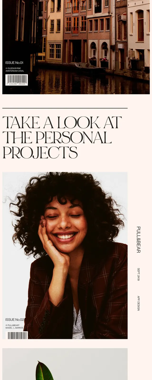
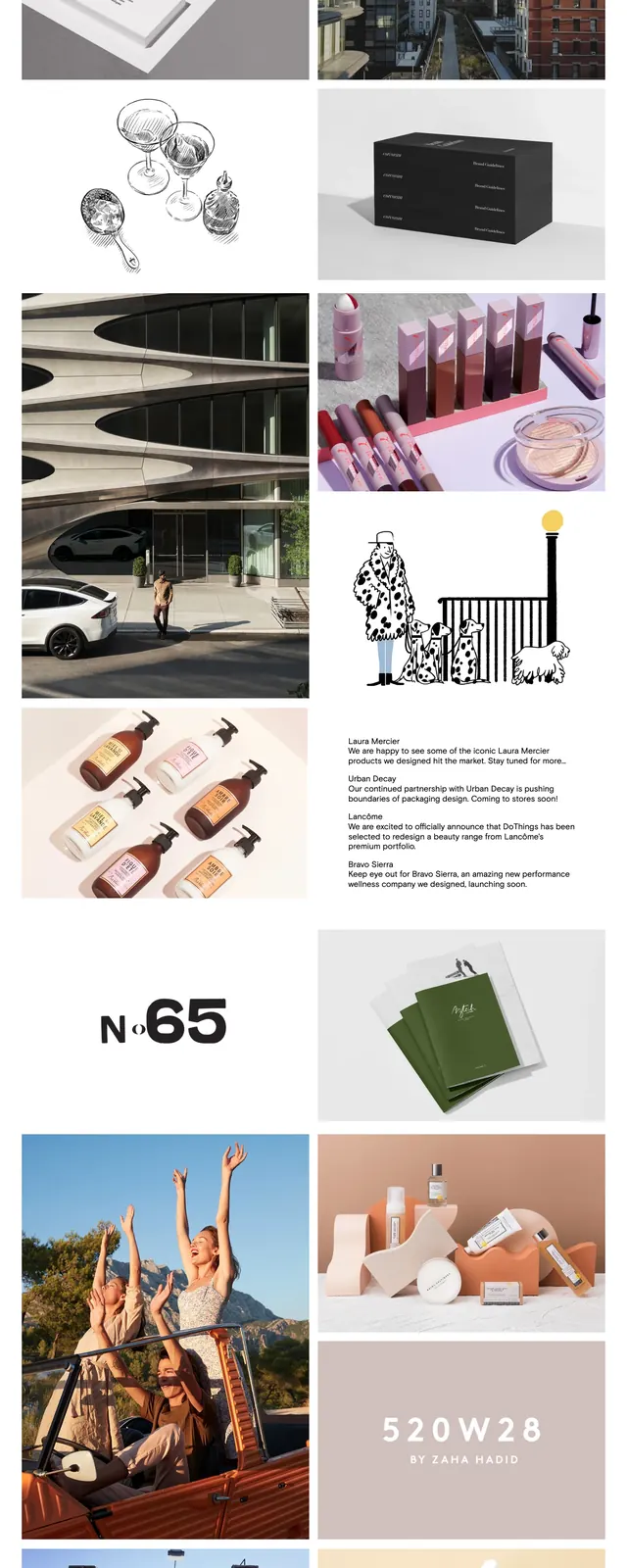
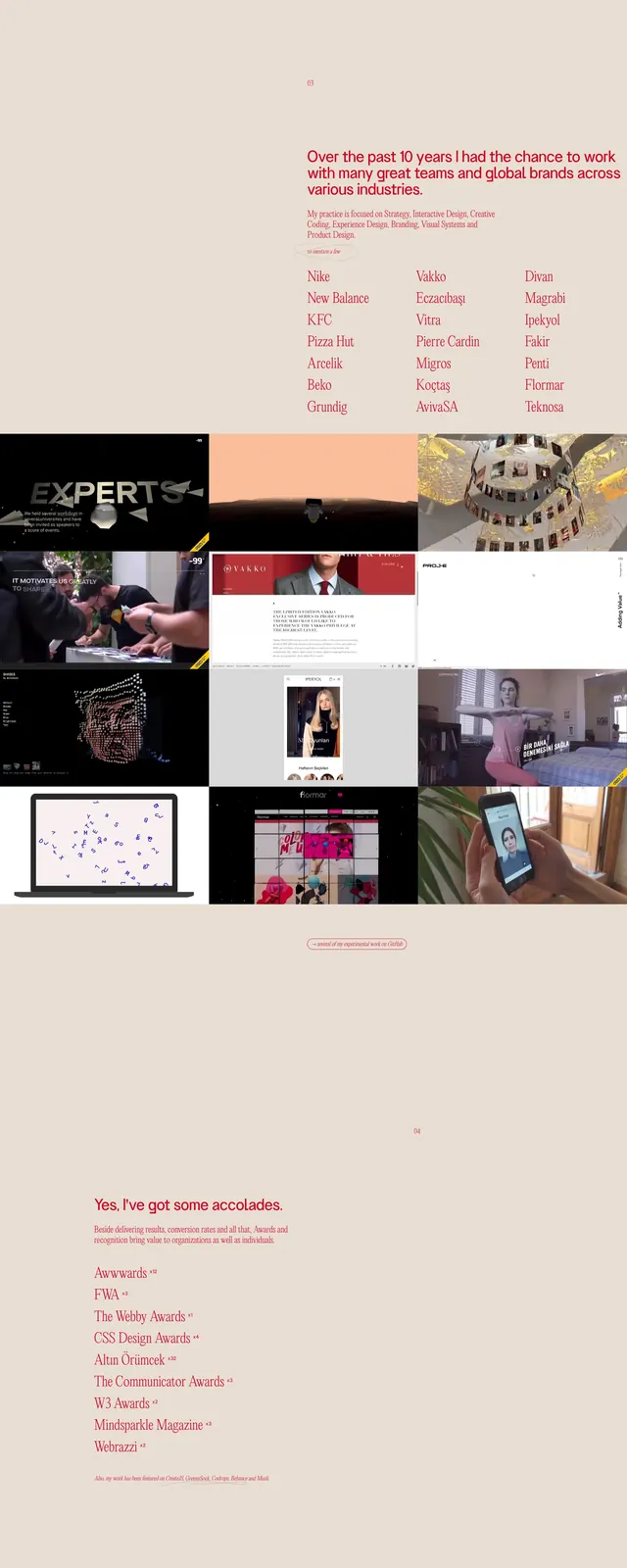
The page opens with a minimal top navigation and a massive serif CLM wordmark spanning nearly the full width of the screen. Below it sits a tightly packed editorial gallery of fashion and portrait imagery arranged in uneven rows and columns. Captions under each image name photographers, subjects, and publications in a refined serif treatment. The overall composition relies on white space, black typography, and image curation rather than UI chrome.
Key takeaway
This layout uses oversized typography and a magazine-like image grid to signal fashion credibility and creative direction immediately. The reusable pattern is a restrained hero paired with a highly curated portfolio mosaic.
Reuse notes
Best reused for studios, agencies, or portfolios that want the homepage to feel like an editorial spread. Keep navigation minimal and let typography plus imagery do the branding work.