Preview image. Unlock full-res
A dark, high-contrast SaaS landing page with a split hero, device mockups, and purple accent interactions.
Summary
A dark, high-contrast SaaS landing page with a split hero, device mockups, and purple accent interactions.
Visual description
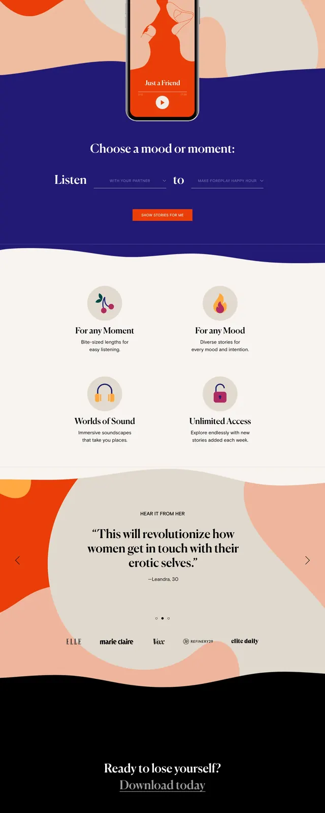
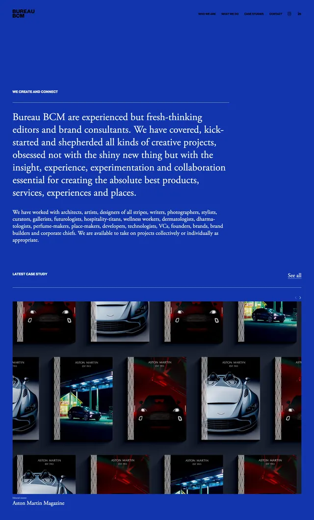
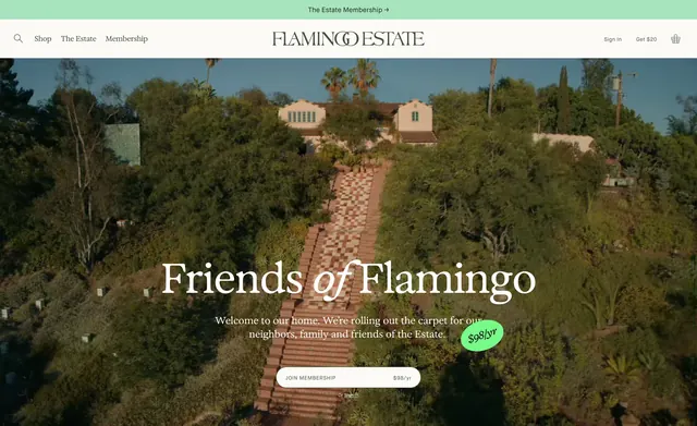
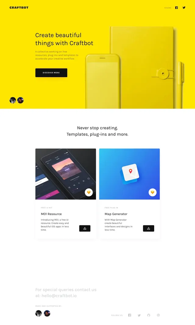
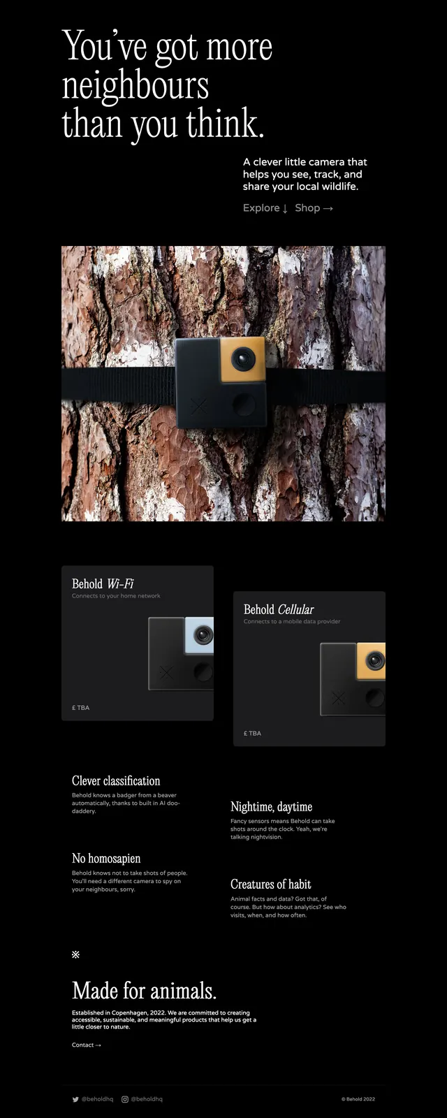
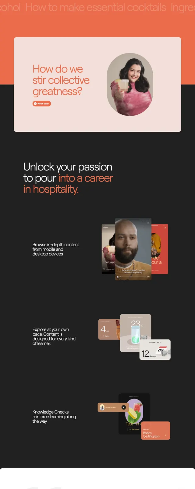
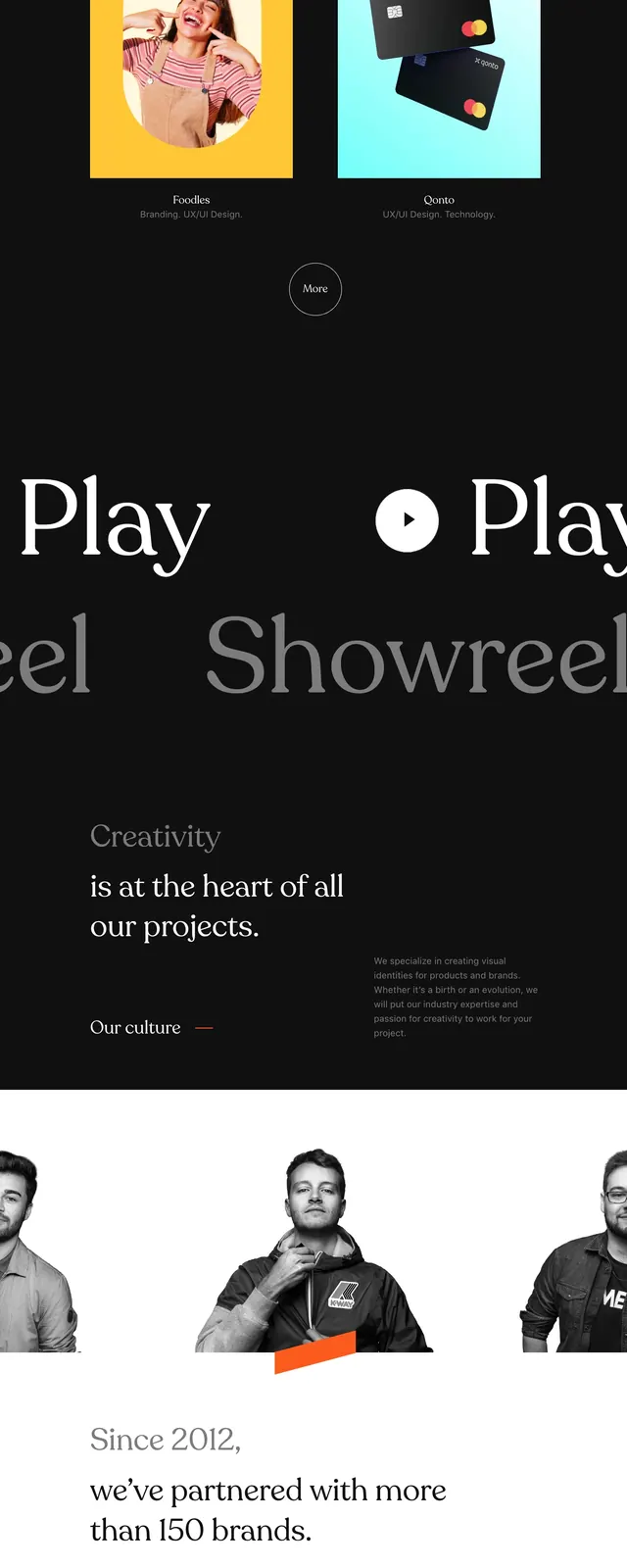
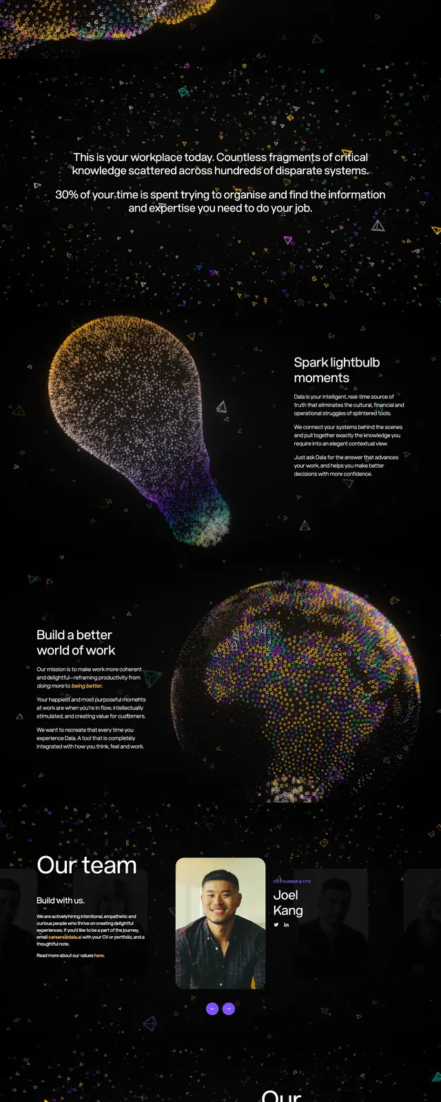
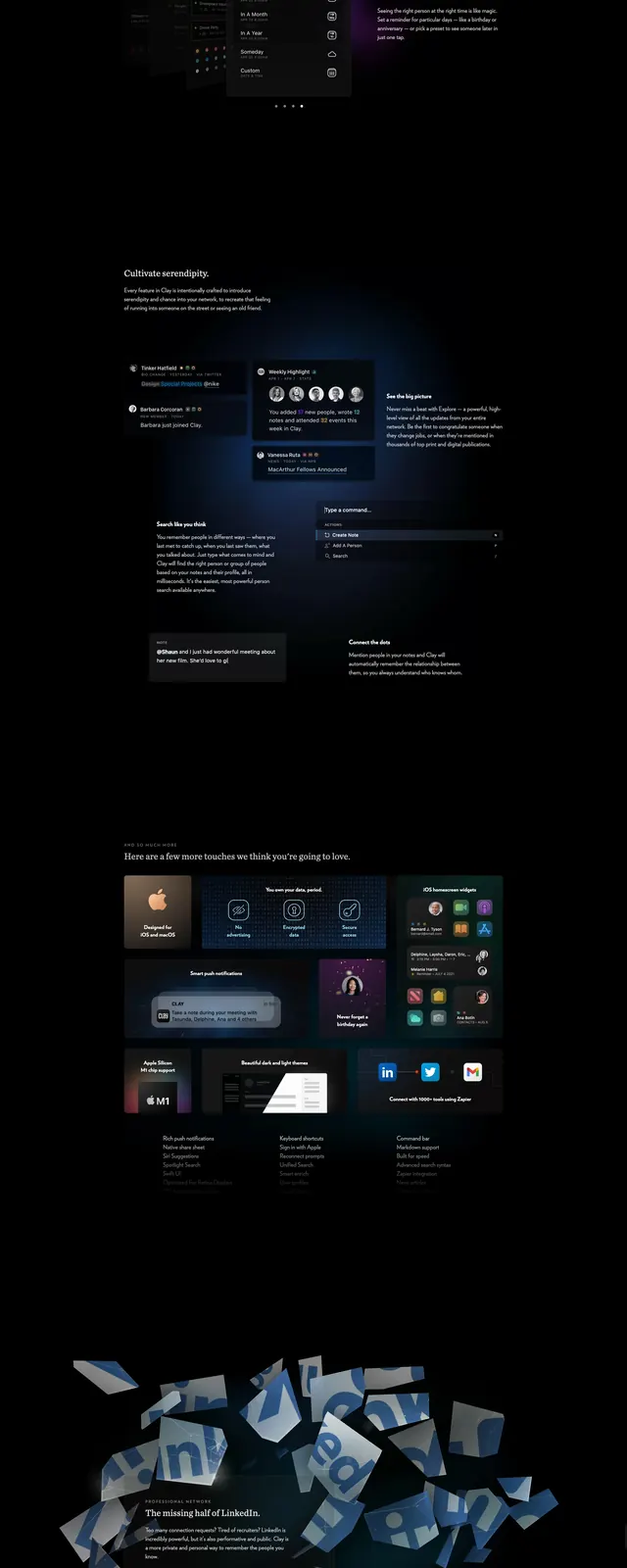
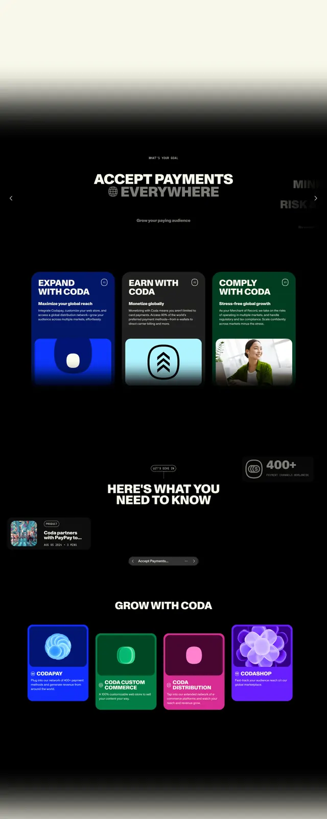
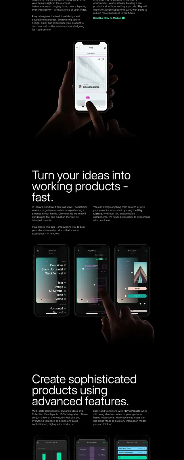
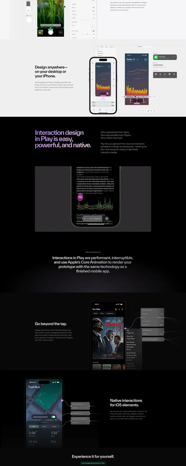
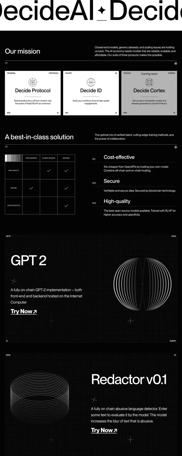
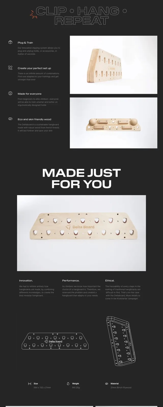
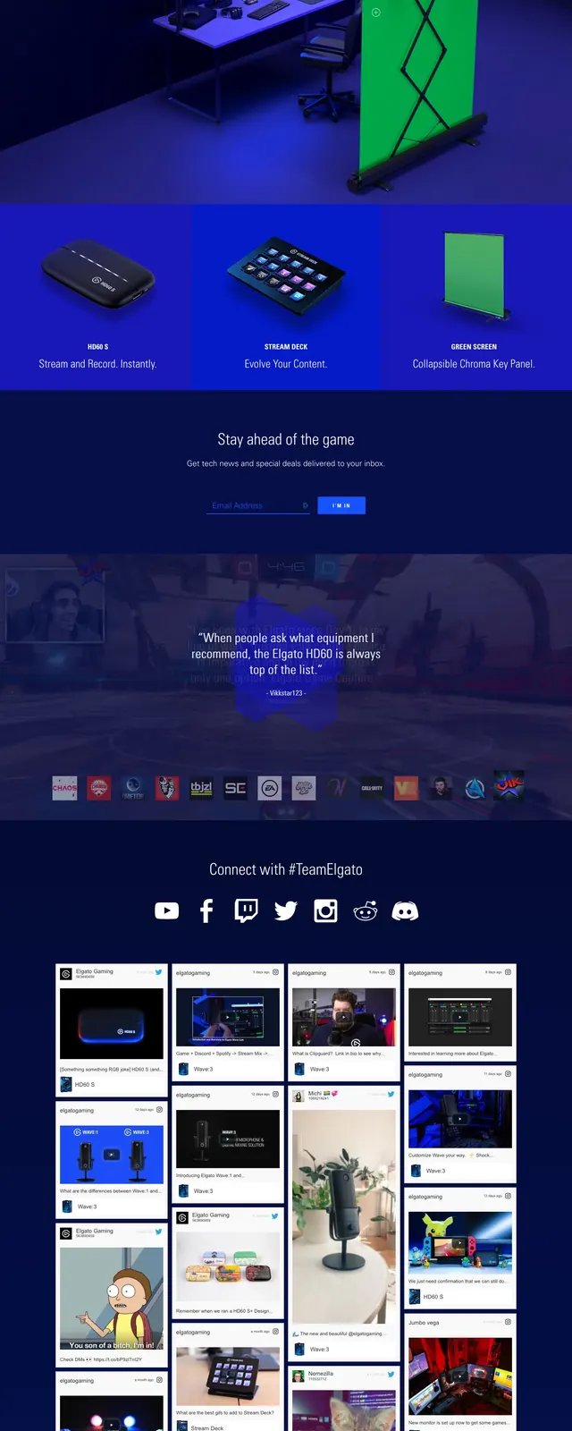
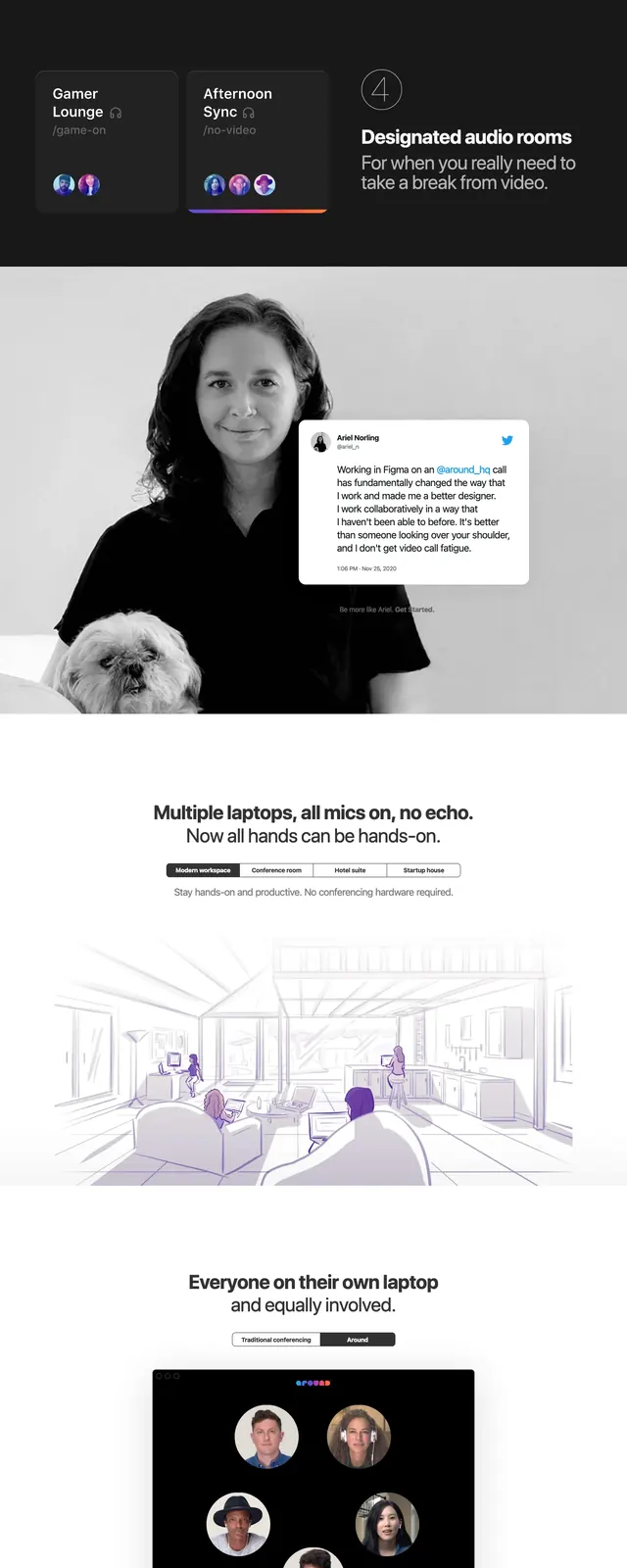
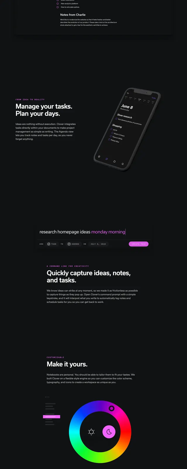
The page uses a near-black background with white typography and bright magenta-purple accents. The top hero pairs angled device mockups on the left with a large headline and signup form on the right. Lower sections continue the dark theme with bold section headings, a command-line style capture bar, logo strip, and a decorative radial grid graphic in the footer area.
Key takeaway
This is a strong reference for a premium dark SaaS homepage that combines product screenshots, minimal copy, and a single vivid accent color. The structure is simple but feels polished because the hierarchy is clear and the visual rhythm changes across sections.
Reuse notes
Reuse the split hero format when the product UI is the main proof point, and keep the CTA compact and right-aligned. The purple accent works best as a single emphasis color for buttons, badges, and subtle section labels, not as a full gradient system.