Preview image. Unlock full-res
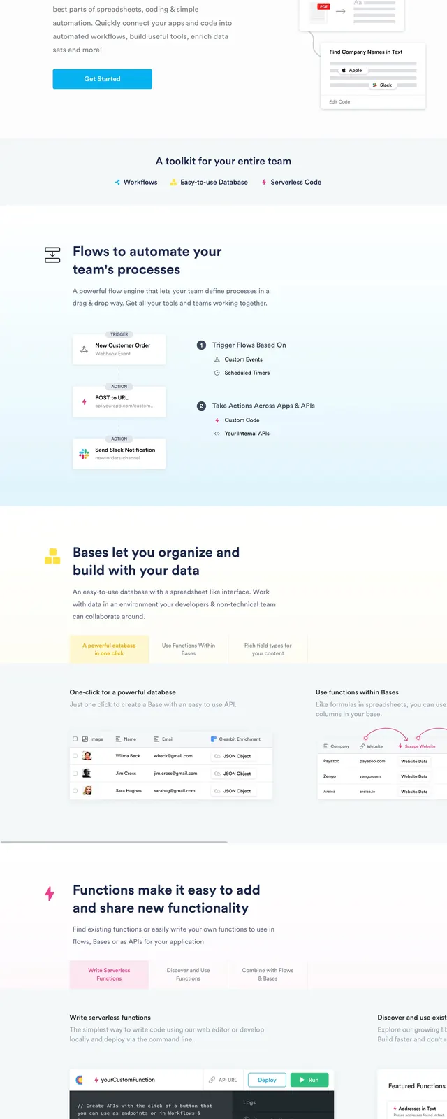
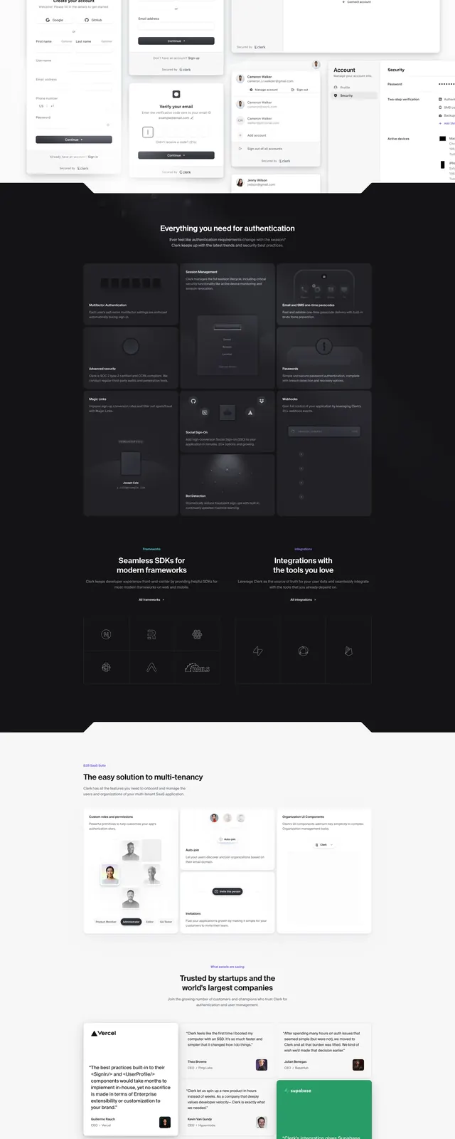
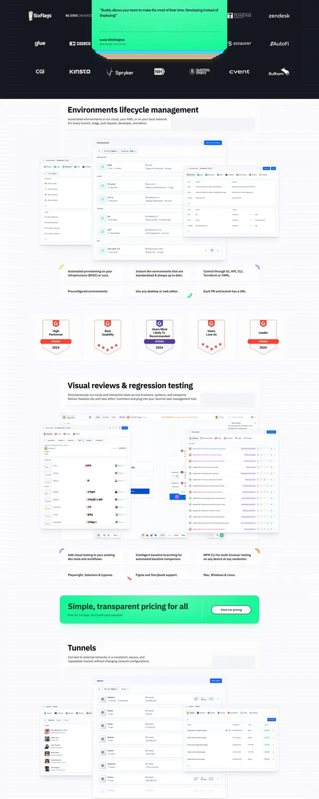
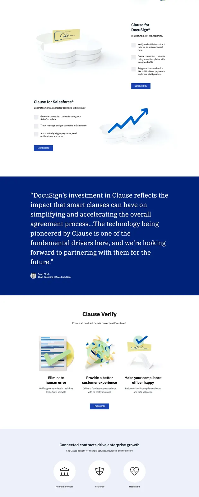
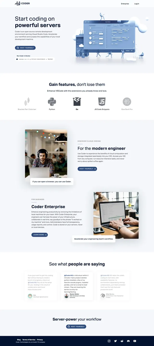
Clean SaaS landing page for a developer tool with a split hero, feature rows, product imagery, testimonials, and a strong CTA.
Summary
Clean SaaS landing page for a developer tool with a split hero, feature rows, product imagery, testimonials, and a strong CTA.
Visual description
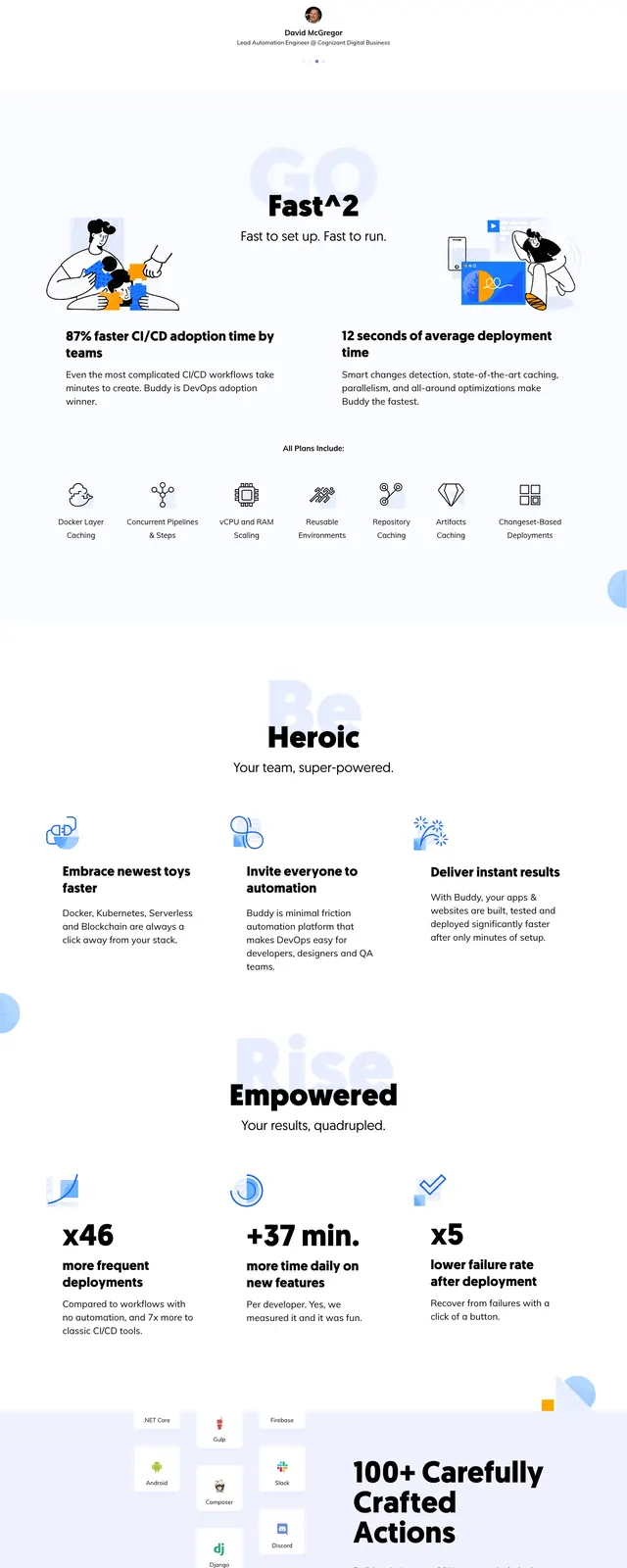
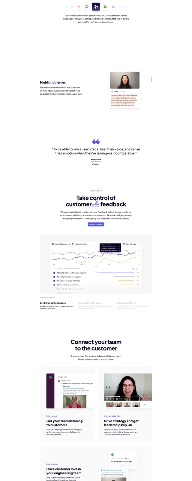
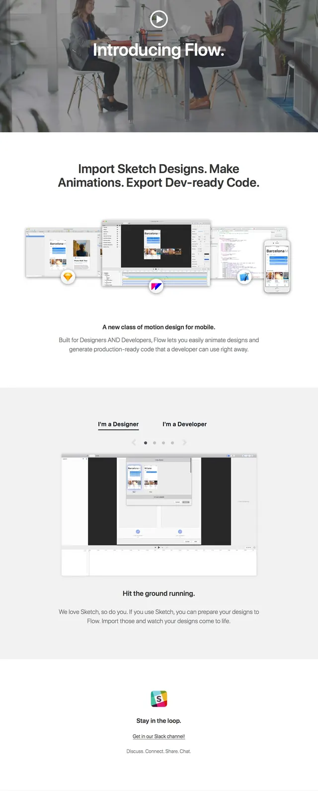
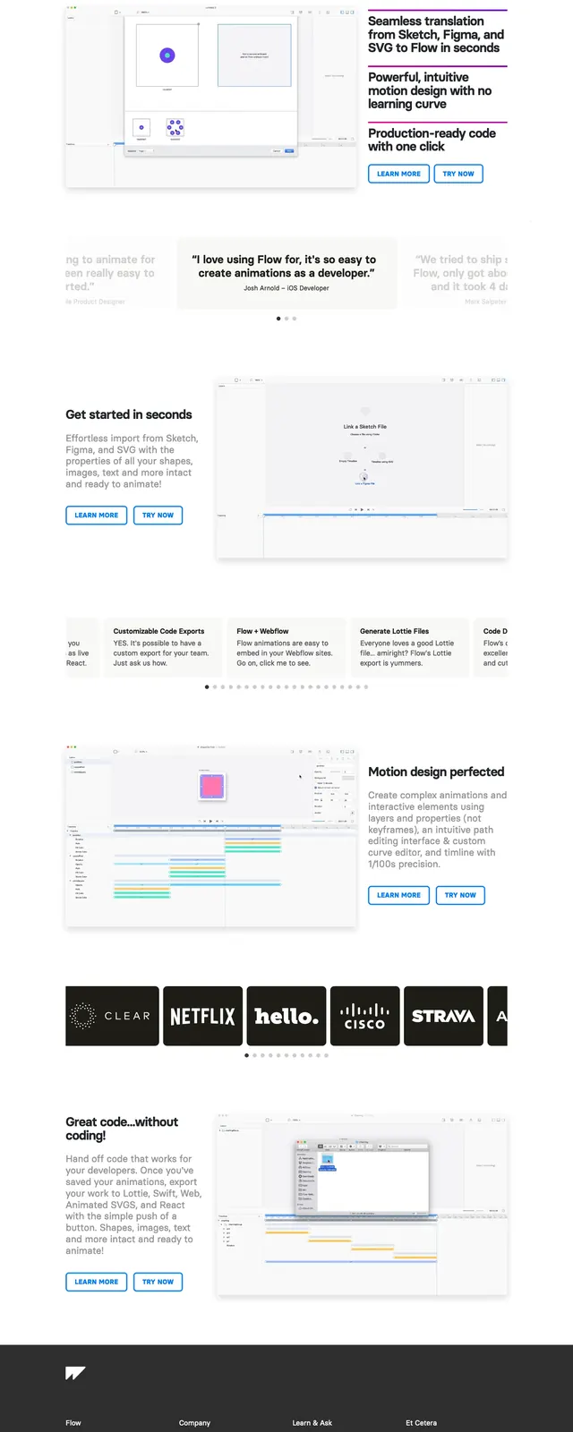
The page uses a very light gray-white background with dark navy text and soft blue accents. The top section is a split hero: headline and copy on the left, a large product illustration on the right, with a prominent pill-shaped CTA button below the text. Lower sections stack in a centered editorial flow with a feature icon row, image-and-text feature blocks, testimonial cards, and a final centered CTA above a dark footer.
Key takeaway
The strongest reusable move is the airy, product-led SaaS layout with generous whitespace, simple navigation, and repeated CTA reinforcement. The mix of feature icons, testimonial cards, and real photography makes the page feel credible without becoming dense.
Reuse notes
Works well for developer tools, B2B SaaS, and productivity products that need a polished but approachable landing page. Reuse the split hero and section rhythm when you want to show product visuals early and keep the page easy to scan.