Preview image. Unlock full-res
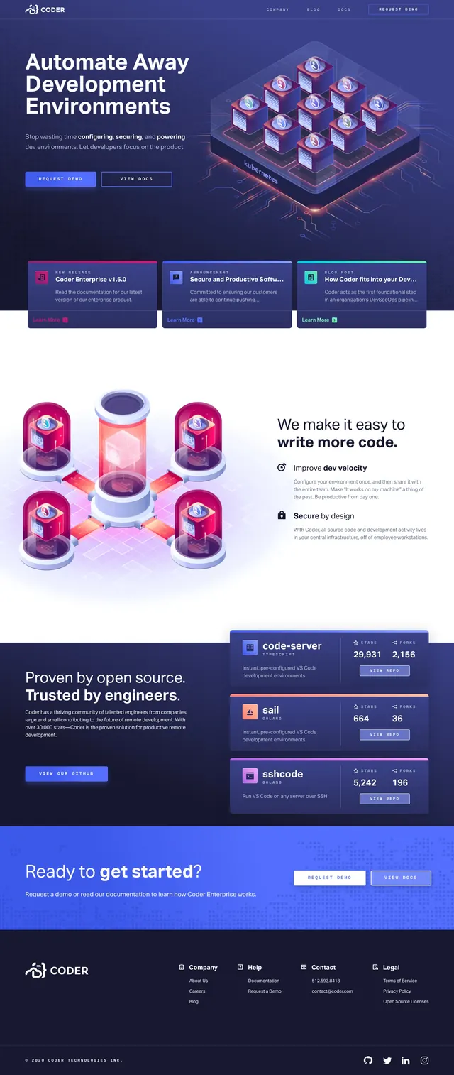
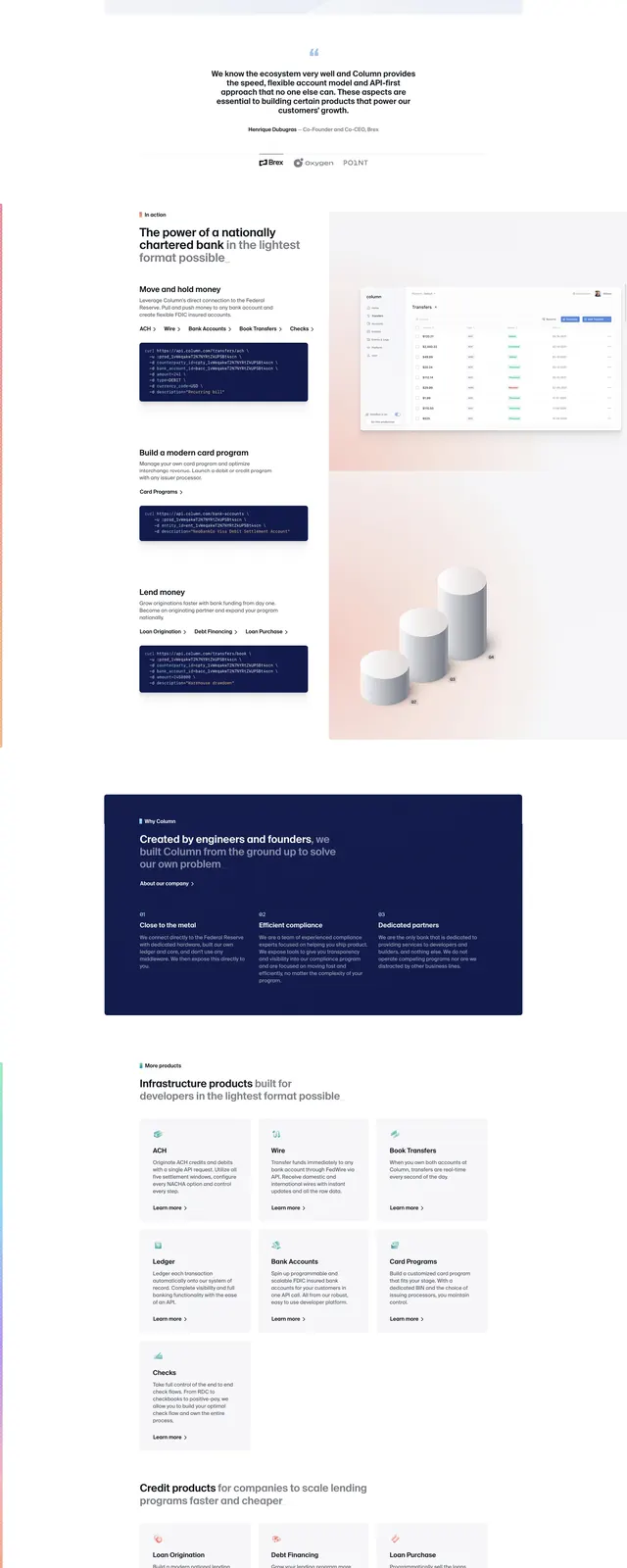
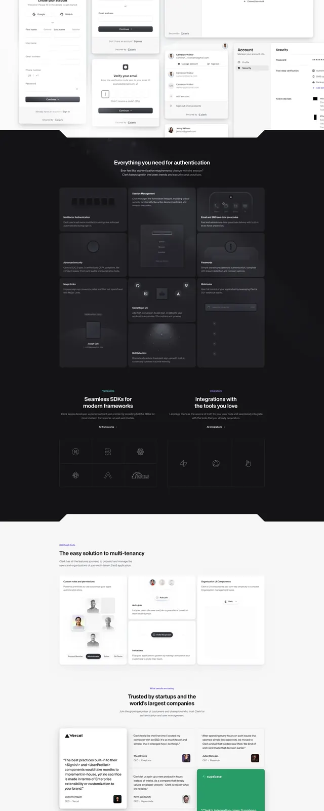
A bright SaaS landing page with a centered hero, layered product UI previews, dark feature band, testimonials, and a final call-to-action.
Summary
A bright SaaS landing page with a centered hero, layered product UI previews, dark feature band, testimonials, and a final call-to-action.
Visual description
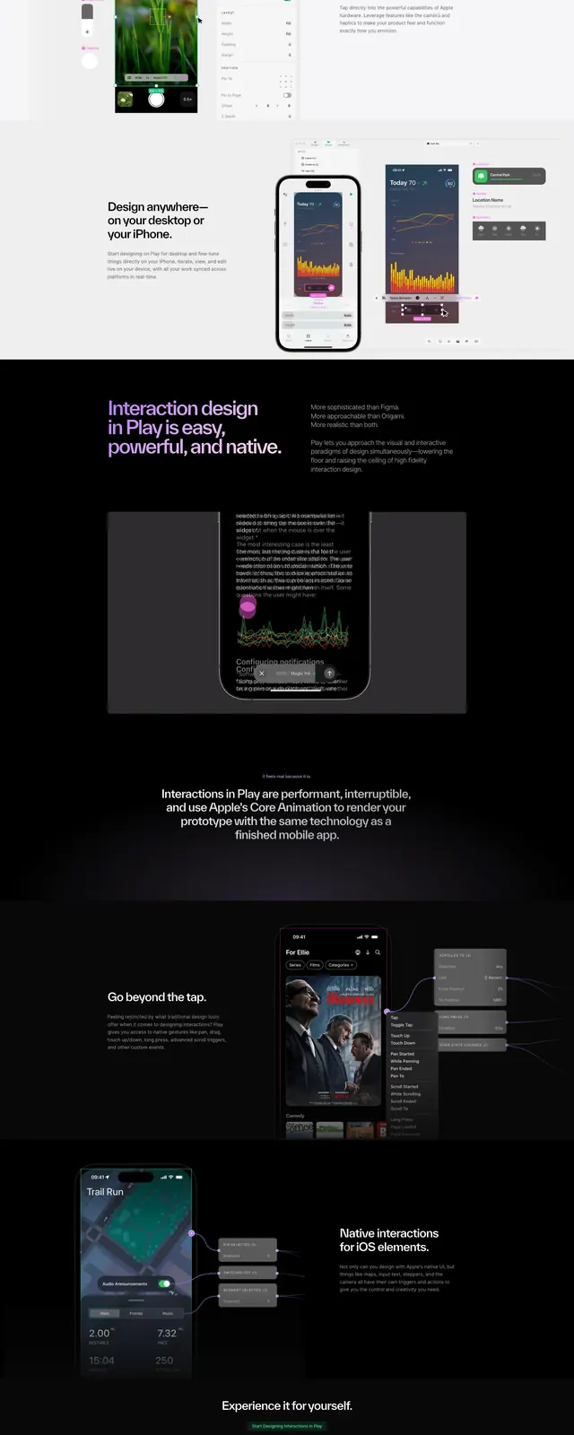
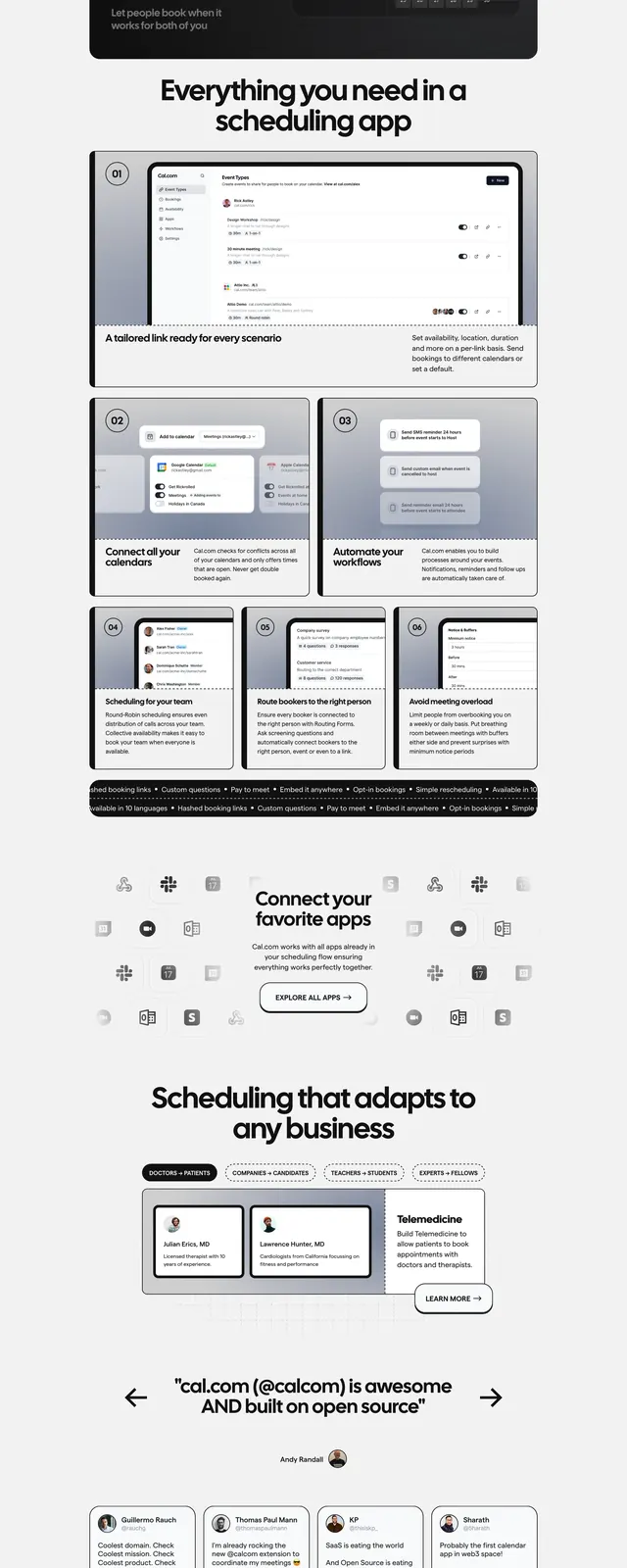
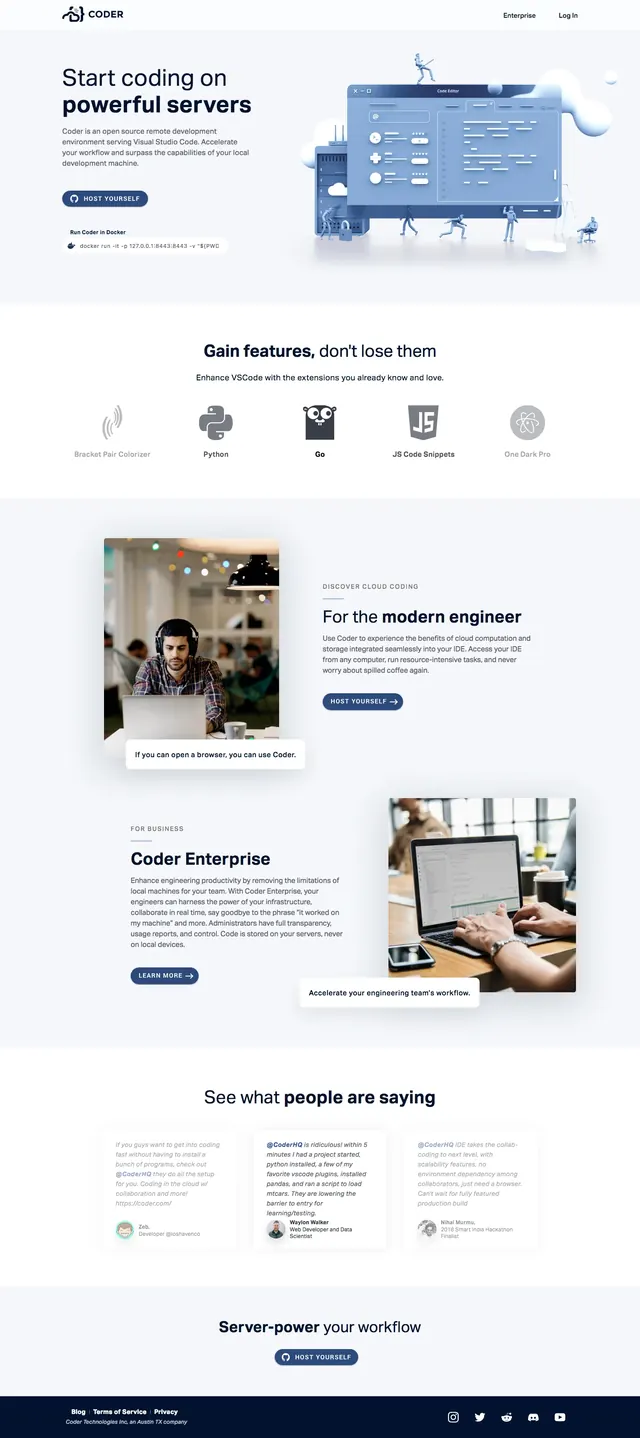
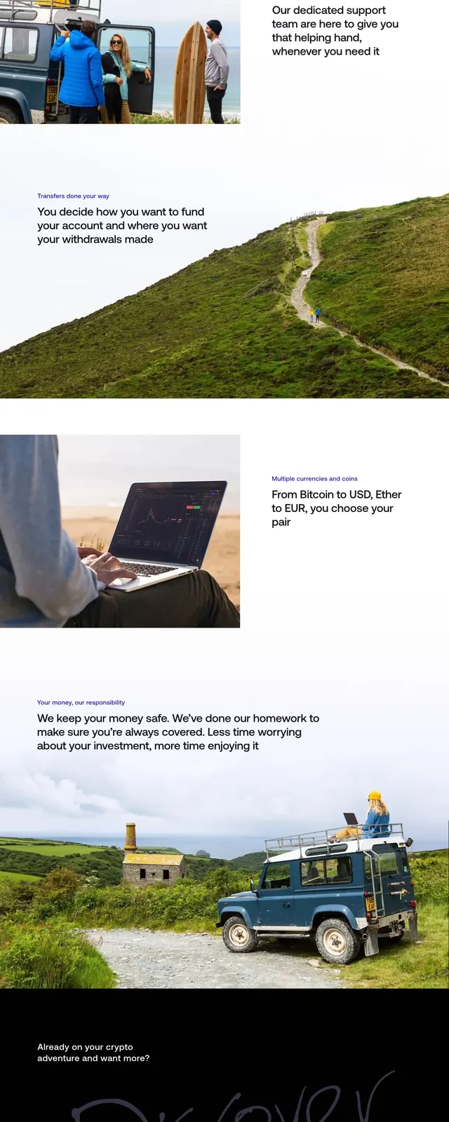
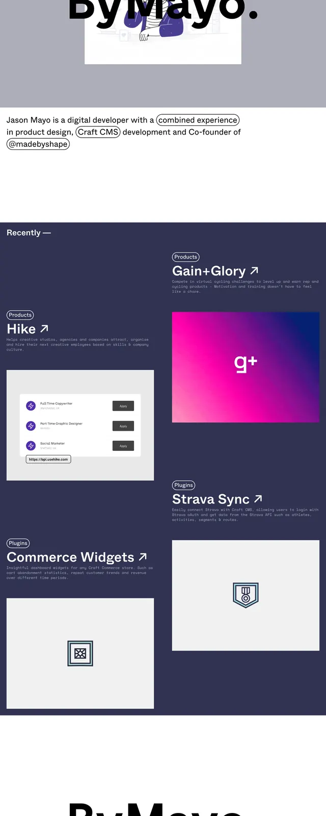
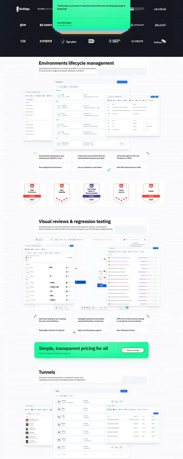
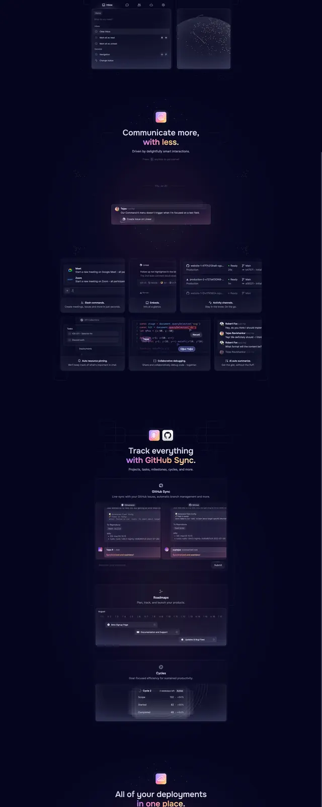
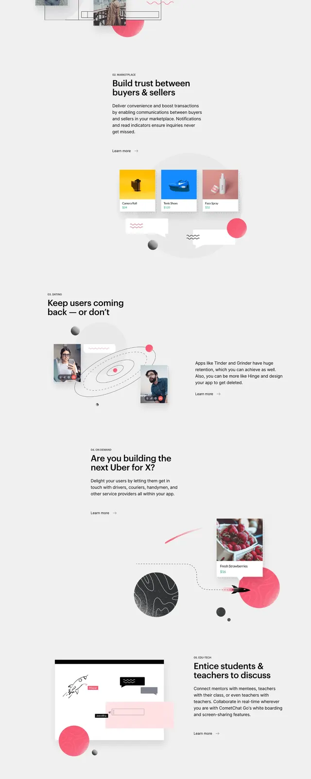
The page opens with a centered hero on a very light background, using a large bold headline, a short supporting paragraph, and two call-to-action buttons. Beneath the hero is a row of customer logos, followed by large product UI mockups and account/profile panels arranged in a clean grid. Midpage, a dark section presents feature cards in a bento-like layout, then the design returns to a light testimonial grid and a final CTA block near the footer.
Key takeaway
The strongest reusable move is the contrast between airy light sections and a dense dark feature band, which gives the page rhythm without losing clarity. The oversized headline, minimal copy, and prominent product screenshots make the page feel authoritative and product-first.
Reuse notes
Useful for SaaS and developer-tool homepages that need to communicate breadth, trust, and interface quality quickly. The layout depends on polished UI imagery and works best when the product itself can be shown in multiple panel-like views.