Preview image. Unlock full-res
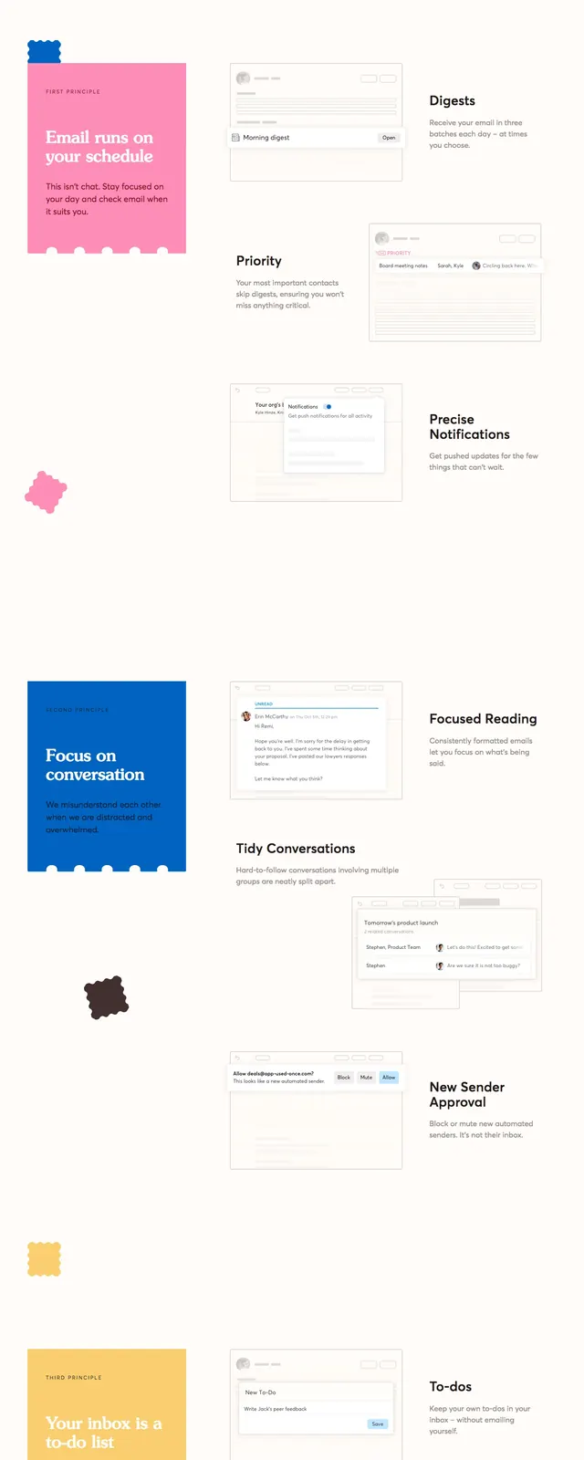
A playful full-page SaaS landing page for an email client with oversized pastel panels, rounded cutout shapes, and bold serif/sans typography.
Summary
A playful full-page SaaS landing page for an email client with oversized pastel panels, rounded cutout shapes, and bold serif/sans typography.
Visual description
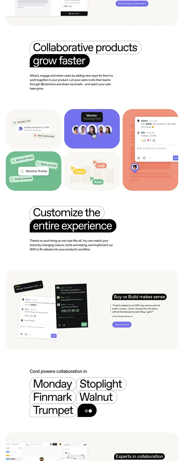
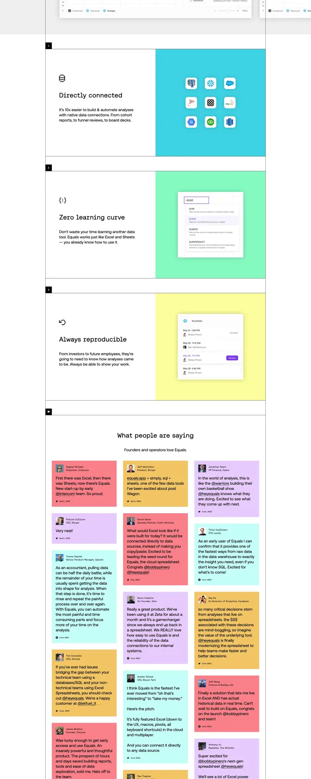
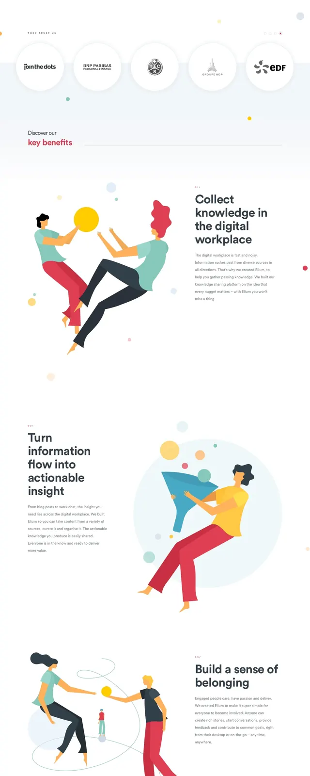
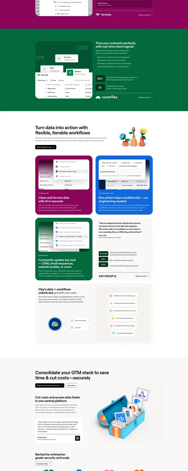
The page opens with a split hero: a large pink block on the left with the brand and headline, and a light cream panel on the right with supporting copy and a primary request-access button. Decorative scalloped and wavy edge shapes, plus small sticker-like blobs, add a playful handcrafted feel throughout the page. Below the hero are product mockups, feature callouts, and a strong CTA section, followed by a large pink footer-style closing panel with curved typography.
Key takeaway
The design combines soft pastel colors with bold editorial type to make a productivity product feel approachable and memorable. It uses irregular shapes and generous whitespace to turn a standard SaaS landing page into a distinctive brand experience.
Reuse notes
Reuse the split hero structure when you want a strong headline on one side and a product benefit on the other. The scalloped edges, wavy dividers, and sticker accents are easy motifs to adapt across sections for a cohesive playful identity.