Preview image. Unlock full-res
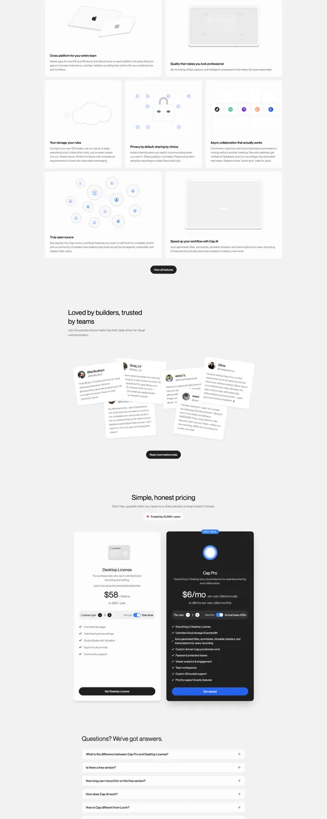
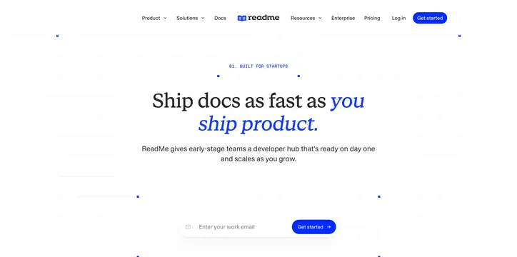
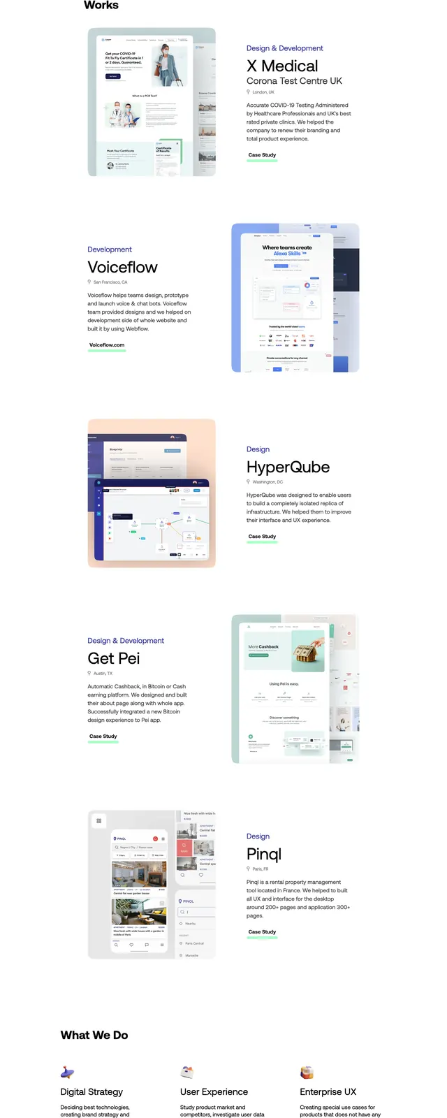
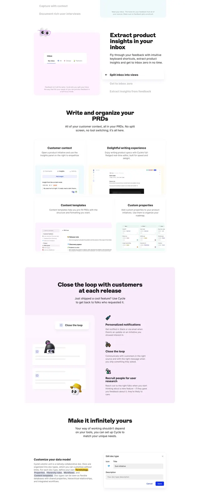
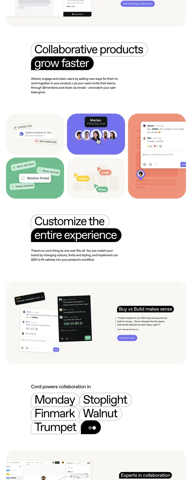
A minimalist SaaS landing page for Cord with oversized typography, soft rounded panels, and colorful product UI previews.
Summary
A minimalist SaaS landing page for Cord with oversized typography, soft rounded panels, and colorful product UI previews.
Visual description
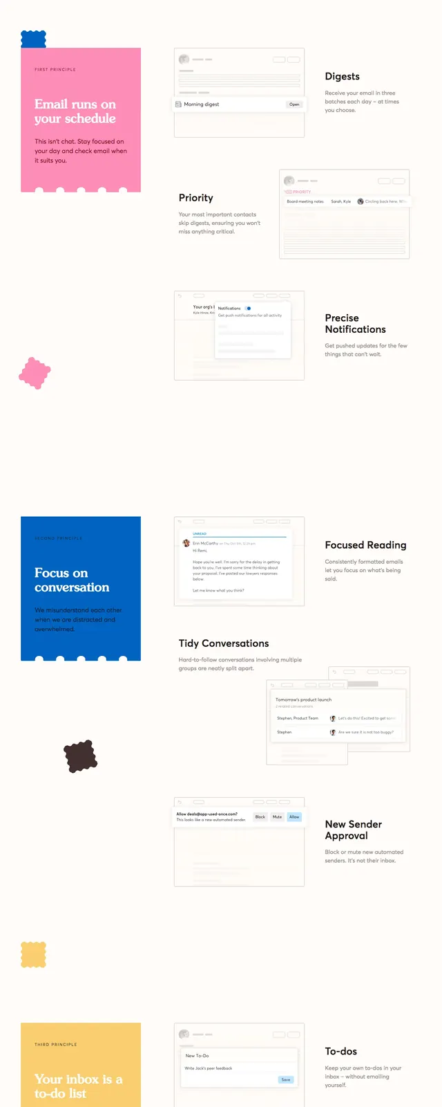
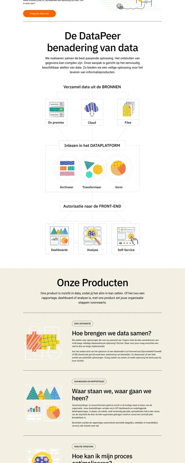
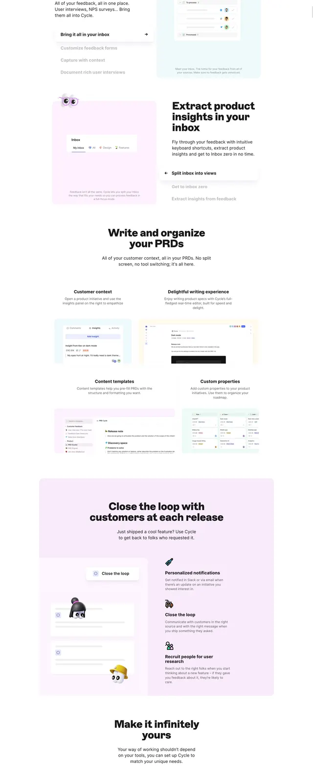
The page uses a clean white canvas with a compact top navigation and a large hero headline built from oversized black text and rounded highlight shapes. Below the hero, the layout shifts into soft cream and pastel product showcase panels with embedded app screenshots, annotation-style UI elements, and short supporting copy. Further down, a large rounded green CTA block and a separate pricing teaser card sit above a dark footer with a prominent Cord logo and small link columns.
Key takeaway
The design pairs editorial typography with friendly rounded containers to make a collaboration product feel modern and approachable. Strong whitespace, simple navigation, and vivid UI mockups keep the focus on the product story.
Reuse notes
Reuse the oversized headline treatment, pill-shaped CTA buttons, and rounded showcase cards for a polished SaaS marketing page. The bento-like product section works well for demonstrating features through UI screenshots rather than dense copy.