Preview image. Unlock full-res
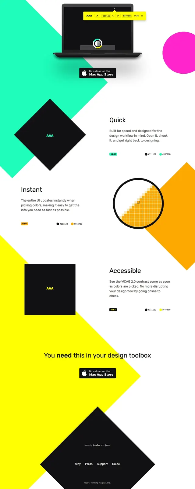
A bright, high-contrast landing page for the Contrast macOS app with oversized geometric shapes, centered product messaging, and scattered feature callouts.
Summary
A bright, high-contrast landing page for the Contrast macOS app with oversized geometric shapes, centered product messaging, and scattered feature callouts.
Visual description
The page opens with a centered hero featuring the large wordmark-like title 'Contrast' above a laptop product mockup and an App Store download button. Huge diagonal geometric blocks in mint, yellow, black, orange, and magenta cut across a mostly white canvas, creating strong visual movement. Lower sections mix short feature headings with sparse explanatory copy, tiny color swatches, and simple product visuals. The footer repeats the geometric motif with a dark diamond-shaped panel and minimal navigation links.
Key takeaway
This layout uses bold color fields and simple typography to make a utility app feel visually memorable without adding interface clutter. The strongest pattern is the combination of centered hero messaging with oversized abstract shapes framing each content block.
Reuse notes
Reuse the large centered hero structure for utility or productivity products where the value proposition is simple and immediate. The geometric background shapes can be adapted as section dividers to keep a long page visually active while preserving a minimal content hierarchy.