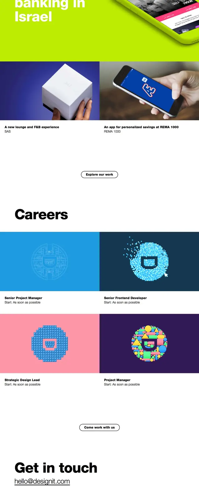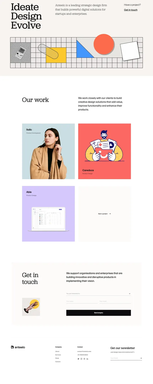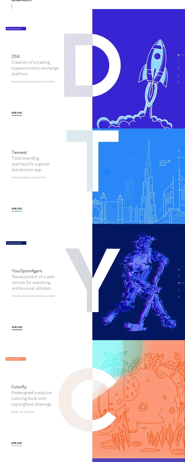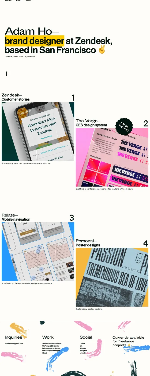
Preview image. Unlock full-res
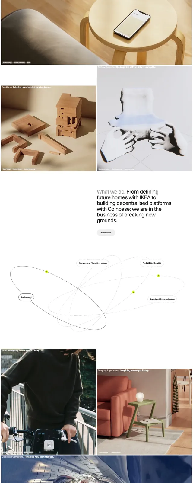
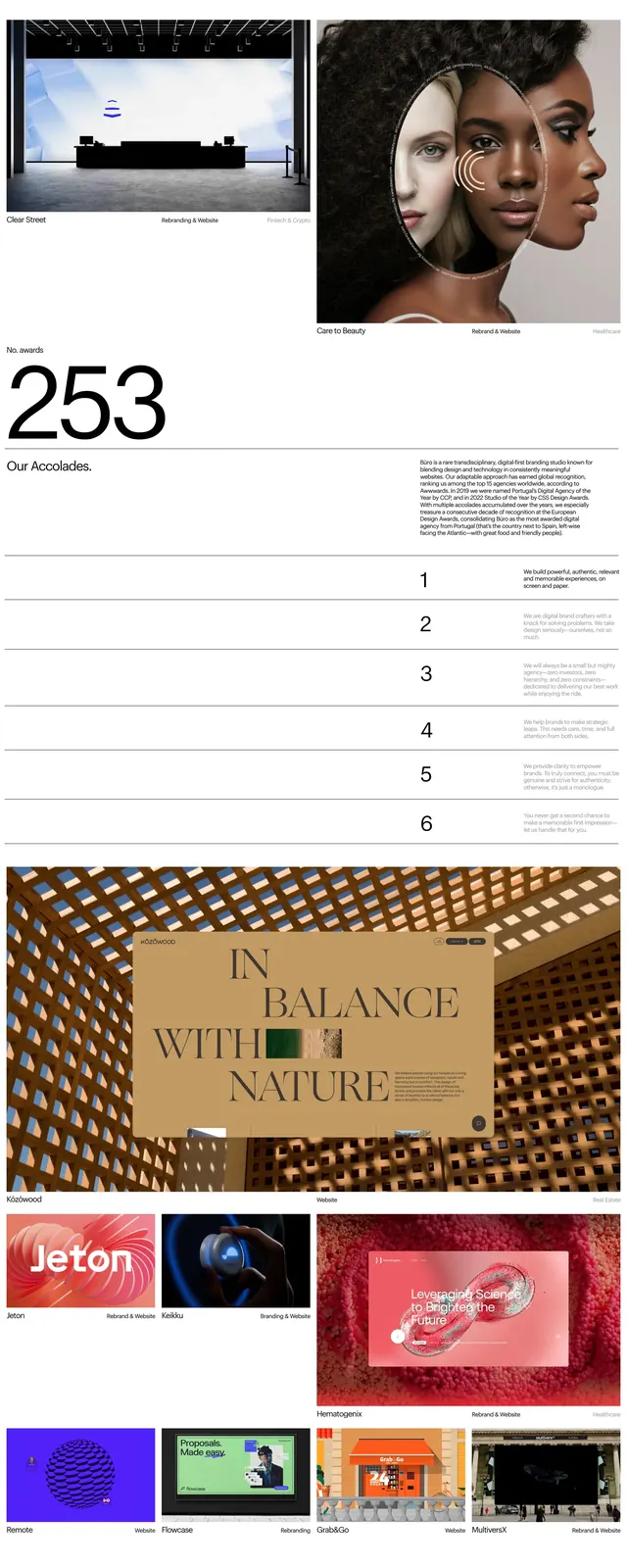
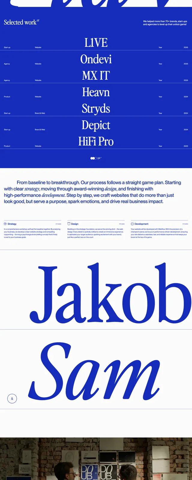
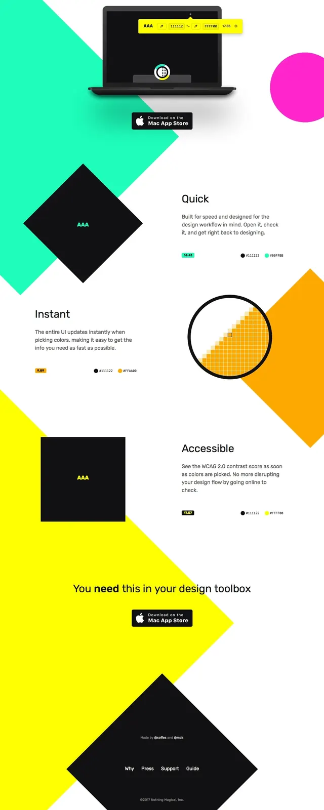
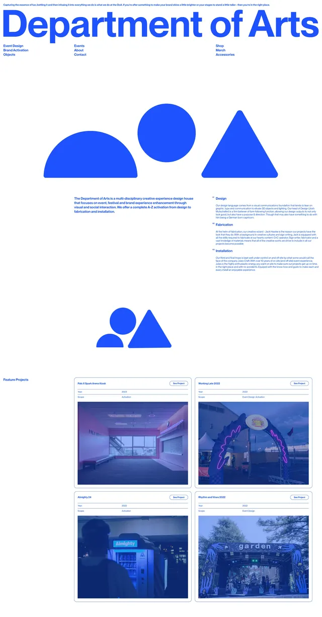
A stark white portfolio homepage with oversized blue branding, geometric illustration blocks, and a grid of project cards.
Summary
A stark white portfolio homepage with oversized blue branding, geometric illustration blocks, and a grid of project cards.
Visual description
The page opens on a white background with a tiny intro line, a huge blue wordmark-style headline, and small navigation links arranged beneath it. Large flat blue geometric forms, including a semicircle, circle, triangle, and smaller abstract shapes, act as the main visual language between text sections. Lower on the page, repeated feature/project areas use a two-column grid of bordered cards with small headings, metadata rows, and large photographic thumbnails tinted in blue.
Key takeaway
The strongest idea is the combination of oversized Swiss-style typography with simple, playful geometric primitives. The layout uses extreme whitespace and repeated project-card modules to keep the page feeling both artistic and structured.
Reuse notes
Works well for creative studios, art-direction portfolios, and agency landing pages that want a strong identity without heavy UI chrome. Reuse the large geometric motif as a section break or brand device, but keep the copy minimal so the shapes remain dominant.