Preview image. Unlock full-res
A bright SaaS landing-page hero for Copper with a left-aligned headline, dual CTAs, and overlapping product-and-portrait imagery.
Summary
A bright SaaS landing-page hero for Copper with a left-aligned headline, dual CTAs, and overlapping product-and-portrait imagery.
Visual description
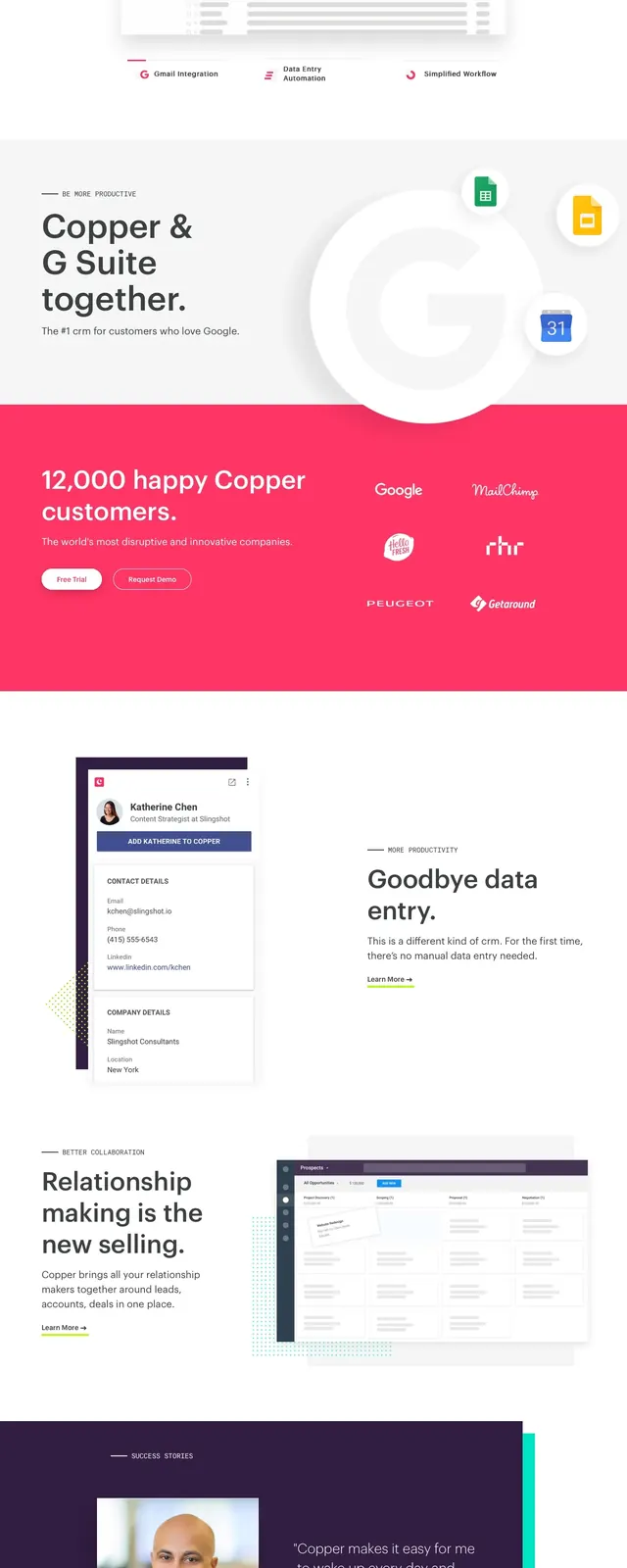
The page opens with a white top navigation bar and a large hot-pink hero block. On the left is the Copper logo, a prominent headline reading "Hello, Copper.", supporting copy, and two rounded CTA buttons; on the right are overlapping cutout portraits and small UI card mockups. Lower sections visible in the capture include a centered statement area, a customer-logo band on pink, a feature split with a profile card and "Goodbye data entry" copy, and a dark footer with multiple link columns.
Key takeaway
The main reusable move is the bold pink hero panel combined with floating portrait/product imagery to make a CRM feel human. The strong contrast between white space, saturated color, and simple CTA treatment keeps the page readable while still feeling energetic.
Reuse notes
Works well for B2B SaaS or sales/productivity products that want a friendly, modern brand tone. The overlapping image collage and bright accent color are the defining elements, so this approach depends on strong photography and a confident brand palette.