Preview image. Unlock full-res
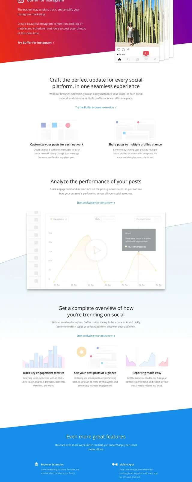
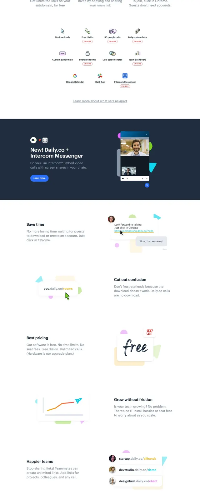
A bright SaaS landing page with a centered hero, colorful step-by-step feature blocks, testimonial cards, and a simple footer.
Summary
A bright SaaS landing page with a centered hero, colorful step-by-step feature blocks, testimonial cards, and a simple footer.
Visual description
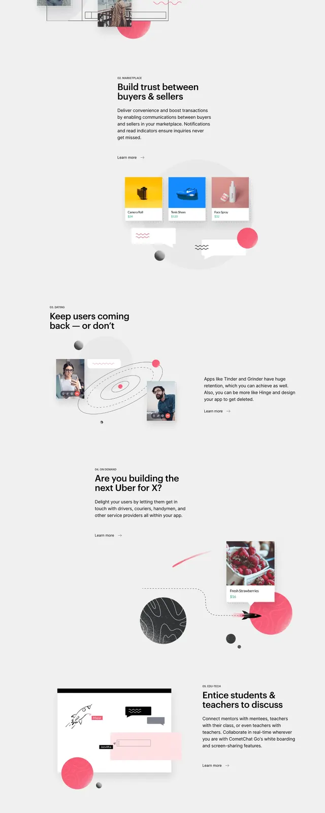
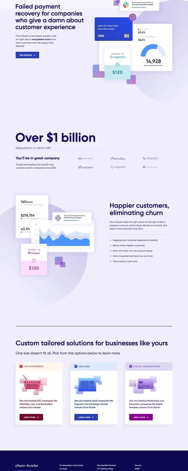
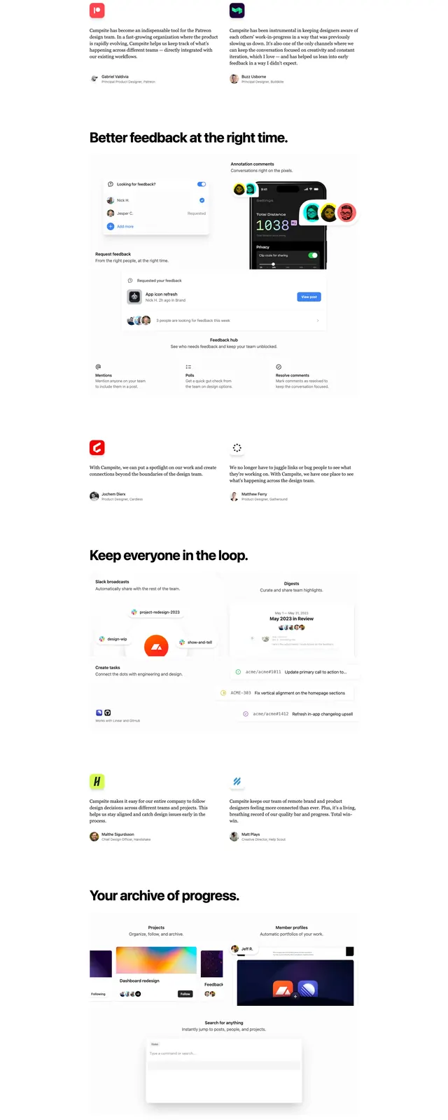
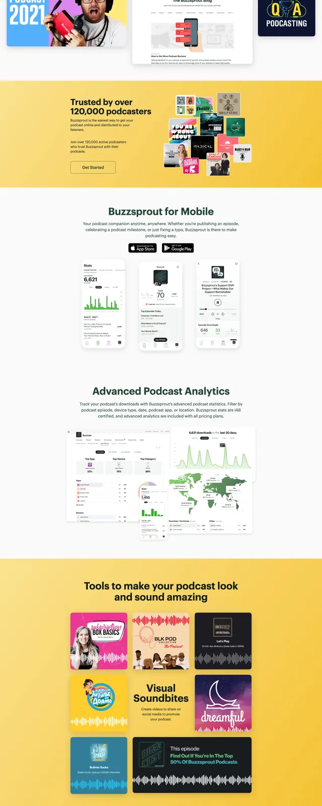
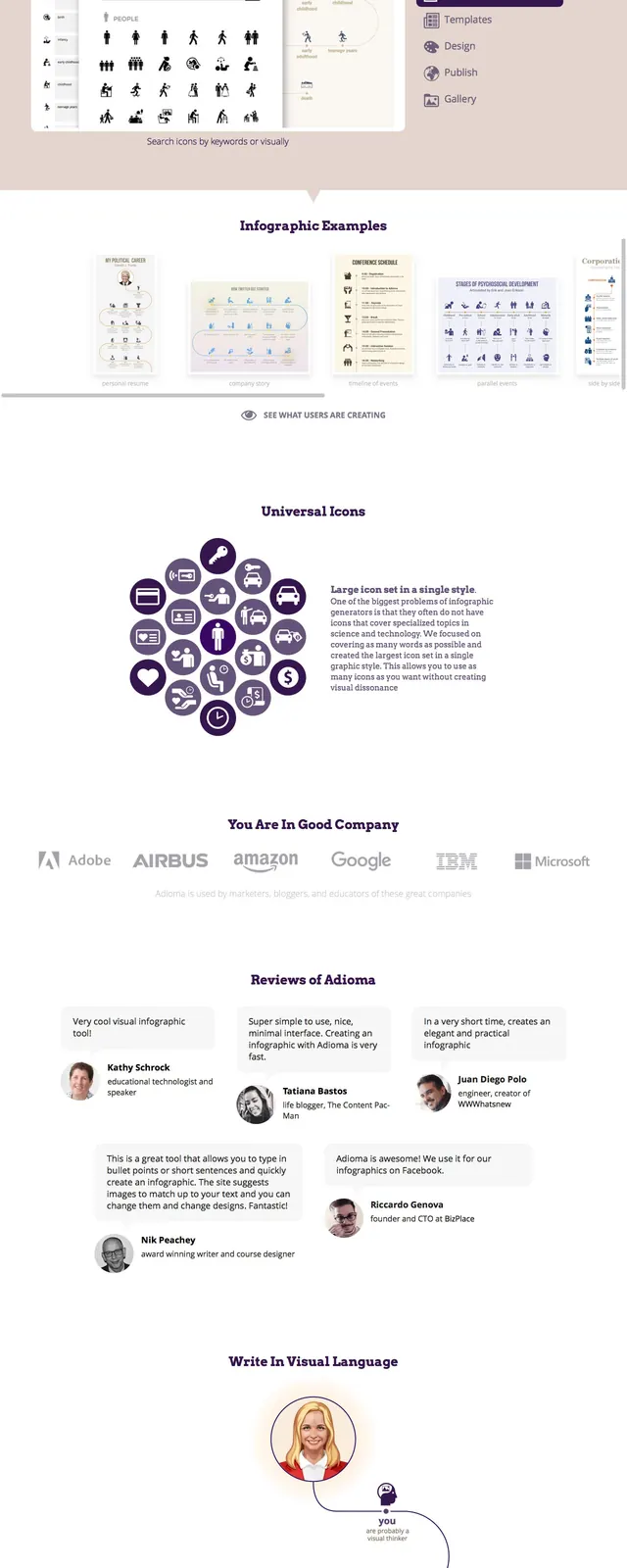
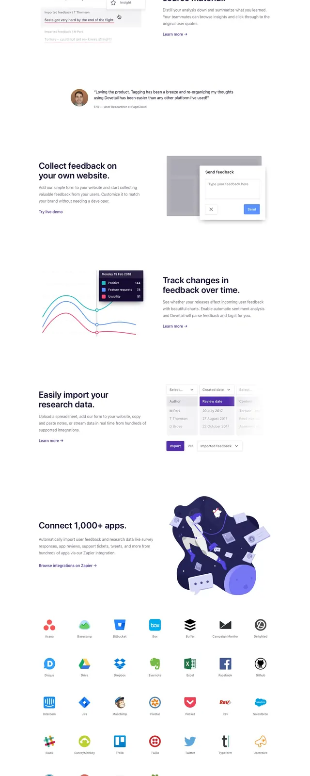
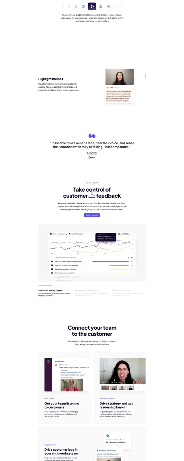
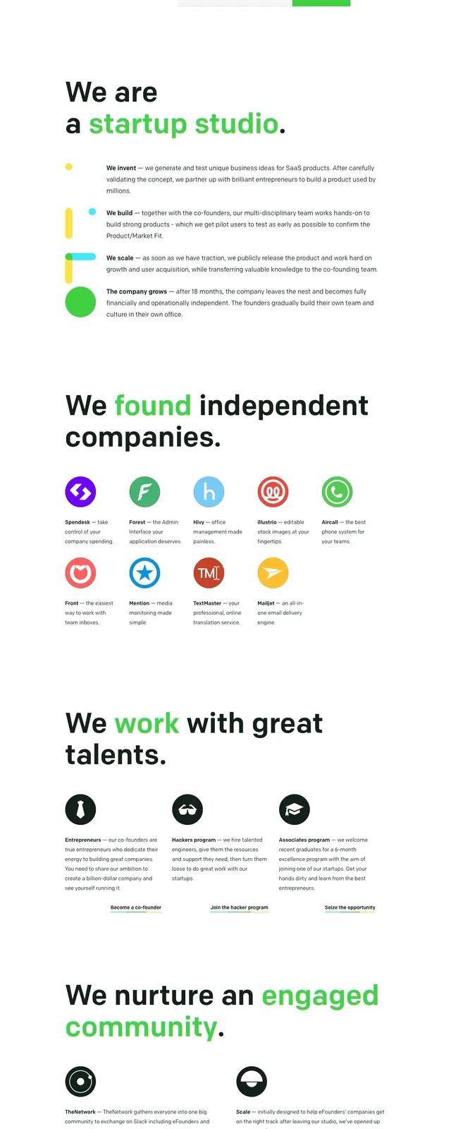
The page opens with a slim top navigation, a small logo at left, and sign-in and sign-up actions at right. The hero is centered on a white background with a large bold headline, a short supporting line, and a primary signup button, followed by faint partner logos. Below, a three-column feature/process section shows colorful rounded tiles labeled as sequential steps, then alternating feature-detail rows with small UI mockups, short explanatory copy, and lots of white space. The lower portion includes a centered call-to-action band, three testimonial cards with avatars, and a sparse footer with grouped links.
Key takeaway
The strongest pattern is the clear progression from hero promise to simple step-by-step explanation, all kept visually light and easy to scan. Bright accent colors on a mostly white canvas make the functional SaaS message feel approachable instead of heavy.
Reuse notes
Use this structure for product-led SaaS pages that need quick comprehension and a low-friction signup path. It works best when you have a simple workflow to explain and a few testimonials or partner logos to support trust.