Preview image. Unlock full-res
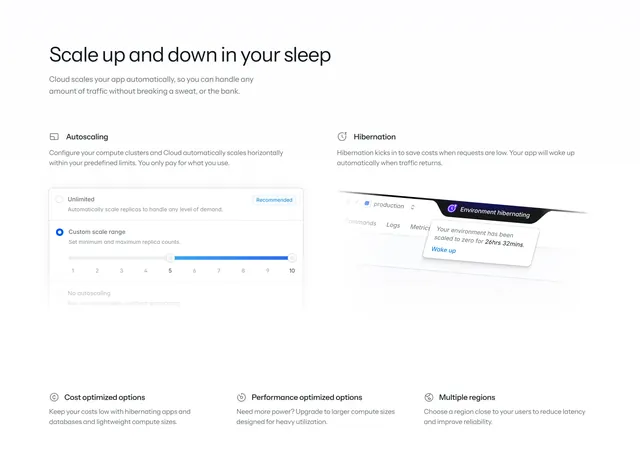
Light feature section pairing two illustrated autoscaling and hibernation blocks with a three-up icon row of supporting benefits below.
Summary
A light feature block built around two illustrated halves, an autoscaling config card and a hibernation dashboard mockup, with a three-column icon row of supporting benefits beneath.
Visual description
Off-white background with a large light-weight headline "Scale up and down in your sleep" and a two-line paragraph at top-left. Below, the section splits in two: the left half ("Autoscaling") shows a rounded options card with three radio choices (Unlimited, marked "Recommended"; Custom scale range with an active blue 1 to 10 slider; No autoscaling), while the right half ("Hibernation") shows a tilted, faded dashboard mockup with a dark "Environment hibernating" pill and a floating tooltip ("scaled to zero for 26hrs 32mins" with a Wake up link). A thin vertical rule divides the two. Across the bottom sits a three-up row, each with a small circular icon, a bold title (Cost optimized options, Performance optimized options, Multiple regions) and a sentence of copy.
Key takeaway
Showing the actual autoscaling slider and radio control makes an abstract concept tangible and demoable inside a marketing page. The tilted, partly-faded dashboard with a single sharp tooltip directs the eye to one message without showing a full busy screenshot. The two-feature split plus three-benefit footer is a clean way to give two ideas room while still listing more.
Reuse notes
Good for explaining a couple of headline platform behaviors that benefit from a real control or state visual, then mopping up secondary benefits in an icon row. Pairs with a broader bento features section elsewhere on the page. The faded-mockup-plus-tooltip move is reusable wherever a full screenshot would be too noisy.