Preview image. Unlock full-res
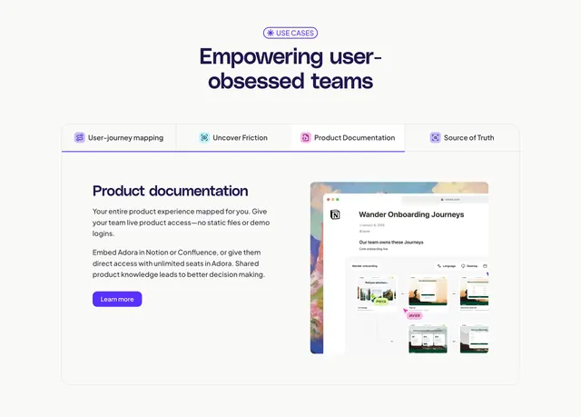
Tabbed features section where a selected tab reveals split copy and a layered product mockup of a Notion-style doc with journey screens.
Summary
A tabbed features block: a four-tab bar with icons switches the panel below, and the active "Product Documentation" tab shows left-side copy beside a layered mockup of a Notion-style doc embedding product journey screens.
Visual description
A small "USE CASES" pill badge centers above an oversized two-line heading ("Empowering user-obsessed teams") in deep violet with a slight italic. Below sits a bordered panel whose top is a horizontal tab bar with four labeled, icon-led tabs (User-journey mapping, Uncover Friction, Product Documentation, Source of Truth); the third is active with a violet underline. Inside the panel, the left column carries a "Product documentation" subhead, two short paragraphs, and a violet "Learn more" button. The right column shows a browser-framed Notion document titled "Wander Onboarding Journeys" with a soft painterly cover and a grid of small embedded product screenshots tagged with name pills.
Key takeaway
The icon-led tab bar lets one section carry four distinct use cases without stacking four blocks. Framing the product inside a recognizable third-party doc (Notion) sells the integration story instantly.
Reuse notes
Best when a product has several parallel use cases that share one layout. Tabs hide motion, so only the active panel is visible in a still. Pairs well with realistic embedded mockups; needs polished screenshots to feel credible.
More feature detail sections
See all

More like this

Keep what you find
A free account saves references to boards and can send you a weekly email of picks based on what you save.
To see every result, go Pro.