Preview image. Unlock full-res
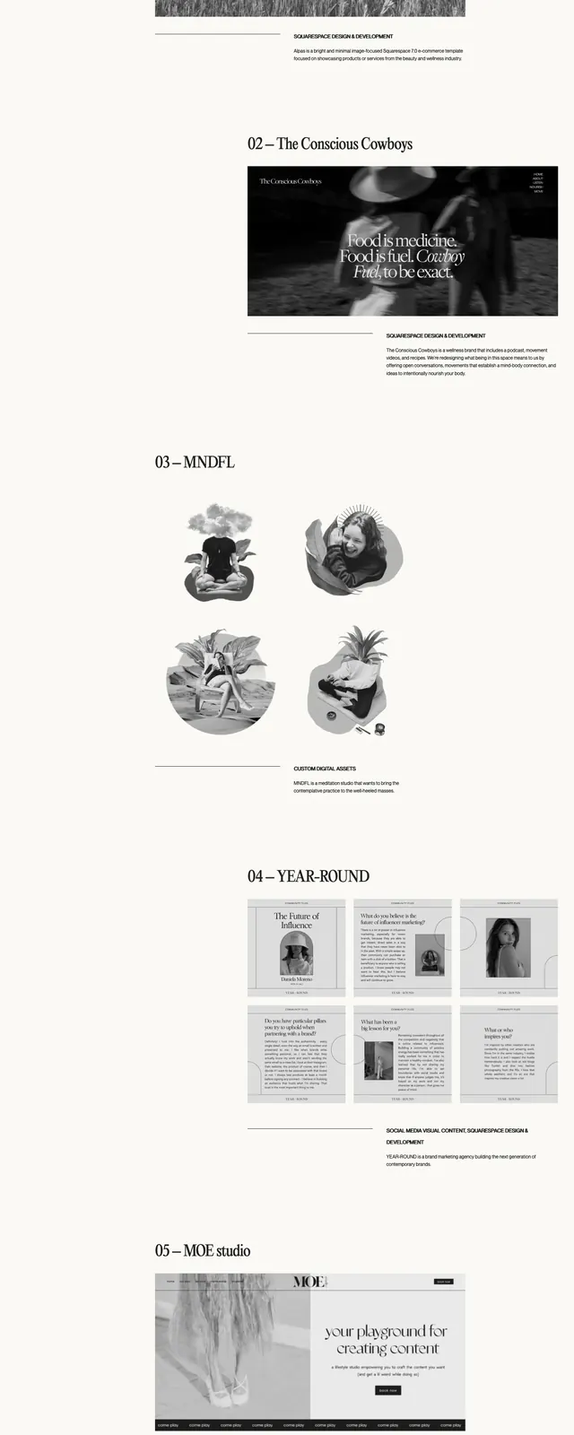
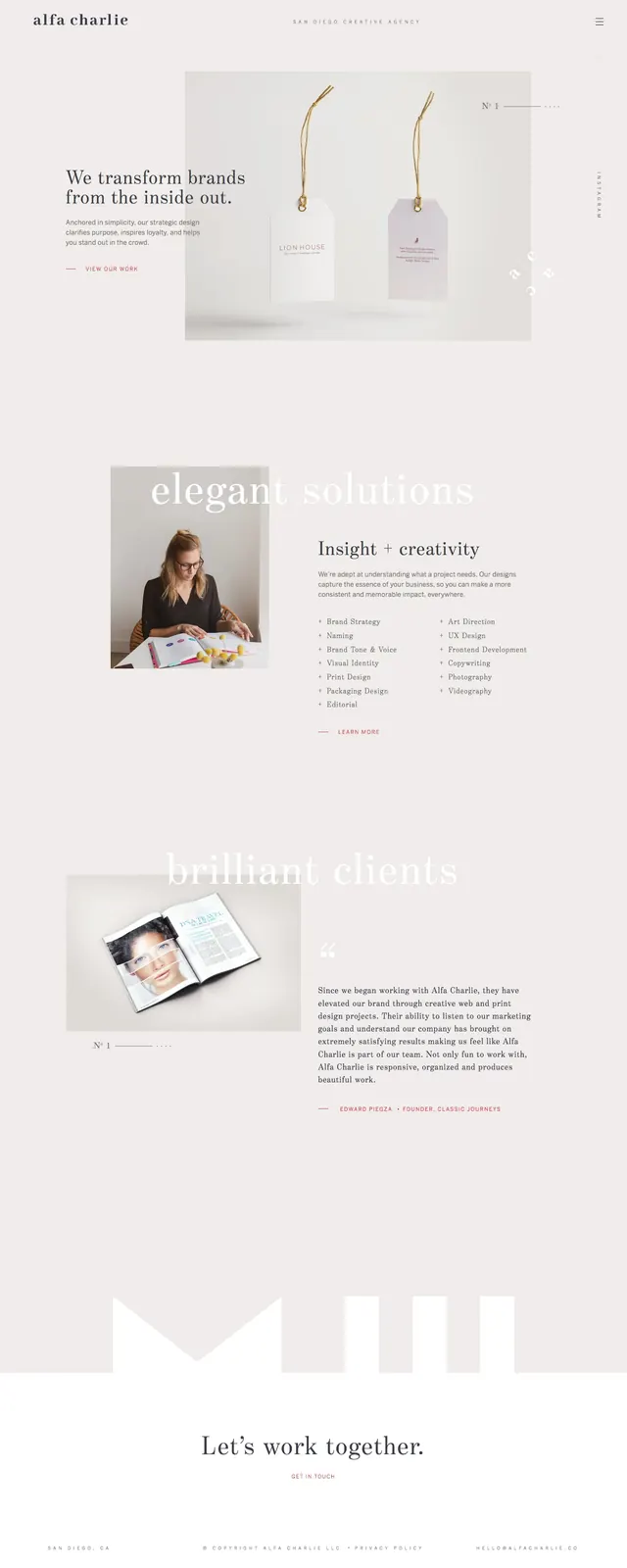
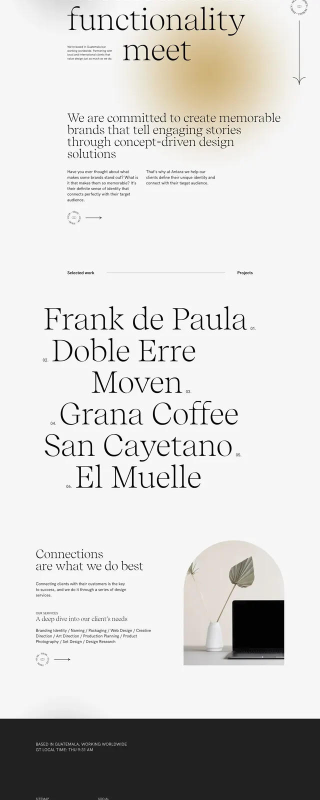
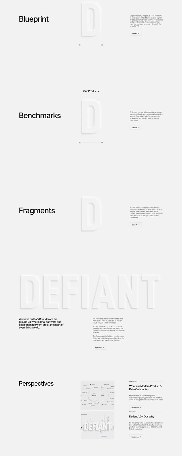
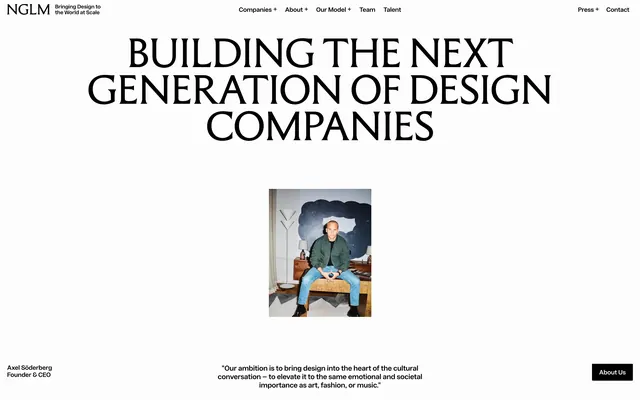
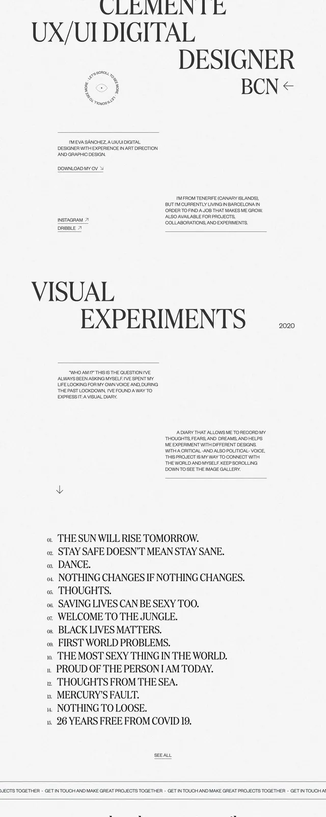
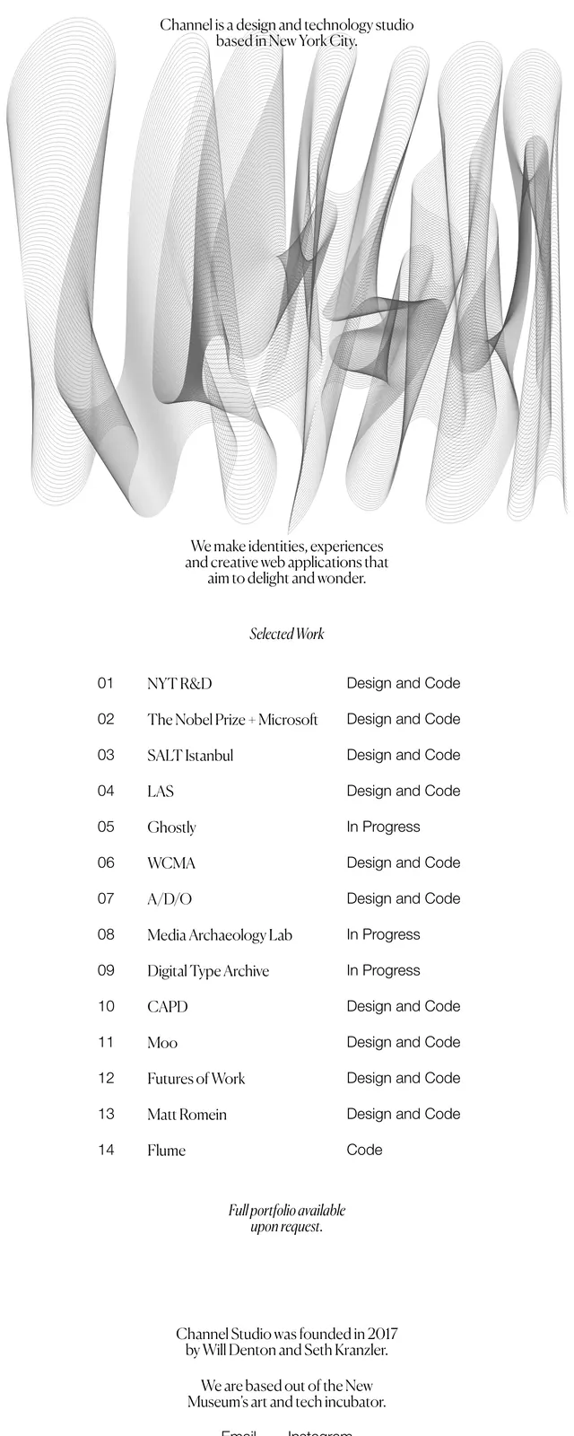
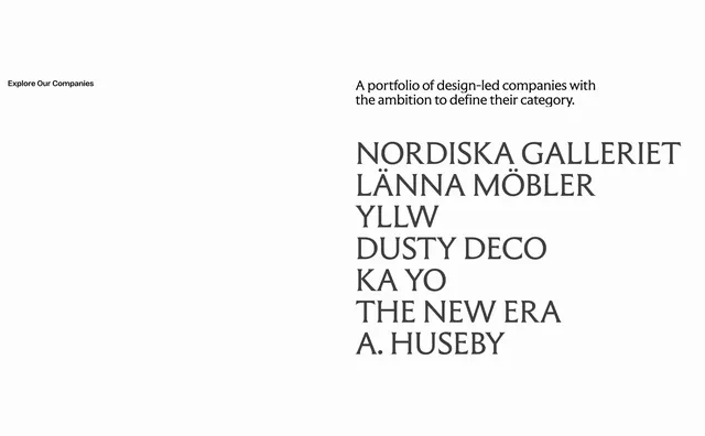
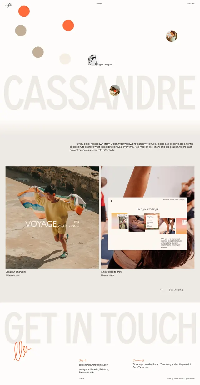
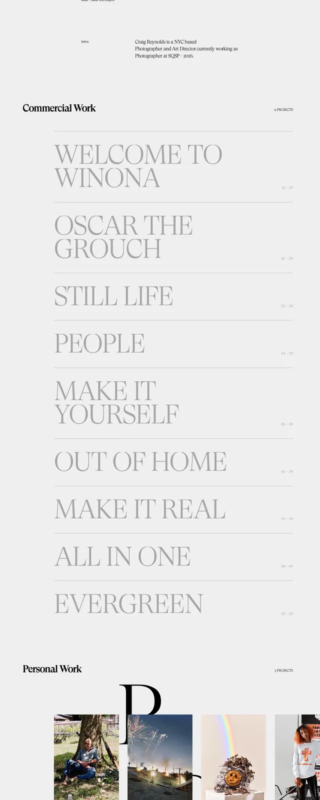
A minimalist portfolio homepage with oversized serif typography, sparse navigation, and a long scrolling grid of projects.
Summary
A minimalist portfolio homepage with oversized serif typography, sparse navigation, and a long scrolling grid of projects.
Visual description
The page opens on a very large serif nameplate reading Craig Reynolds, centered on a pale background with tiny navigation and location text around it. Below the hero, the page switches into a tall stacked list of project categories separated by thin rules, followed by a row of image thumbnails and a sparse footer with contact details. The layout relies on large whitespace, restrained black-and-gray type, and a highly editorial composition with minimal UI chrome.
Key takeaway
The main reusable move is the extreme type-led hero paired with generous negative space and tiny support text. The lower section shows how to combine a simple project index with a clean image strip without adding visual noise.
Reuse notes
Use this pattern for portfolio or creative studio sites that want to feel refined and art-directed. It works best when the brand name or one central message can carry the top of the page, and when the content can be organized into simple list or gallery sections.