Preview image. Unlock full-res
A dark, editorial-style homepage for CSS-Tricks with a featured article hero, stacked content cards, and a dense archive layout.
Summary
A dark, editorial-style homepage for CSS-Tricks with a featured article hero, stacked content cards, and a dense archive layout.
Visual description
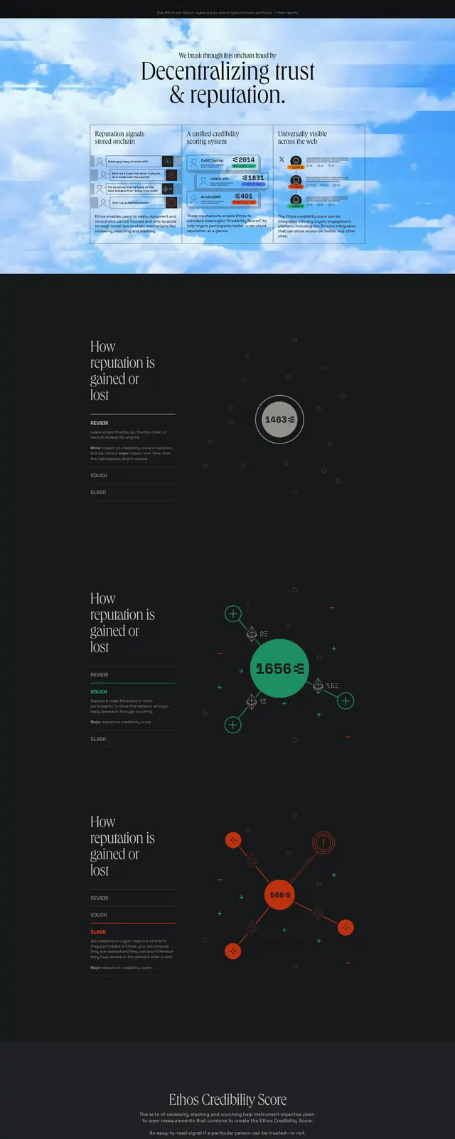
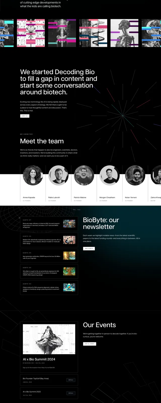
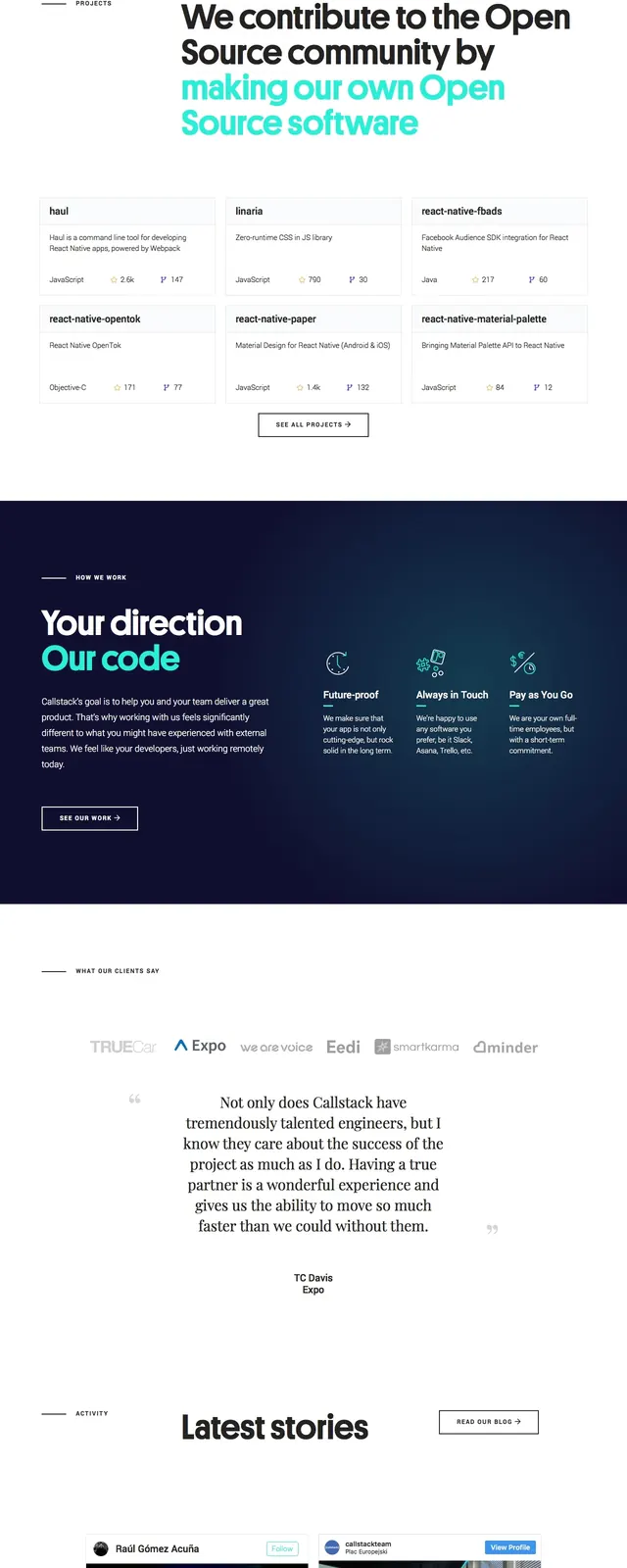
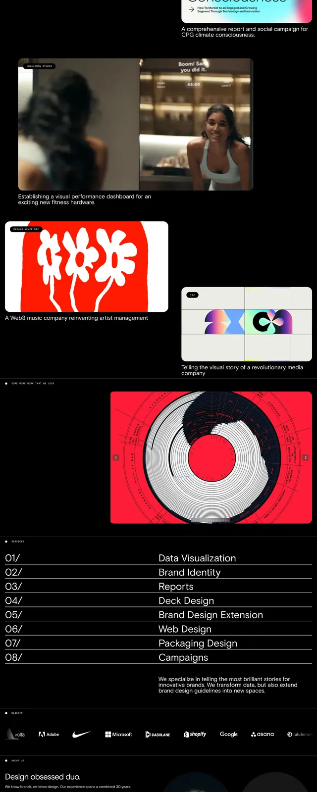
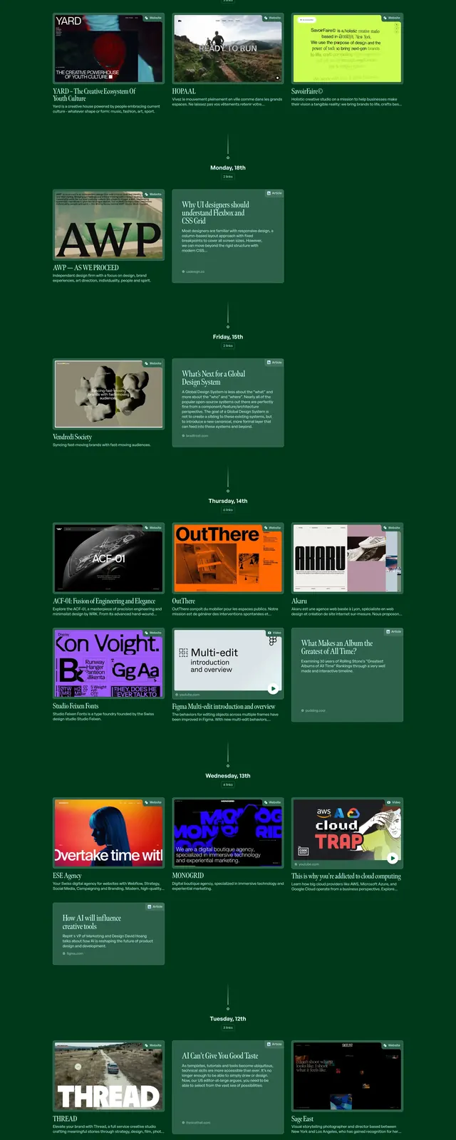
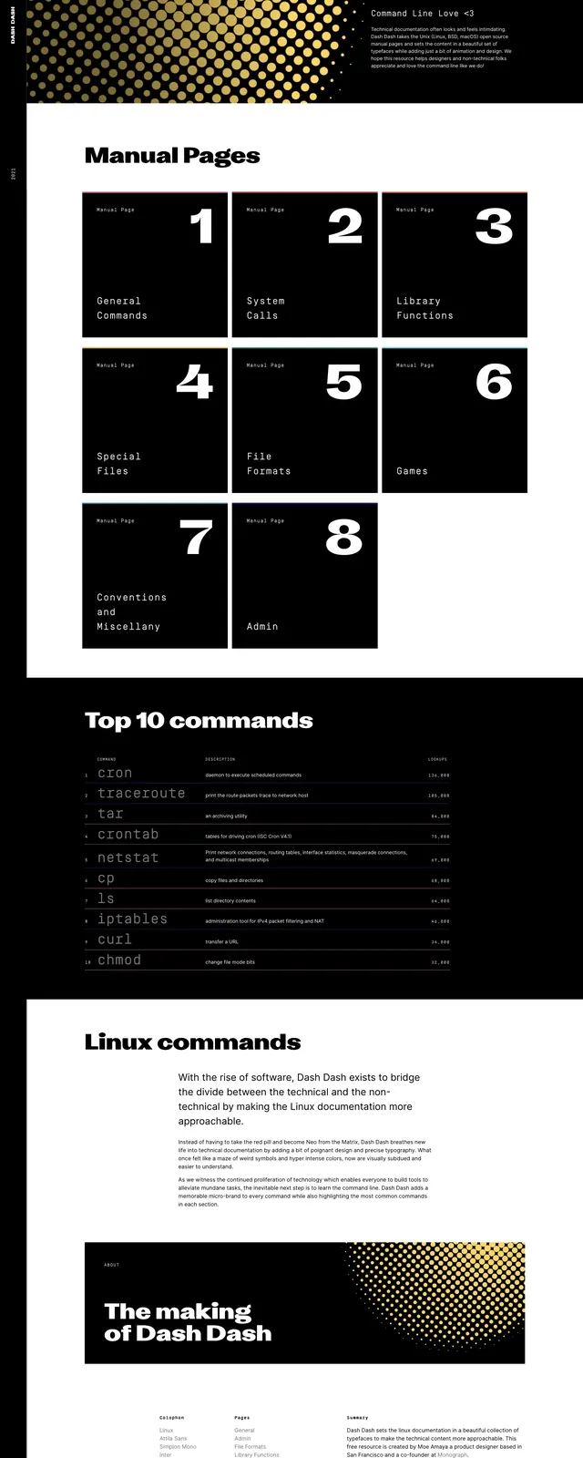
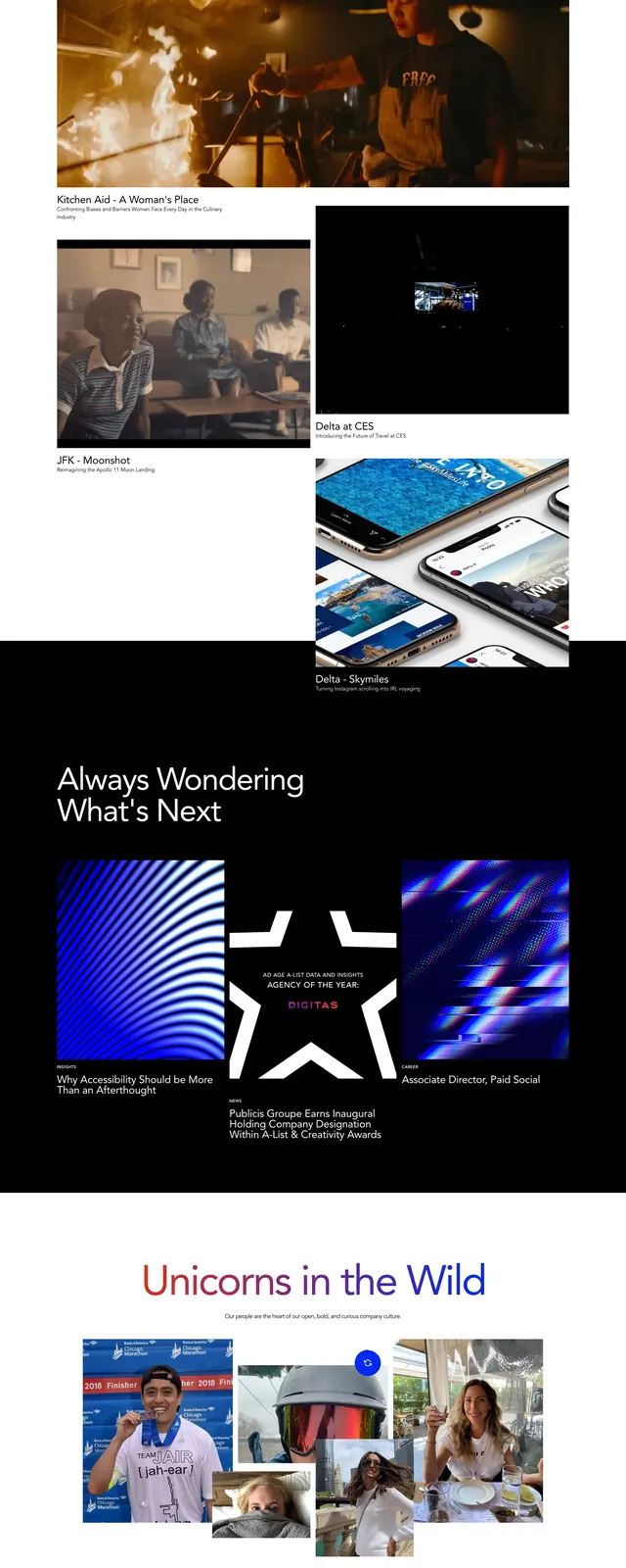
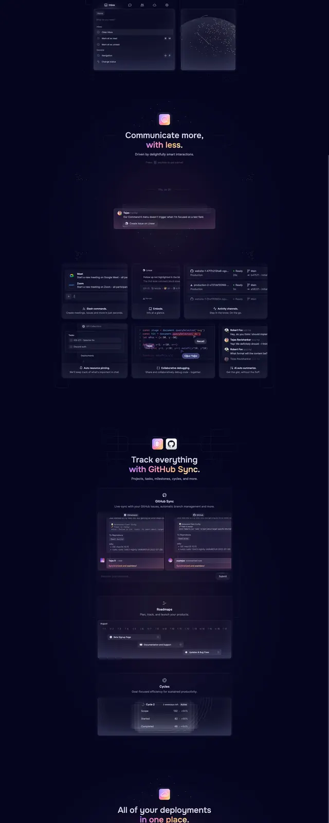
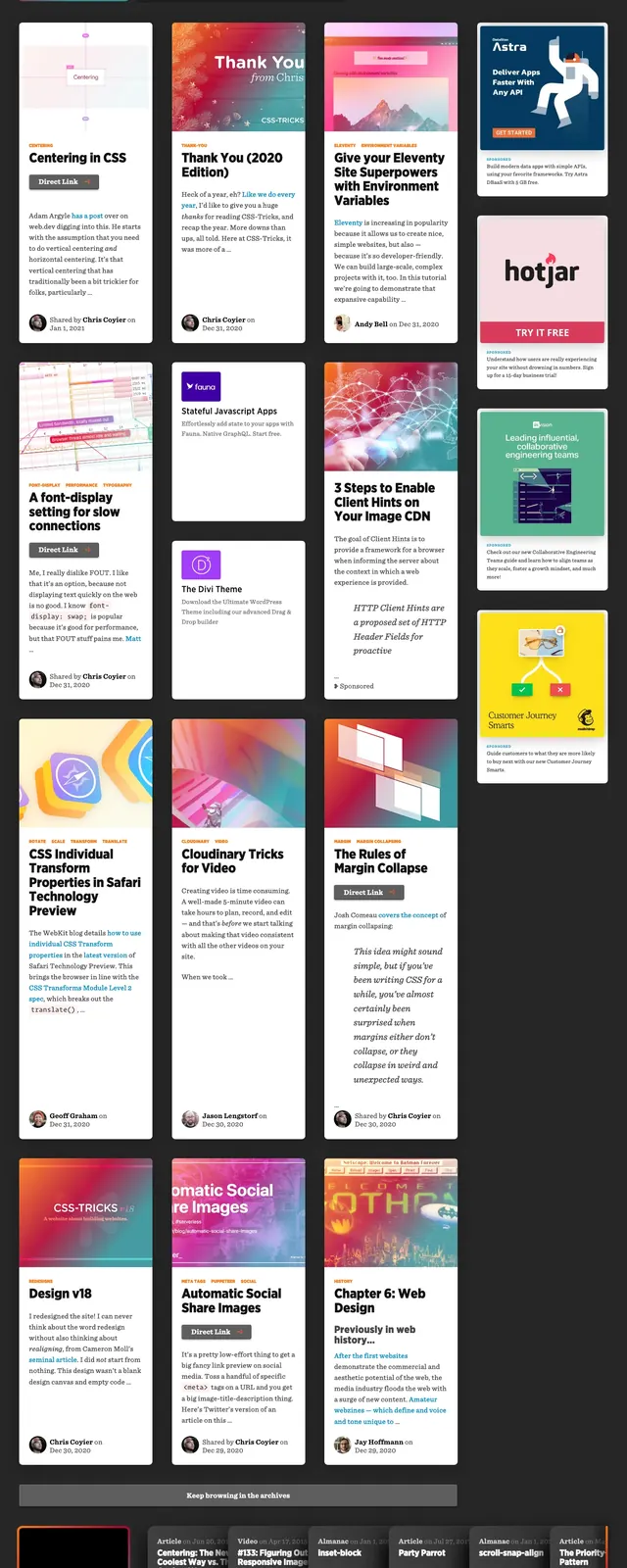
The page opens with a large featured story card on a dark background, paired with a top navigation bar and small utility icons. Below it, multiple rows of content cards mix tall article tiles, compact promo panels, and horizontal article strips, creating a magazine-like archive layout. The bottom area includes a newsletter signup block and a dense multi-column footer with category links. Color accents use warm gradients, orange highlights, and subtle neon edges against charcoal surfaces.
Key takeaway
This layout is built for content discovery, with one strong hero story supported by a highly scannable editorial grid. The combination of dark mode, strong contrast, and varied card sizes makes it feel technical and lively without losing structure.
Reuse notes
Reuse this pattern for developer publications, documentation hubs, or content-heavy blogs that need a prominent featured piece plus rapid browsing. The stacked card system and newsletter/footer treatment can also translate well to media archives and community resource pages.