Preview image. Unlock full-res
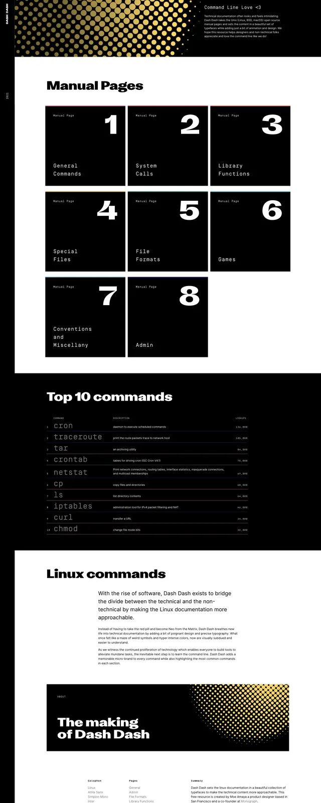
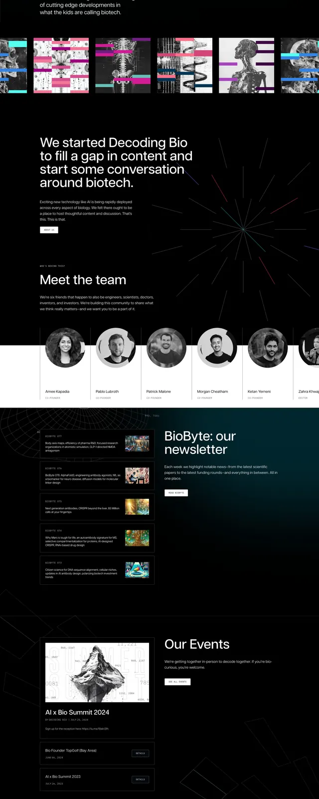
A dark, editorial biotech landing page with a vivid radial hero graphic, oversized headline, and stacked content sections for team, newsletter, and calls to action.
Summary
A dark, editorial biotech landing page with a vivid radial hero graphic, oversized headline, and stacked content sections for team, newsletter, and calls to action.
Visual description
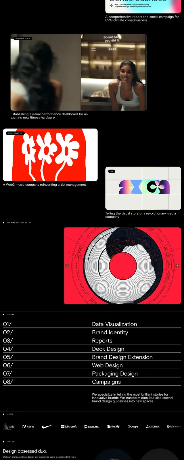
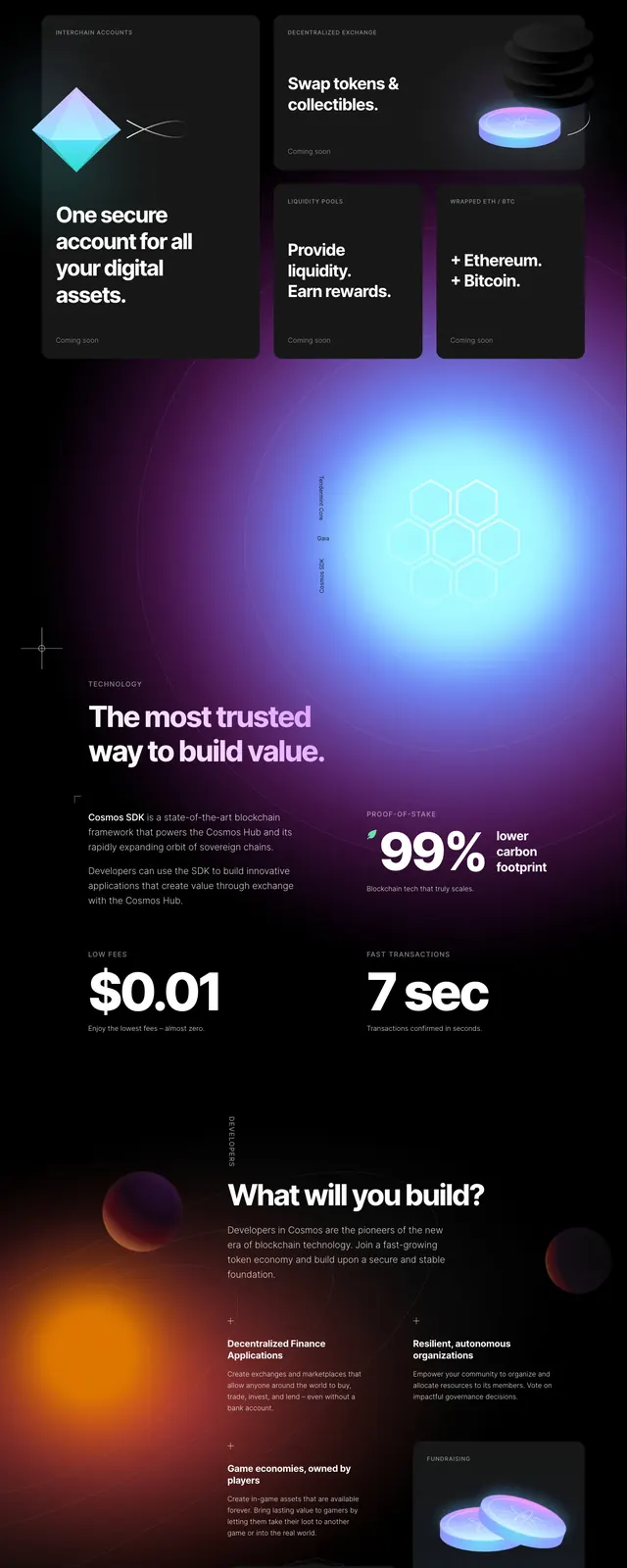
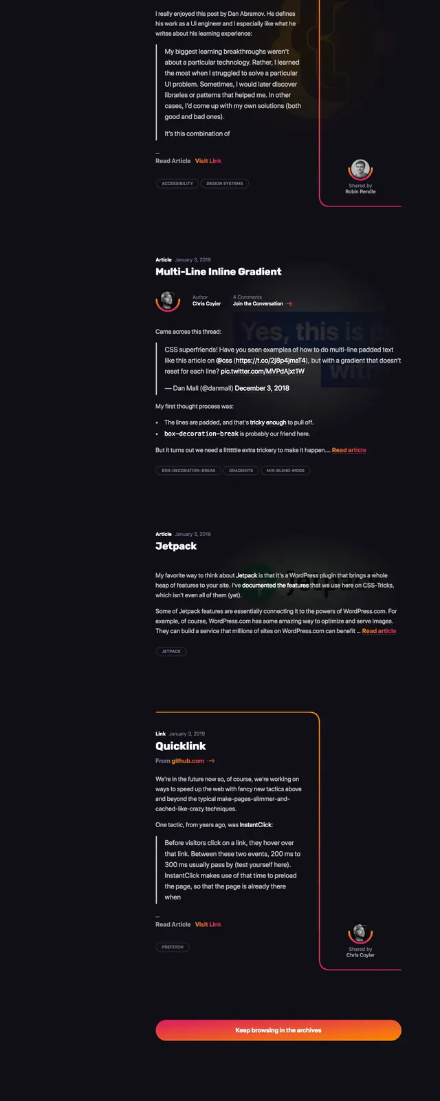
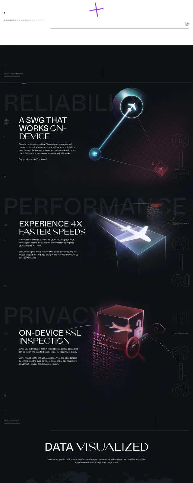
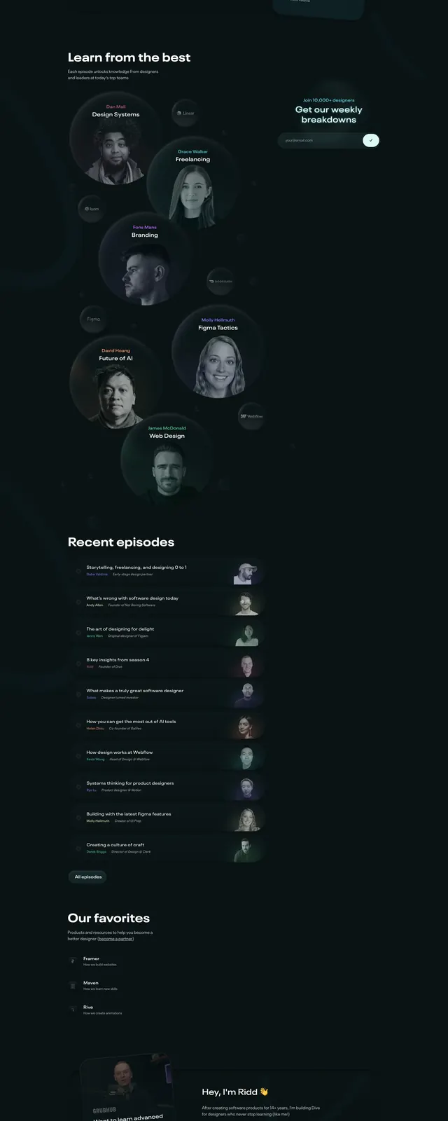
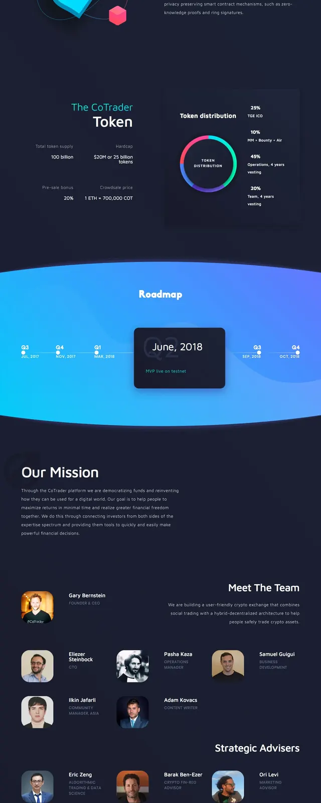
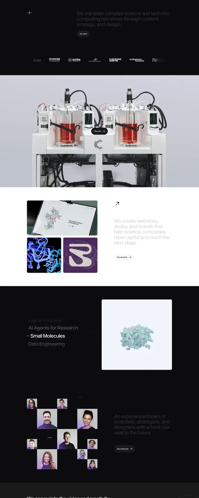
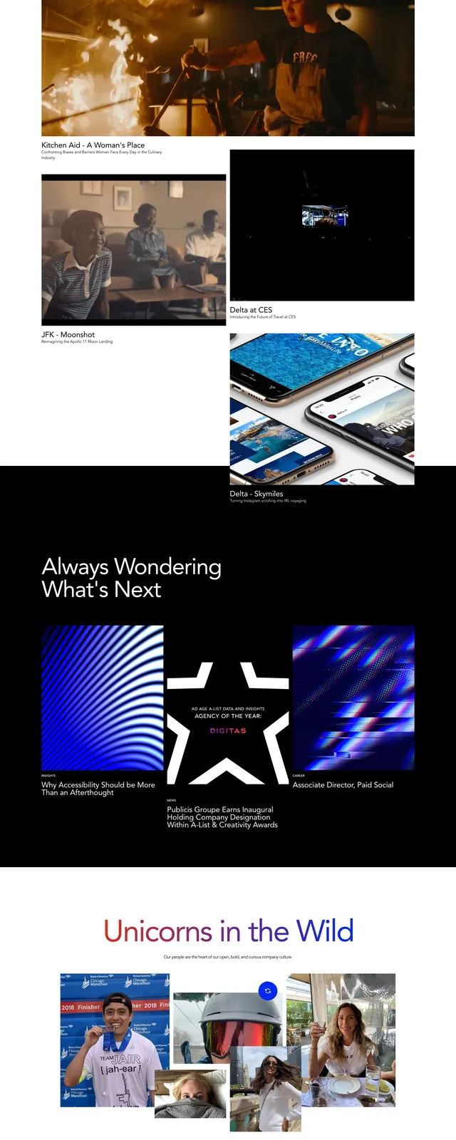
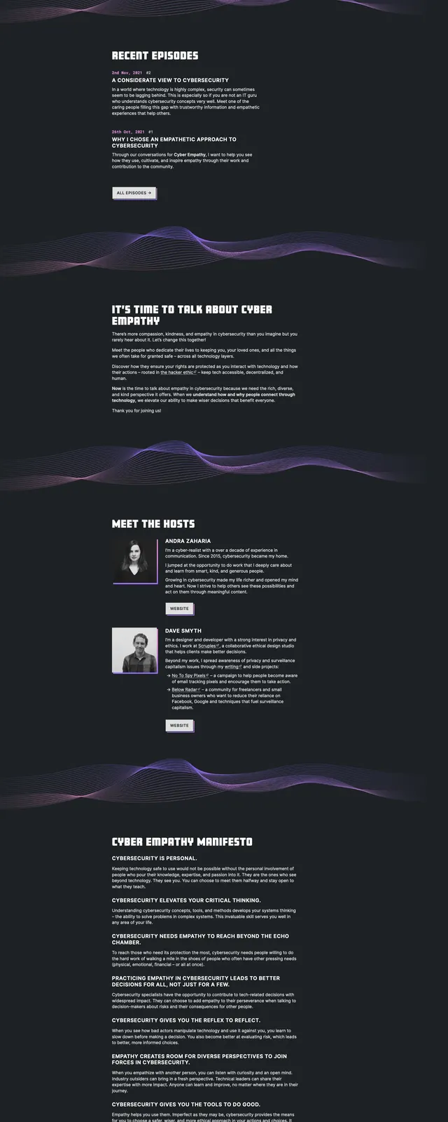
The page opens with a centered hero on a nearly black background, topped by a large circular multicolor abstract graphic and a bold white headline. A thin navigation row and small brand mark sit beneath the hero, followed by a short intro paragraph on a dark field. Lower sections show a team strip with circular portraits on white cards, a newsletter area with article cards beside a signup callout, a centered suggestion box CTA, and a large footer wordmark.
Key takeaway
The strongest move is the contrast between the dark, restrained layout and the bright, scientific-looking radial graphic at the top. The page also reuses simple modular blocks to keep a content-heavy editorial site readable.
Reuse notes
Use this pattern for media brands, research newsletters, or science communities that need a premium, serious tone. It works best when paired with strong imagery, short section copy, and a dark canvas that lets accent colors stand out.