Preview image. Unlock full-res
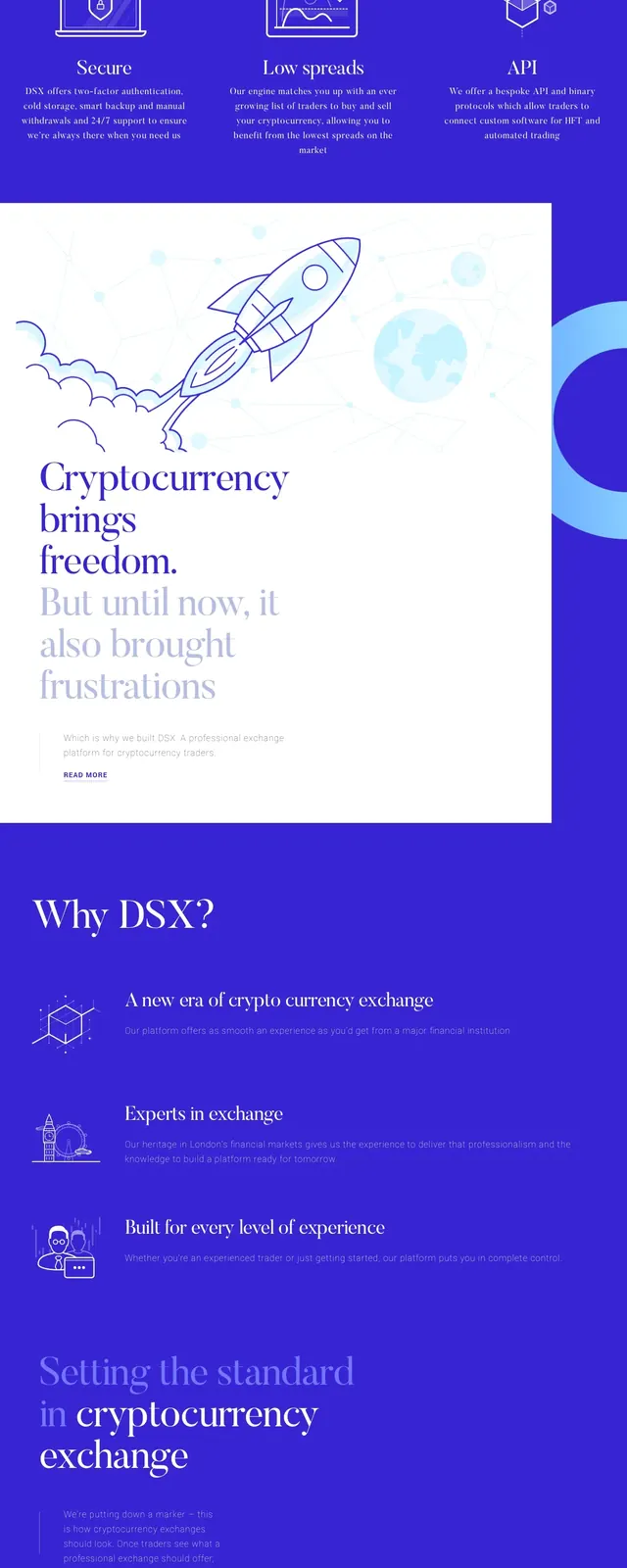
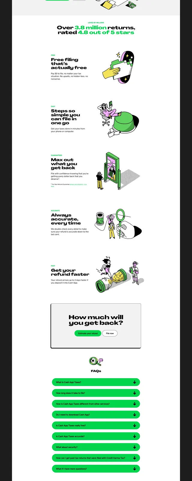
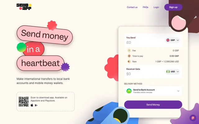
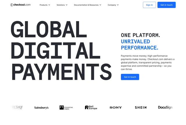
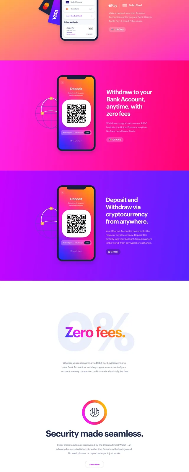
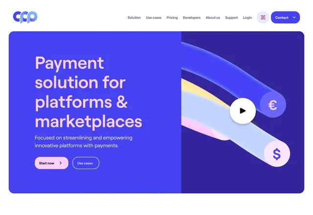
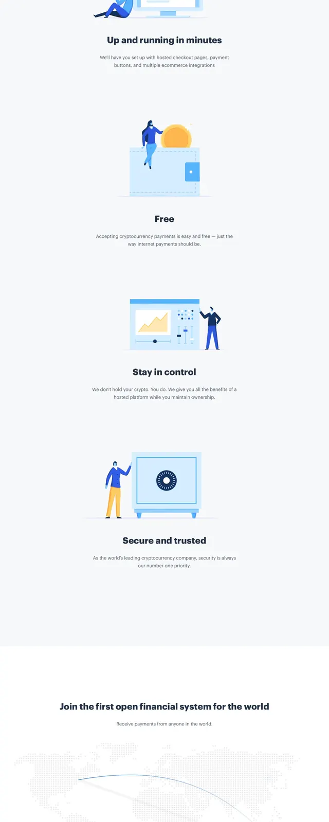
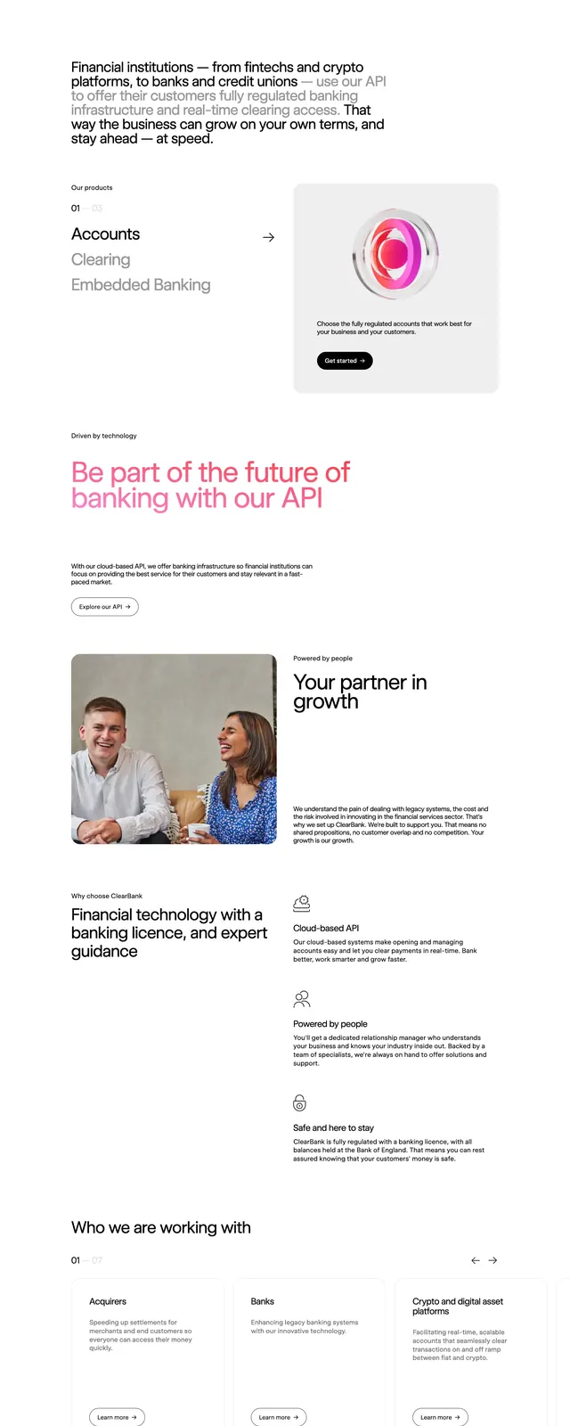
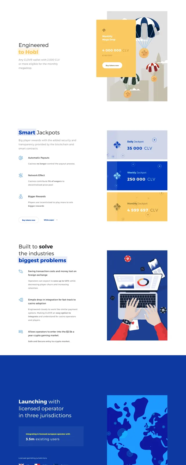
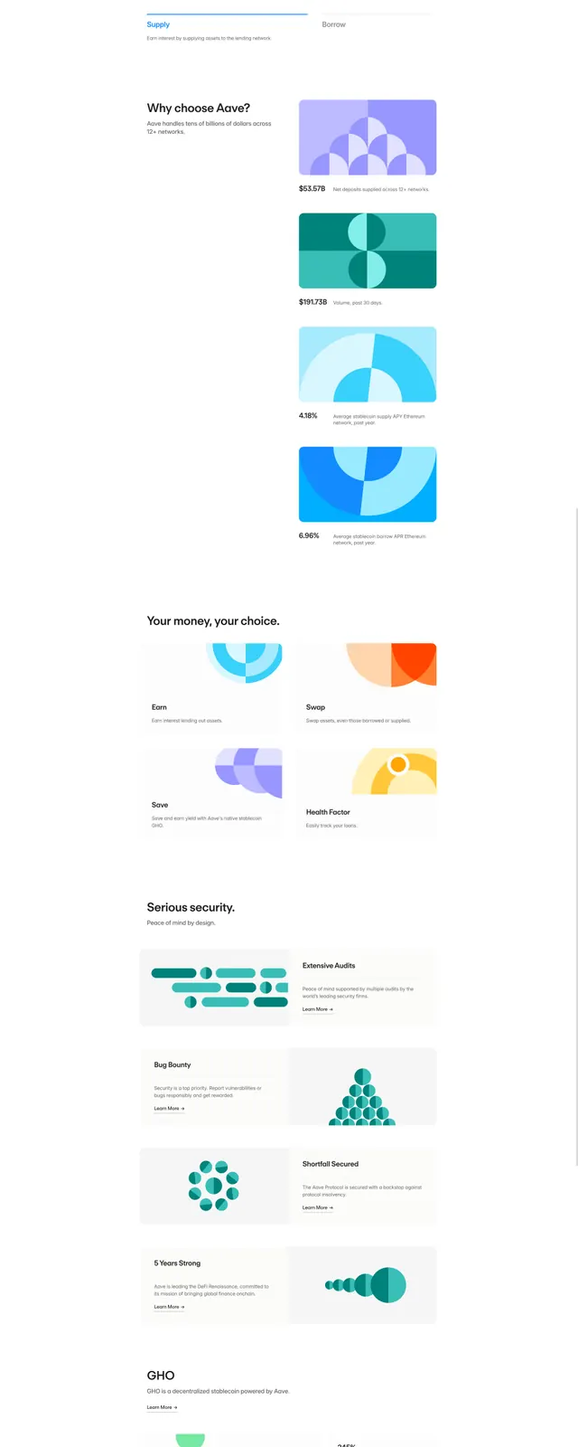
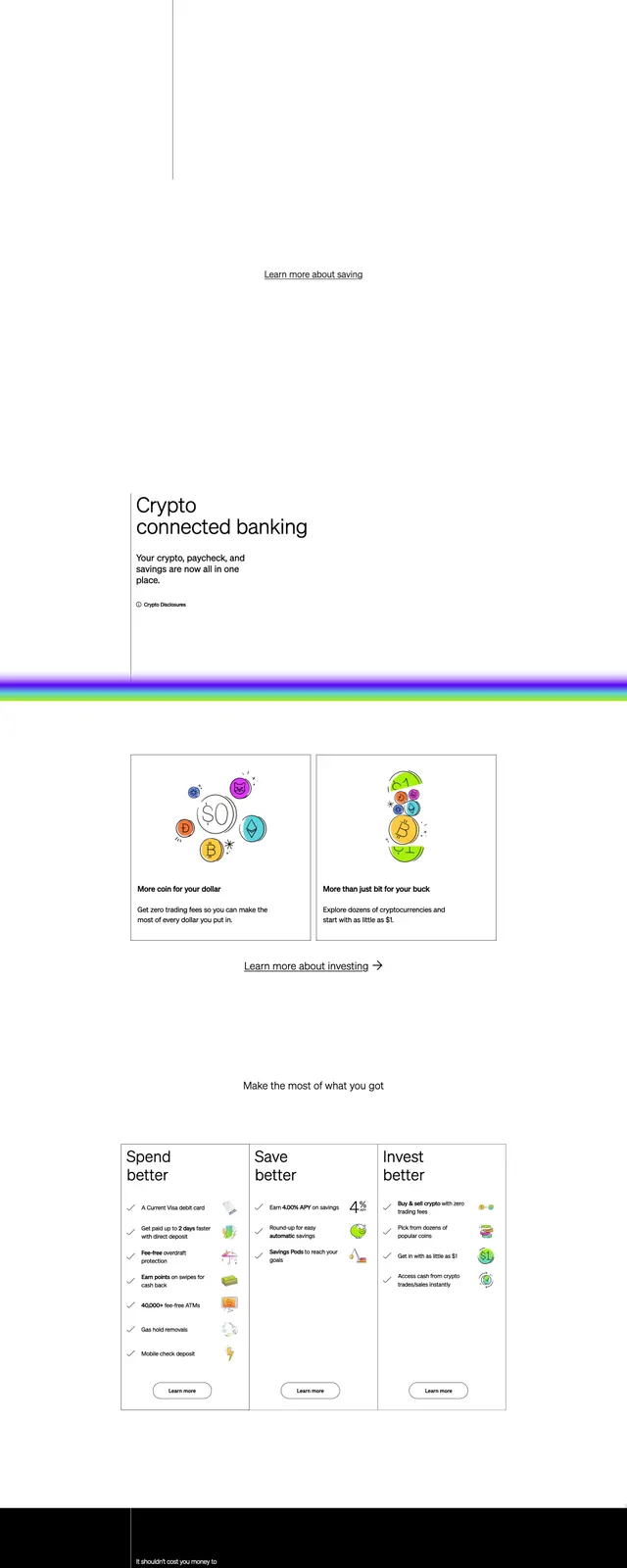
A clean fintech homepage with a split hero, illustrated product visuals, and stacked promotional sections separated by vivid gradient dividers.
Summary
A clean fintech homepage with a split hero, illustrated product visuals, and stacked promotional sections separated by vivid gradient dividers.
Visual description
The page opens with a sparse top navigation, a large split hero, and a product illustration on the left paired with a bold headline and small CTA on the right. Below, a large text-led value proposition section sits on white space, followed by two bordered feature cards in a two-column grid. A dark CTA band with a bright magenta geometric shape interrupts the layout near the bottom, and the page ends with a simple multi-column footer and dense legal text. Thin neon-like gradient rules separate the major sections throughout the page.
Key takeaway
The strongest reusable idea is the combination of very restrained white-space-heavy fintech layout with occasional high-saturation gradient accents for section breaks and calls to action. The illustrated hero and minimal typography keep the page feeling approachable while still premium.
Reuse notes
Use this pattern for consumer finance or crypto products that need to feel simple, modern, and trustworthy. It works best when the page alternates between clean editorial sections and one or two dramatic accent moments rather than maintaining heavy visual intensity throughout.