Preview image. Unlock full-res
A dark, editorial landing page for a branding inspiration publication with oversized typography and stacked project showcases.
Summary
A dark, editorial landing page for a branding inspiration publication with oversized typography and stacked project showcases.
Visual description
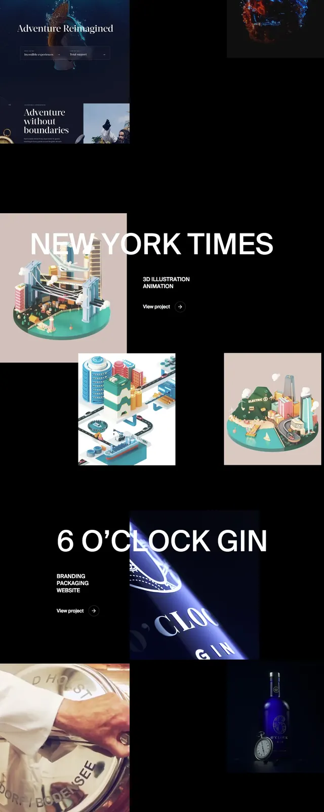
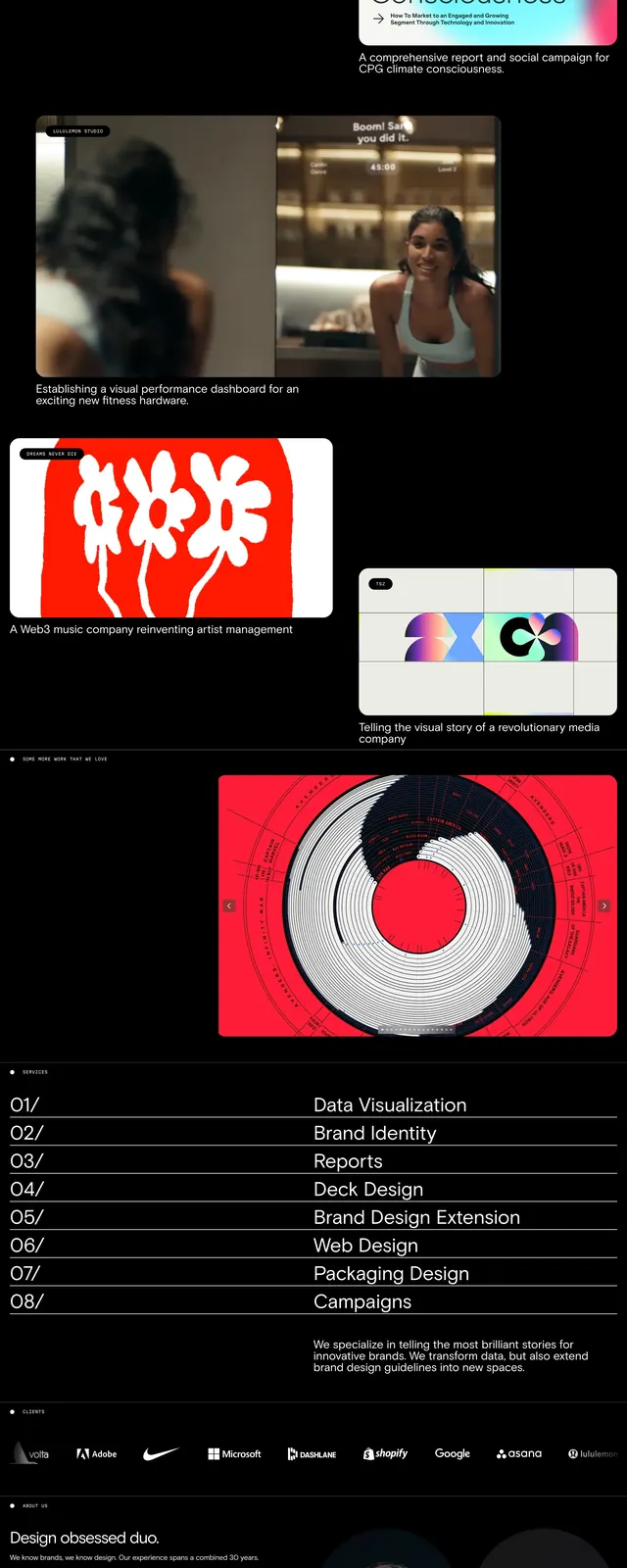
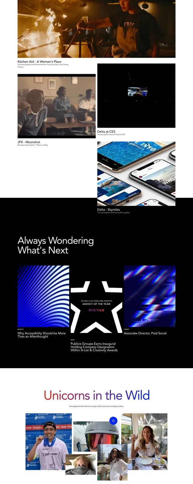
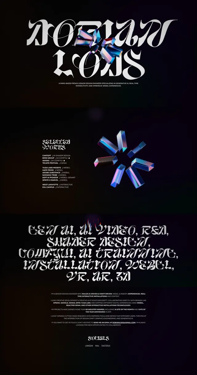
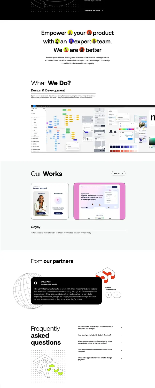
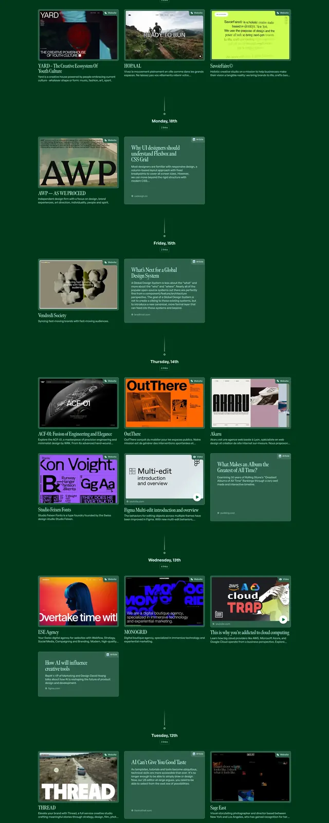
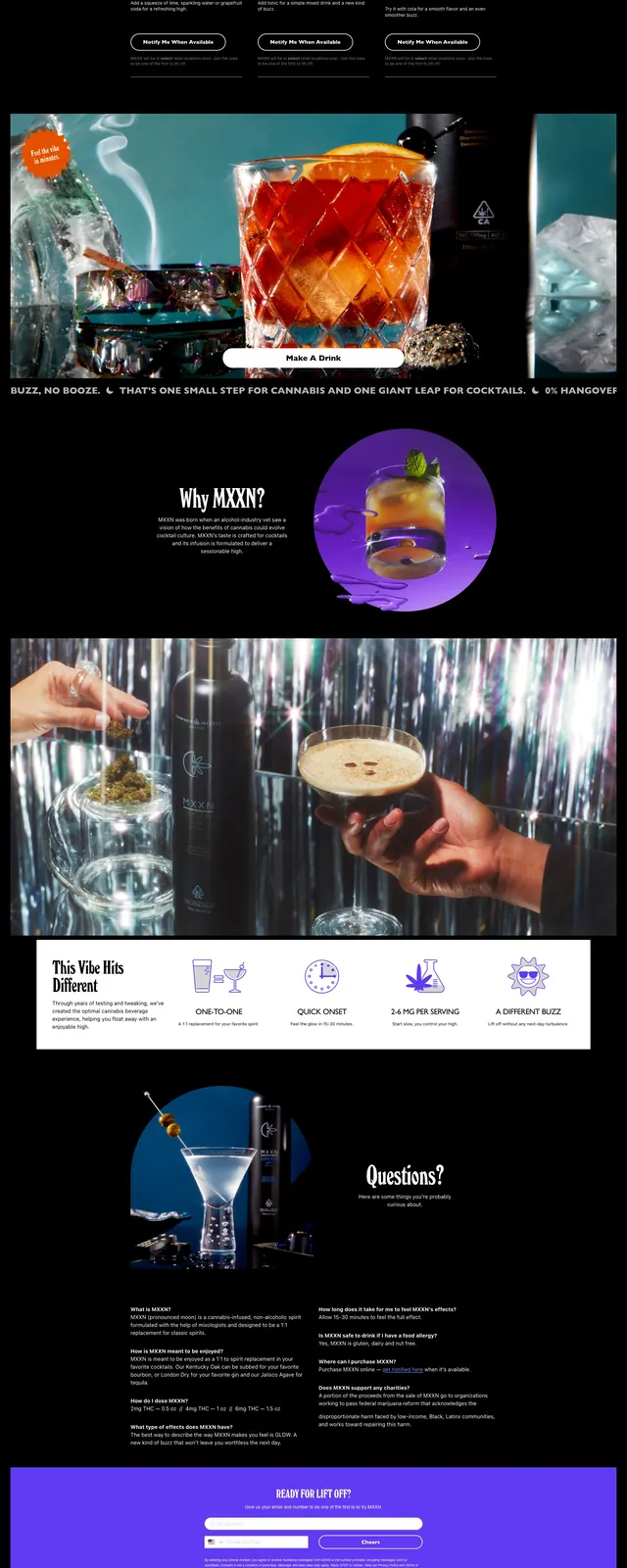
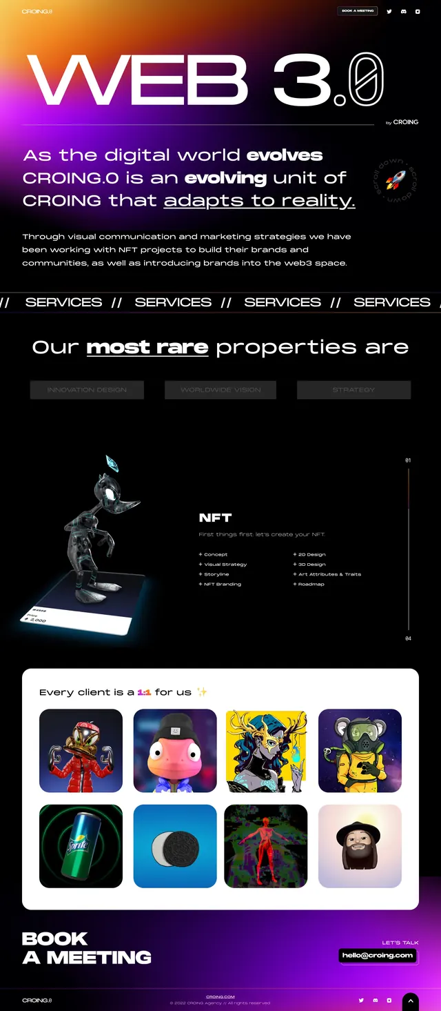
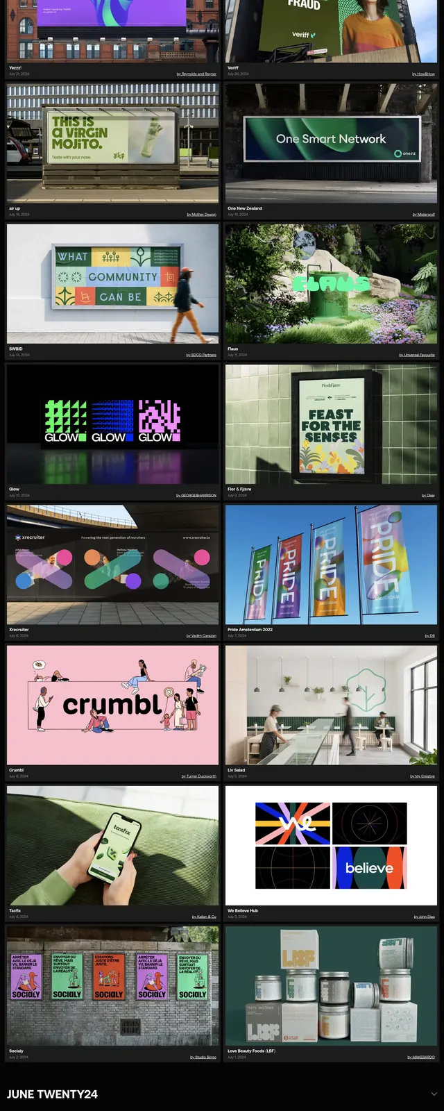
The page uses a black background with a huge condensed all-caps masthead at the top and a compact signup row beneath it. Below, a featured hero image is followed by a grid of branding project cards with captions, dates, and small attribution text. A wide rounded 'See more' button separates the gallery from a second oversized promotional block that repeats the same bold typographic treatment over a purple background. The overall composition feels like a curated magazine index with strong image-led hierarchy.
Key takeaway
Use oversized display typography, dark framing, and tightly curated image cards to make a branding inspiration site feel immediate and editorial. The alternating hero, grid, and promo sections create a strong rhythm without needing complex UI.
Reuse notes
This pattern works well for daily-curation, showcase, or inspiration-library homepages where the main goal is to drive browsing. Reuse the top signup strip, featured project hero, and masonry-style gallery as a repeatable content system.