Preview image. Unlock full-res
A bright, women-focused program landing page with a bold split hero, explanatory sections, program cards, a timeline, and an FAQ accordion.
Summary
A bright, women-focused program landing page with a bold split hero, explanatory sections, program cards, a timeline, and an FAQ accordion.
Visual description
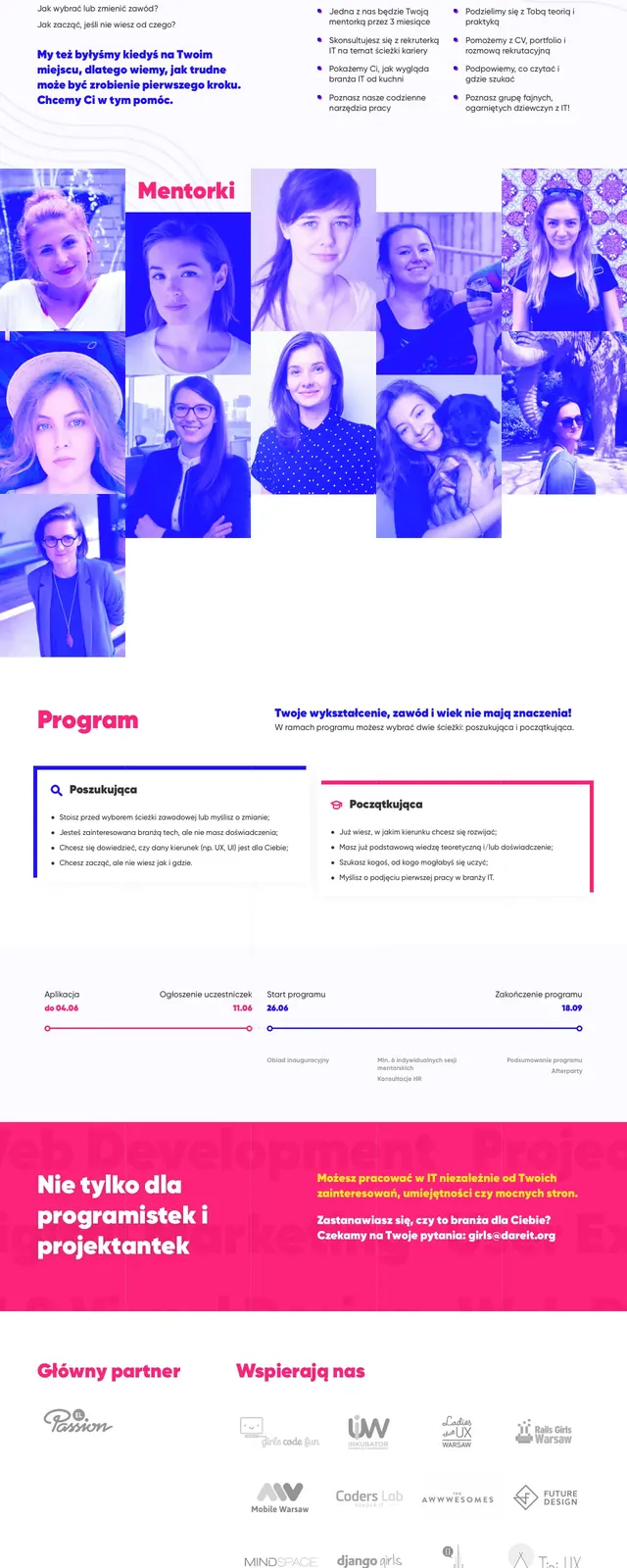
The top section is a split hero with a deep blue text panel on the left and a large magenta-tinted portrait on the right, surrounded by abstract blob shapes and playful accent marks. Below it, the page switches to a white background with an about section, a two-column program explanation, two bordered program cards, a horizontal timeline, and a FAQ list. Typography is large and rounded for headings, with smaller sans-serif body copy and strong pink and blue accents throughout.
Key takeaway
The strongest reusable idea is the high-contrast split hero with a human portrait and abstract graphic framing. The lower sections reuse the same color system to keep a community/program page energetic while still structured.
Reuse notes
Works well for nonprofit, education, or mentorship campaigns that need to feel approachable and modern. The combination of portrait-led hero, program choice cards, timeline, and FAQ is especially useful for application-driven landing pages.