Preview image. Unlock full-res
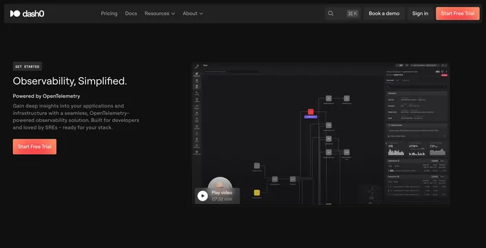
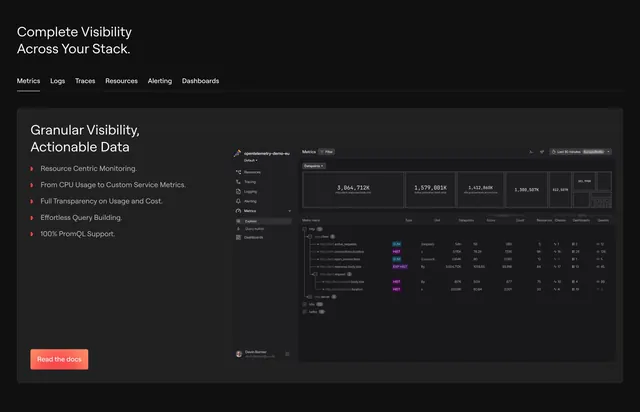
Dark features section with a top tab row and a split copy-plus-bullets layout beside a dense metrics-explorer screenshot.
Summary
A dark, developer-focused features section that pairs a horizontal category tab row with a split layout: a short headline and coral-bulleted benefit list on the left, a dense metrics-explorer screenshot on the right. The defining trait is the data-rich, monitoring-tool UI doing the persuading.
Visual description
An oversized two-line section title "Complete Visibility Across Your Stack." sits above an underlined tab row (Metrics, Logs, Traces, Resources, Alerting, Dashboards) spanning the full width. Below, a large dark panel splits into a left column with a secondary heading "Granular Visibility, Actionable Data", five short benefit lines each marked by a small coral diamond bullet, and a coral "Read the docs" button; the right side holds a detailed metrics explorer screenshot with summary stat cards, a hierarchical metric table showing SUM, HIST, and EXP HIST type badges, and per-row counts. Text is near-white on near-black with one consistent coral accent.
Key takeaway
Letting a horizontal tab row preview the product's full feature surface while the active view shows one genuinely dense, credible monitoring screenshot. The single coral accent across bullets, button, and badges keeps a data-heavy dark layout from feeling cold, and the small diamond bullets read as a deliberate brand mark.
Reuse notes
Default for developer tools and observability or analytics products where technical depth is the selling point. Needs a real, legible data UI; a fake-looking dashboard would undercut the audience. Only works on dark, and the bullet list should stay terse so it balances the screenshot's density.