Preview image. Unlock full-res
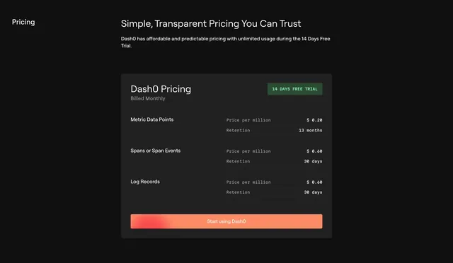
Dark single-panel usage pricing listing per-million rates and retention per data type with one full-width CTA.
Summary
A dark pricing section that rejects tiers in favor of one usage-based card listing a per-million price and retention period for each data type. The single transparent rate card is the defining idea.
Visual description
A small left-aligned "Pricing" label and an oversized headline "Simple, Transparent Pricing You Can Trust" with a short supporting line sit over a near-black background. Below, one dark rounded card titled "Dash0 Pricing / Billed Monthly" with a green "14 DAYS FREE TRIAL" badge in the corner. The card lists three usage rows (Metric Data Points, Spans or Span Events, Log Records), each with a monospaced "Price per million" figure and a "Retention" value, separated by faint dividers. A full-width coral gradient "Start using Dash0" button spans the bottom of the card. Numbers and rate labels are set in monospace for a precise, technical feel.
Key takeaway
Replacing a tier grid with a single honest usage-rate card when pricing is purely consumption-based, which feels transparent and removes plan-comparison friction. Setting all the figures in monospace reinforces the technical, no-tricks positioning, and the lone gradient CTA keeps the next step obvious.
Reuse notes
Best for usage-metered developer or data products where customers pay by volume rather than seats or tiers. Only works when pricing genuinely reduces to a few clear rates; complex plans would break the single-card clarity. Suits dark, technical brands and pairs naturally with a usage calculator if added later.