Preview image. Unlock full-res
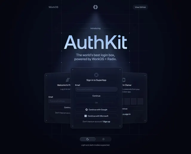
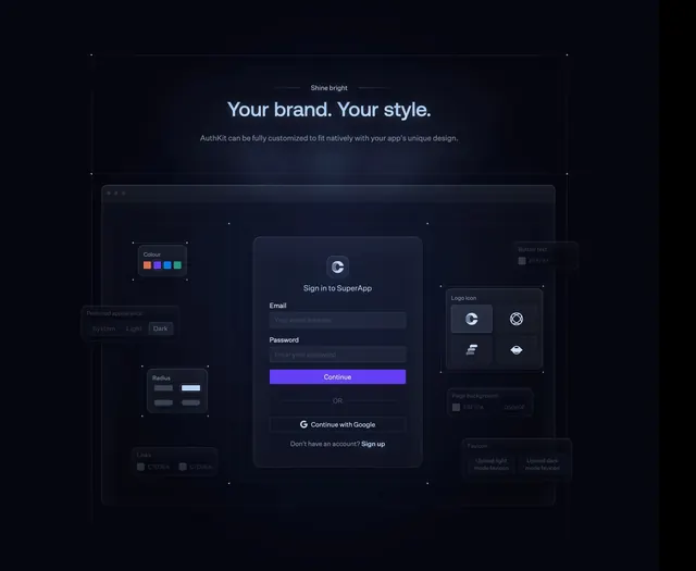
Dark feature section with a central login modal surrounded by floating glass config panels for colors, radius, logos, and appearance.
Summary
A centered AuthKit customization demo showing a SuperApp sign-in modal wired to surrounding theme controls for color, radius, logo, and light/dark appearance.
Visual description
Charcoal background with small overline "Shine bright", bold white headline "Your brand. Your style.", and gray subcopy about white-label auth. A large dark canvas frames a purple-accented login card with email/password fields, Continue button, Google SSO, and sign-up link. Semi-transparent panels orbit the modal: Colour swatches, Preferred appearance toggles (System/Light/Dark), Radius presets, Logo icon grid, hex inputs for button text and page background, Links color field, and Favicon upload buttons. Thin glowing connector lines link panels to the modal.
Key takeaway
Floating config panels around a live preview make abstract customization tangible without a settings screenshot tour. Glass panels plus connector lines read as a visual API diagram for non-technical buyers.
Reuse notes
Strong for embeddable widgets, auth, or any white-label SaaS. Requires wide layout; collapse panels below the preview on smaller screens.