Preview image. Unlock full-res
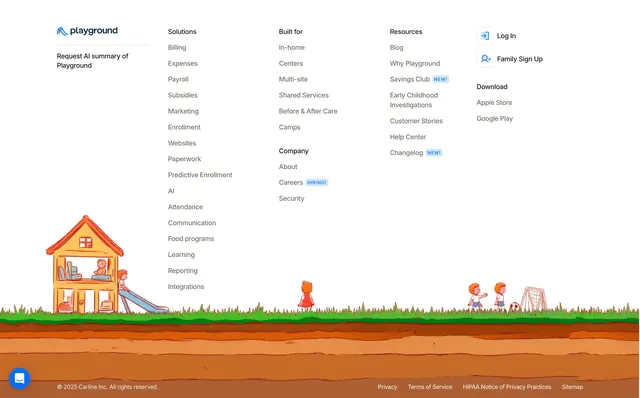
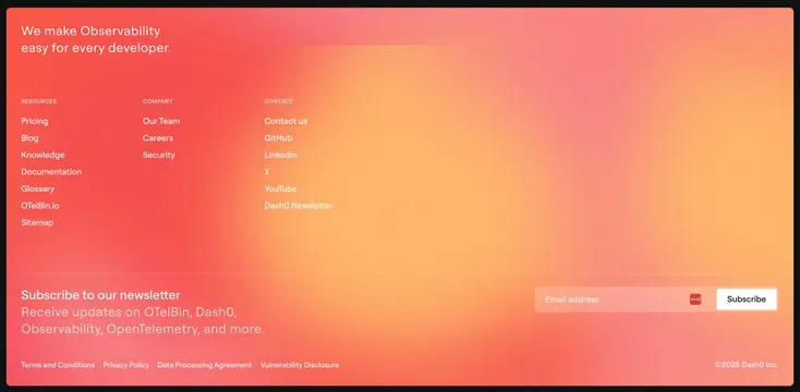
Full-bleed footer over a coral-to-peach gradient with three link columns, a tagline, and an inline newsletter signup.
Summary
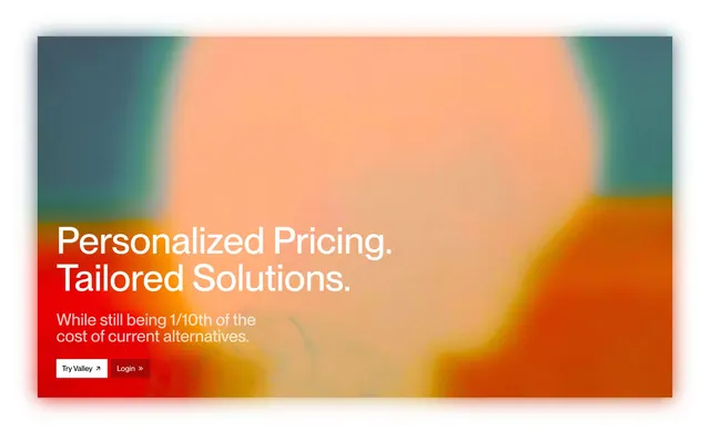
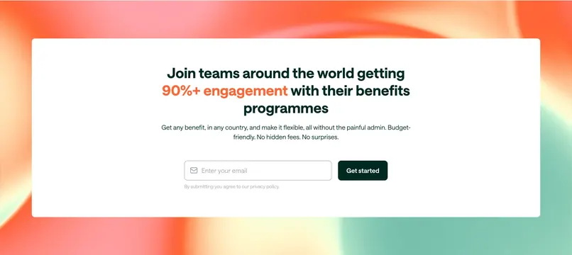
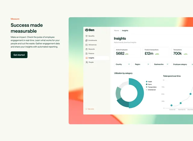
A full-bleed footer rendered over a warm coral-to-peach gradient, combining three white link columns, a large tagline, and an inline newsletter signup. The soft glowing gradient is the defining contrast to the brand's otherwise dark, technical pages.
Visual description
The footer fills the frame with a diagonal gradient flowing from red-coral at the lower left to warm peach at the upper right, framed by a thin black page border. Top left, an oversized two-line tagline "We make Observability easy for every developer." Beneath it, three labeled link columns (Resources, Company, Contact) in white text. A faint divider separates the upper area from a bottom band holding a "Subscribe to our newsletter" heading with supporting copy on the left and an inline email input plus a white "Subscribe" button on the right. A small legal row (Terms, Privacy, Data Processing Agreement, Vulnerability Disclosure) and a copyright line close the bottom edge.
Key takeaway
Using a single warm gradient to make the footer a memorable closing moment rather than a dark dead zone, while keeping all text white for legibility. Placing the newsletter input inline on the same warm field, opposite the tagline, integrates capture into the footer instead of bolting on a separate band.
Reuse notes
Good when you want the page to end on brand energy and warmth, especially for a developer product whose body is mostly dark. The gradient must stay high-contrast against white text or links become hard to read. Works as a full-bleed closer; the inline signup suits products actively building a newsletter audience.