Preview image. Unlock full-res
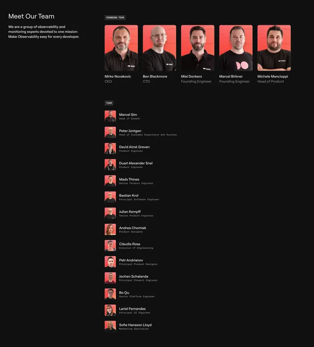
Dark team section with a left-aligned intro, a five-up row of founder cards on red-tinted portraits, and a long roster list below.
Summary
A dark team section that splits a left-aligned mission intro from a five-up row of large founder portraits, then drops into a long single-column roster of the rest of the team. The defining move is the warm red color wash applied uniformly across every portrait.
Visual description
Near-black background. Top left holds a "Meet Our Team" heading with two lines of muted mission copy. To its right, a small "FOUNDING TEAM" pill badge sits above five rounded portrait cards in a single row, each person shot against the same red-tinted backdrop, with name in white and role in grey beneath. Below, a "TEAM" pill badge introduces a vertical list of roughly fourteen smaller members, each a tiny red-tinted square avatar paired with a name in white and a job title set in small monospace grey type.
Key takeaway
The uniform red color grade across all portraits, which turns mismatched headshots into one cohesive system. The two-tier split between a featured five founders row and a compact monospace roster list lets you show a big team without overwhelming the layout.
Reuse notes
Strong for a developer-tool or observability brand that wants a human, credible team page on dark UI. The portrait color-grade trick is the key dependency: it only works if you can recolor every headshot to match. The monospace role labels reinforce a technical tone but reduce legibility at small sizes.