Preview image. Unlock full-res
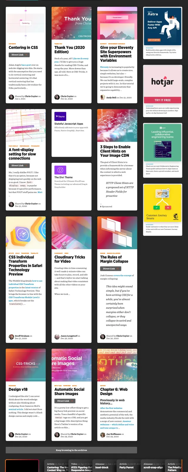
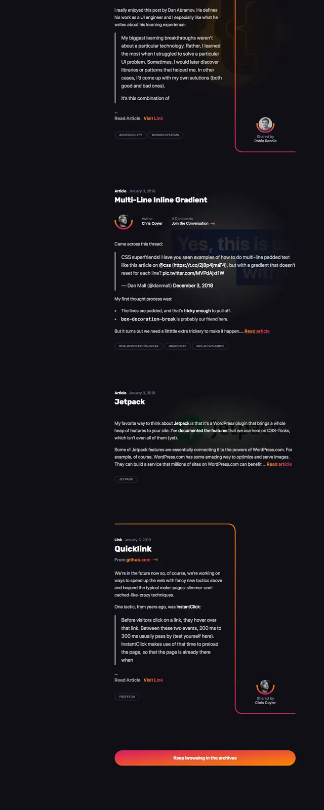
A dark, content-heavy homepage with a large editorial hero, article cards, and a newsletter CTA built around vivid orange-pink accents.
Summary
A dark, content-heavy homepage with a large editorial hero, article cards, and a newsletter CTA built around vivid orange-pink accents.
Visual description
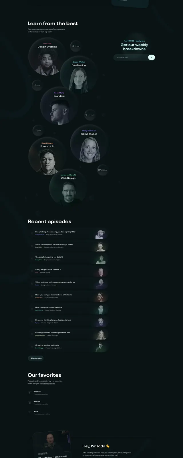
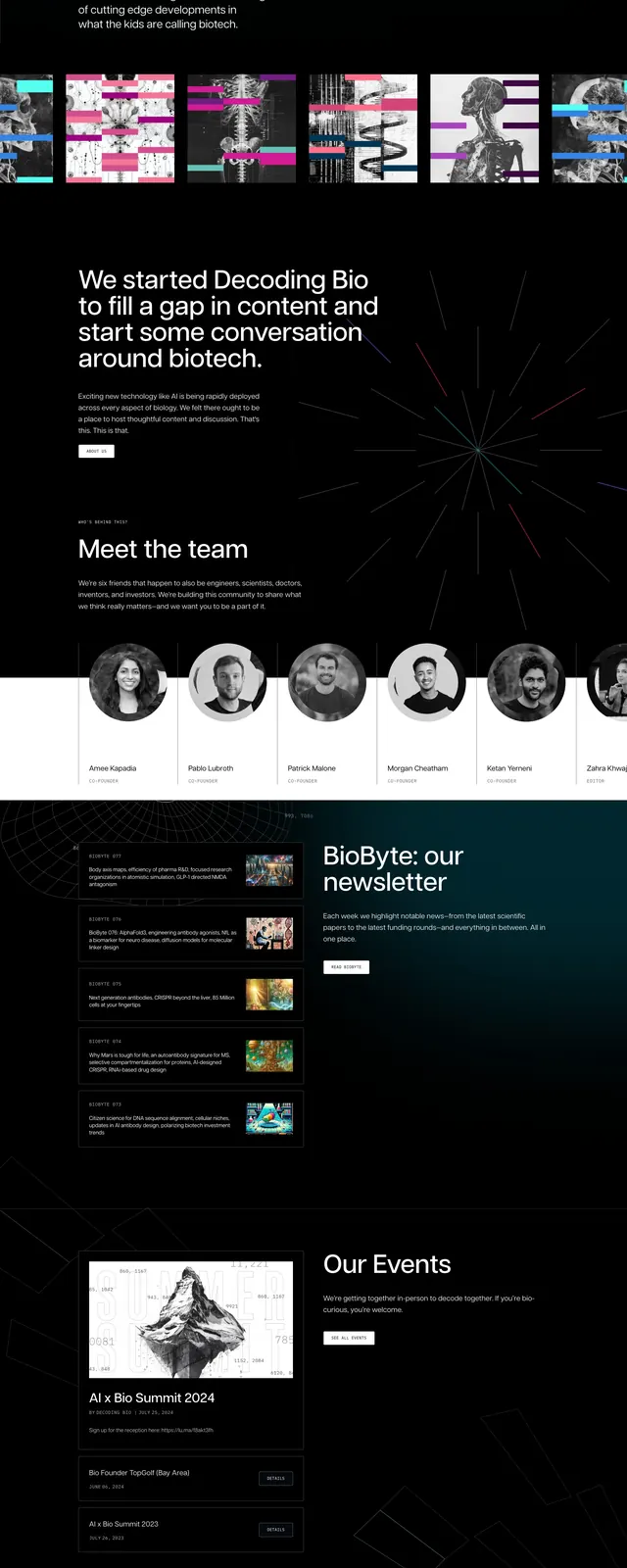
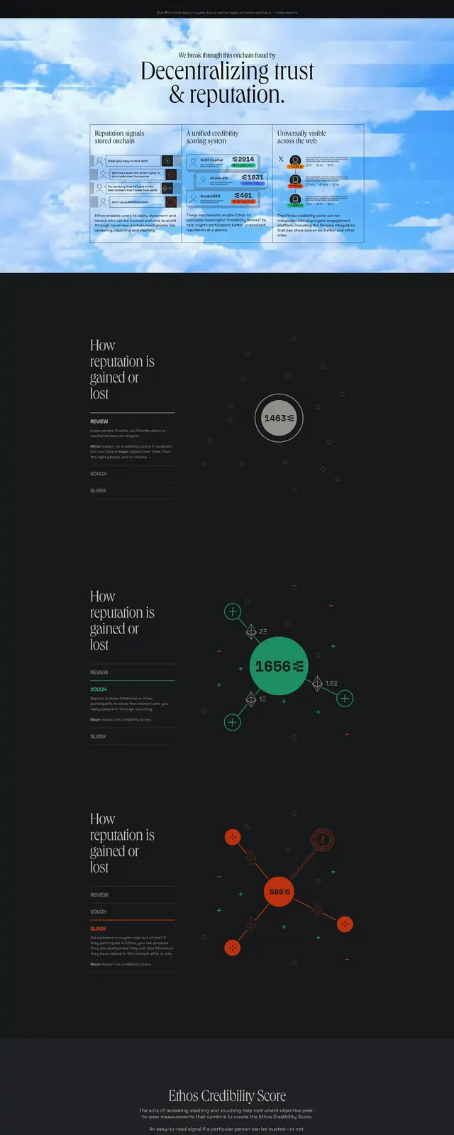
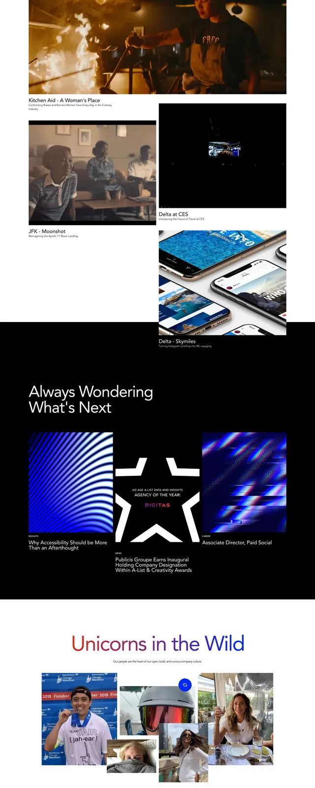
The page uses a nearly black background with thin warm gradient accents and a compact top navigation bar. The first screen features a large editorial headline, supporting copy, author details, and a subtle illustrated background treatment, followed by a row of article cards and a bright promotional tile. Lower on the page, a centered newsletter signup section uses a long rounded input and orange gradient button, then ends with a dark footer and sponsor logo cards.
Key takeaway
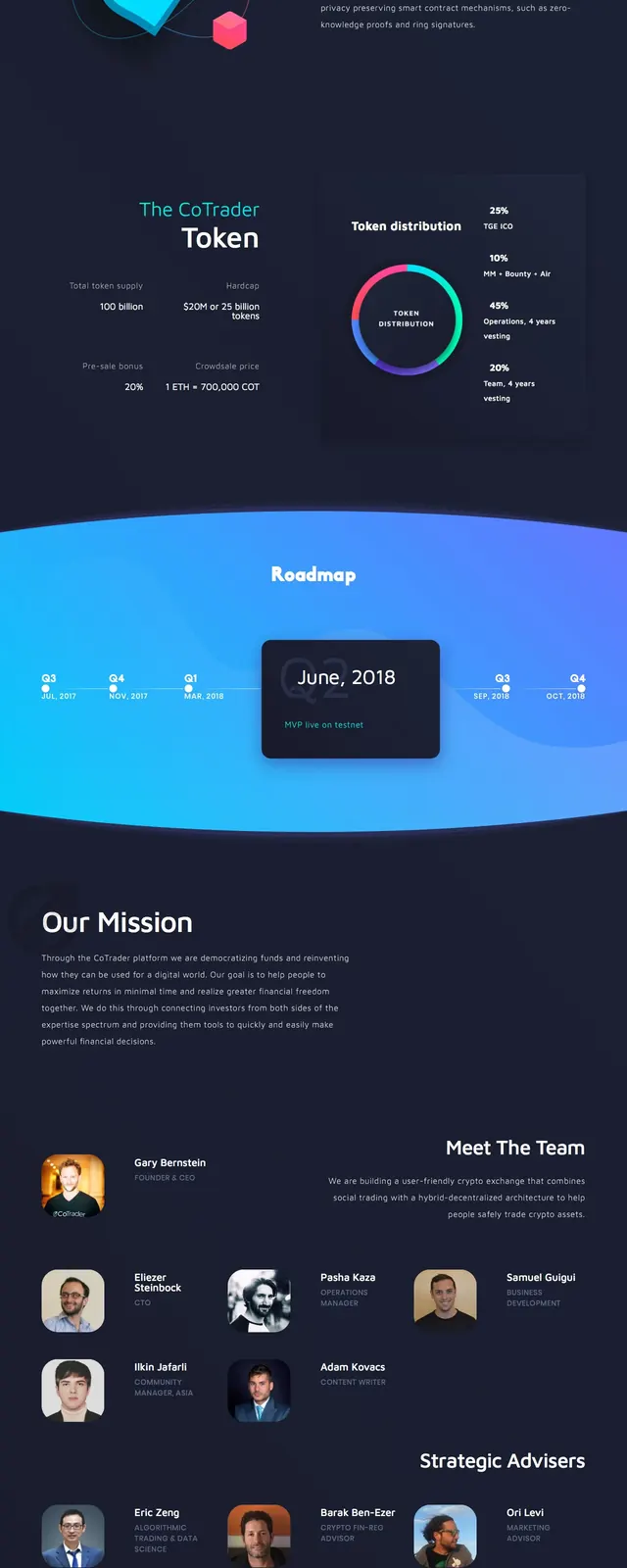
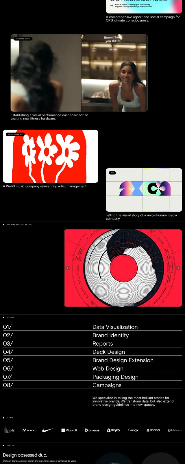
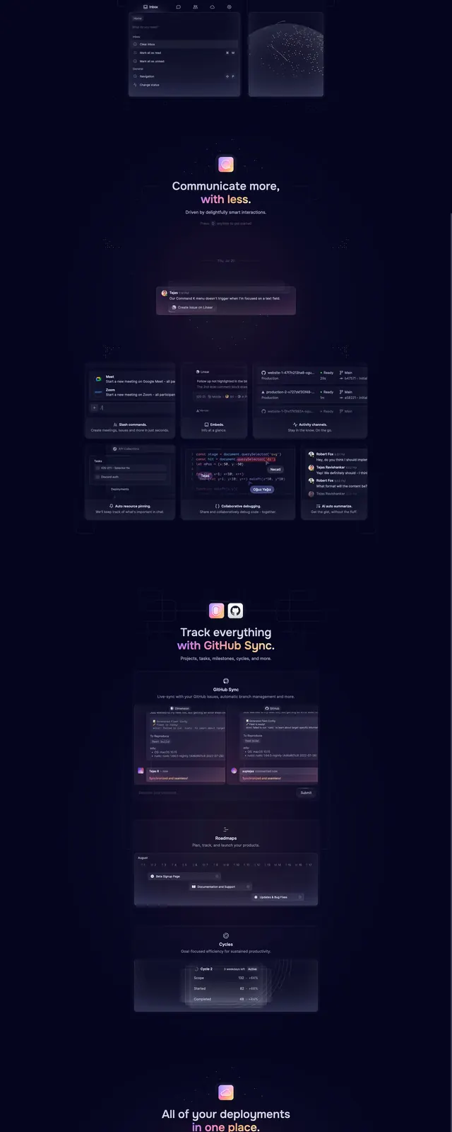
The strongest move is the contrast between a restrained dark canvas and vivid gradient highlights, which gives the content a polished, modern magazine feel. The layout is dense but still readable because the hierarchy is clear and the accent color is reserved for key actions and calls to read more.
Reuse notes
Use this pattern for content-rich editorial sites, developer publications, or blogs that need to feel premium without looking sterile. It works best when the page has many repeated cards, a strong newsletter CTA, and a small set of vivid brand accents against a dark background.