Preview image. Unlock full-res
A minimal, editorial landing page that pairs oversized typography with large photographic project and product imagery for an architectural acoustic brand.
Summary
A minimal, editorial landing page that pairs oversized typography with large photographic project and product imagery for an architectural acoustic brand.
Visual description
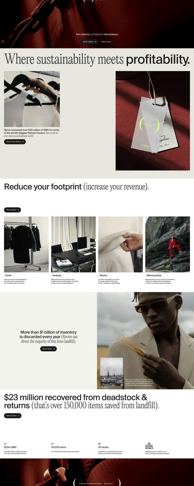
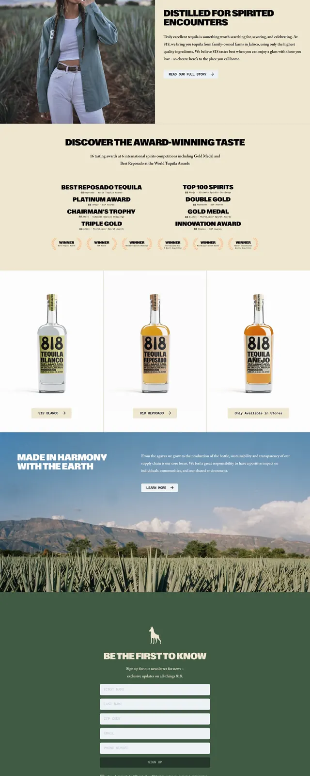
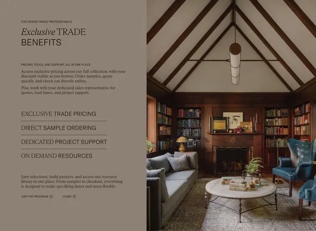
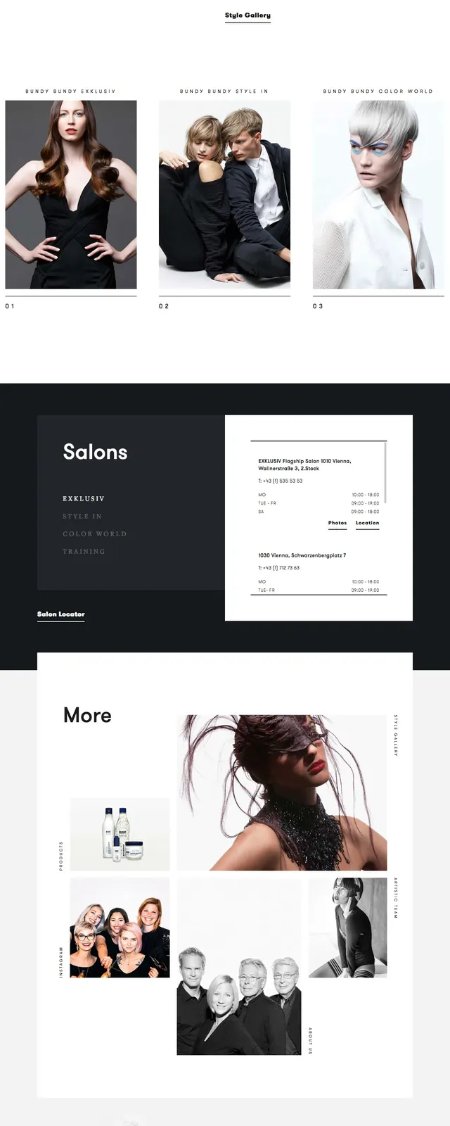
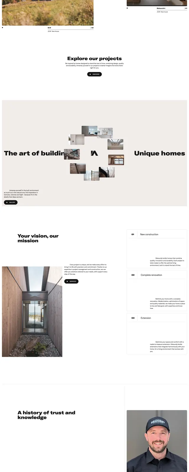
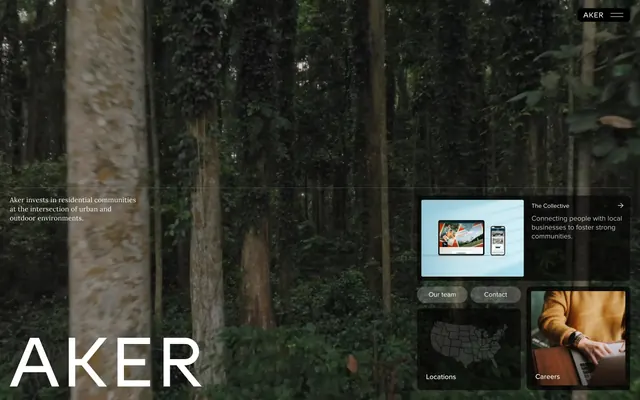
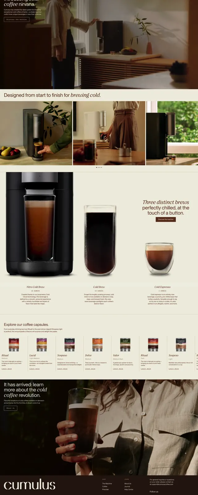
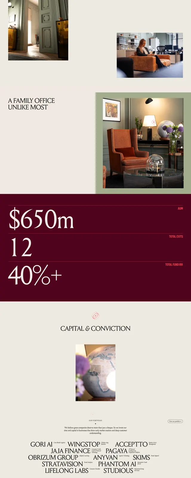
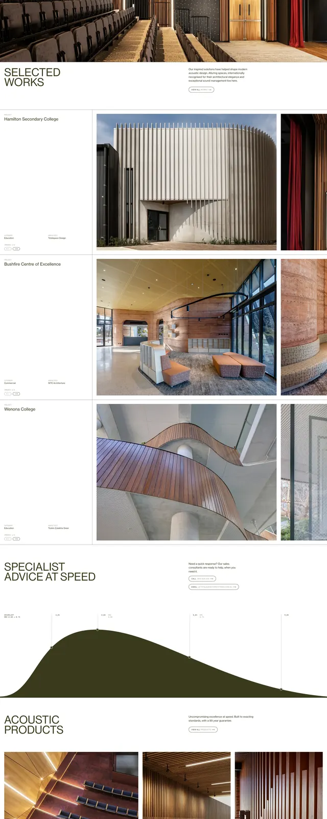
The page opens with a sparse top navigation and an oversized all-caps headline reading "ARCHITECTURAL ACOUSTIC SOLUTIONS" on a white background. A small supporting paragraph and a subtle outlined button sit beneath the hero text, with a large full-width interior photograph directly below. Further down, the layout shifts into editorial case-study rows and a three-column product/image grid with small captions and lots of whitespace. The imagery focuses on warm wood slats, acoustic installations, and architectural interiors in neutral, earthy tones.
Key takeaway
The main reuse pattern is the contrast between very large, restrained headline type and richly textured full-bleed photography. The page also shows how to present a product catalog or project archive in an editorial, high-end layout without heavy UI chrome.
Reuse notes
Useful for B2B brands that need to feel premium, design-led, and technically credible. Best when the visual assets are strong enough to carry the page, since the interface itself stays intentionally quiet.