Preview image. Unlock full-res
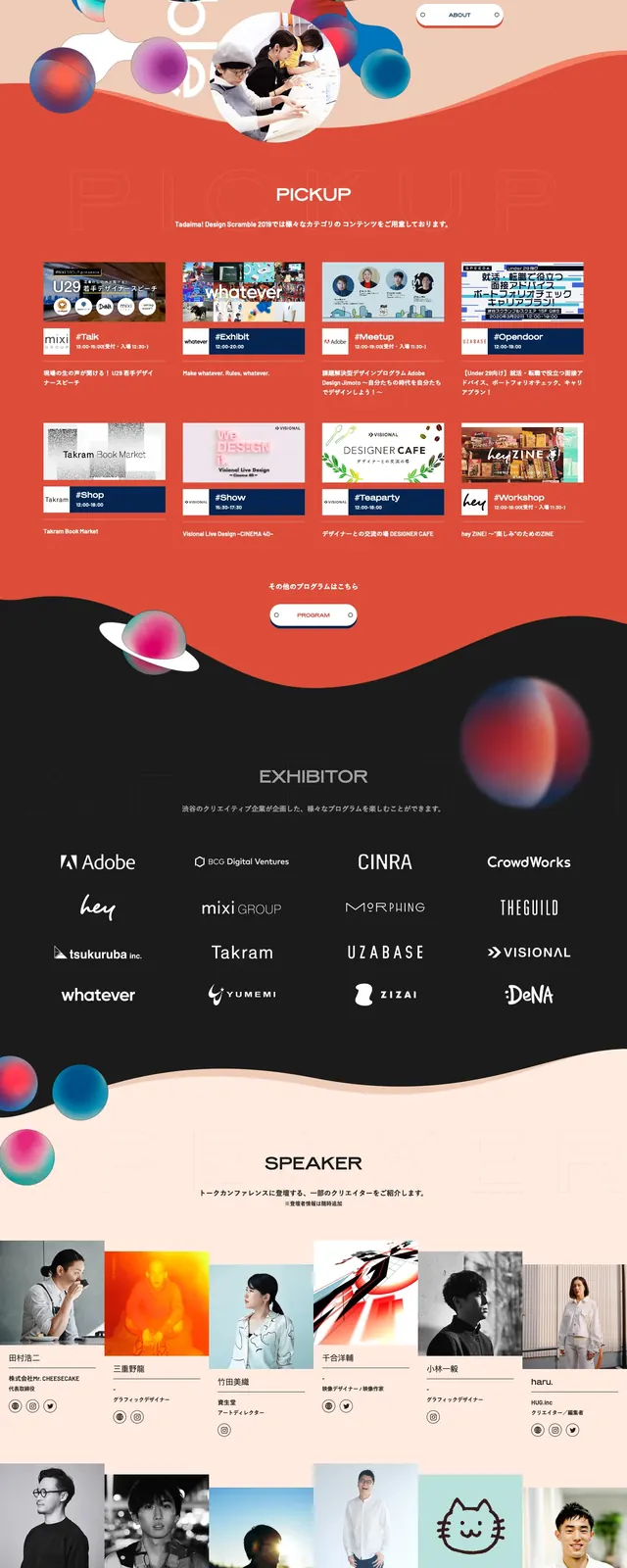
A maximalist event landing page hero with oversized layered typography, floating colorful spheres, and a bold dark-to-warm color split.
Summary
A maximalist event landing page hero with oversized layered typography, floating colorful spheres, and a bold dark-to-warm color split.
Visual description
The top slice shows a black navigation bar over a dark blue hero filled with floating glossy spheres, tilted geometric panels, and a central festival title lockup. The main headline is large, stacked, and highly stylized, with event date and time centered below it and a small pill-like ticket button in the header. Lower slices show a horizontal program strip, a black exhibitors section with a grid of logos, and a white sponsor section with a large centered event mark. A peach wave divider separates the dark and light sections.
Key takeaway
The page uses dense layering, saturated color, and playful 3D-like spheres to turn an event landing page into a poster-like composition. The contrast between the dark hero, red program band, and clean sponsor block creates strong section separation without losing energy.
Reuse notes
Useful for event promotions, design festivals, conferences, or cultural landing pages that need a memorable first impression. The approach works best when the content is short and the brand can support highly expressive typography and decorative graphics.