Preview image. Unlock full-res
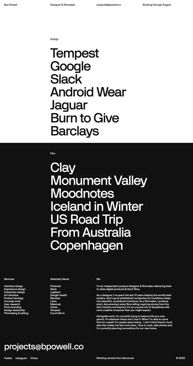
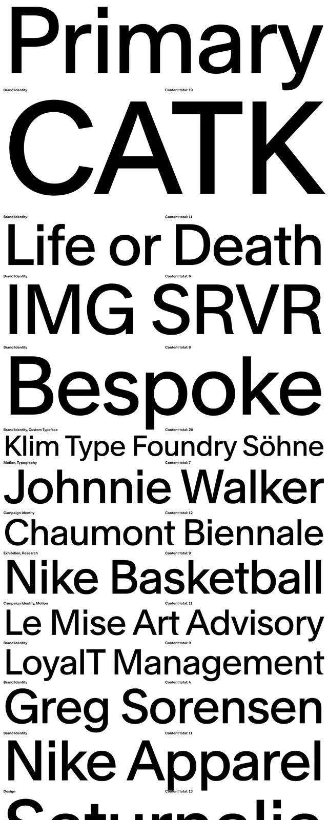
A stark editorial project index for Dia with huge black typography, minimal navigation, and dense stacked entries on a white field.
Summary
A stark editorial project index for Dia with huge black typography, minimal navigation, and dense stacked entries on a white field.
Visual description
The page opens with a black header band containing small white text, a short navigation row, and contact information aligned in the corners. Below it, the main content is a long vertical list of projects on a white background, each entry dominated by an oversized black project name such as Squarespace, MoMA It Wasn't Written, The Beat, and IMG SRVR. Small category labels and content counts sit near each title, creating a sparse but highly structured editorial grid.
Key takeaway
The design relies on extreme type scale contrast and very little decoration to make the index feel authoritative and visually memorable. Repeated labels and counts turn a simple list into a browsable archive.
Reuse notes
Use this pattern for portfolio directories, case-study archives, or editorial catalogs where typography needs to carry the interface. It works best when the content names are strong and the goal is fast scanning rather than imagery-led presentation.