Preview image. Unlock full-res
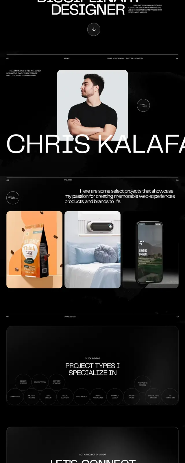
A monochrome personal portfolio page with oversized typography, dense project listings, and stark editorial spacing.
Summary
A monochrome personal portfolio page with oversized typography, dense project listings, and stark editorial spacing.
Visual description
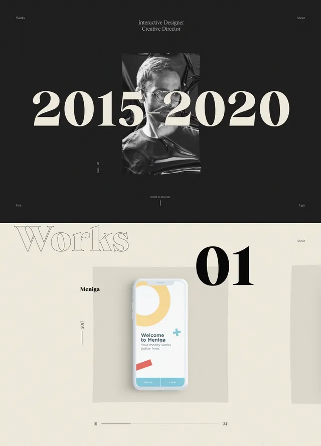
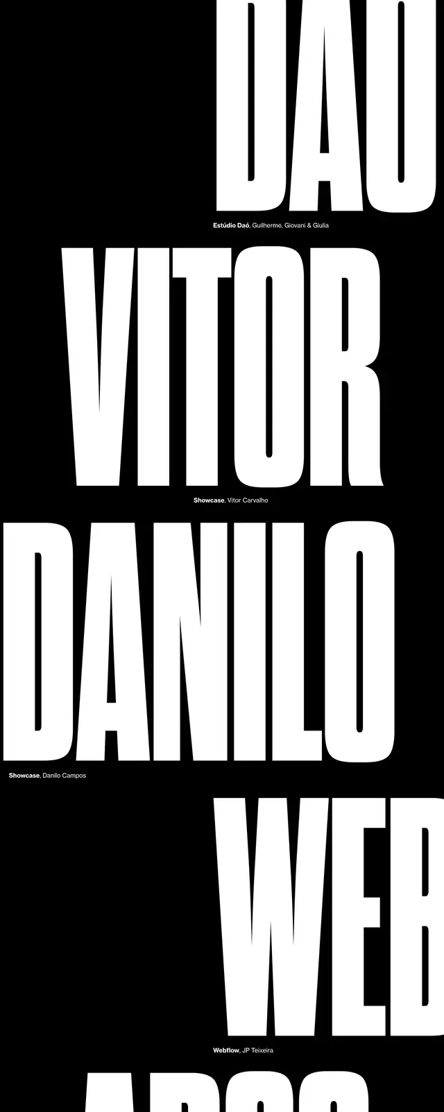
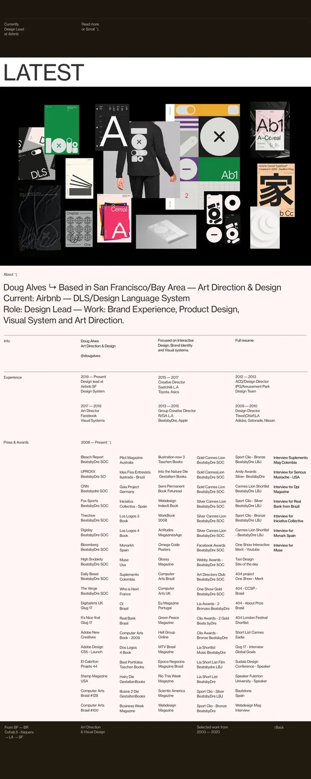
The page uses a restrained black, white, and gray palette with large whitespace, thin rules, and compact text blocks. The first screen combines a small top navigation, an about/info area, a small preview image, and a huge cropped name wordmark that dominates the composition. Lower sections shift into a structured project list with numbered rows, tag pills, and a dense awards block with oversized overlapping typography, followed by a sparse contact area and a dark closing section. The overall look is highly editorial and data-driven, with strong contrast between delicate text details and massive display headings.
Key takeaway
This layout pairs a personal portfolio with magazine-like presentation, using scale contrast to make a simple content structure feel striking. The reusable pattern is a clean hero plus dense index-style sections for projects and achievements.
Reuse notes
Best reused for portfolio homepages, creative director sites, and resumes-with-identity where credibility and personality both matter. The strongest borrowable elements are the oversized name treatment, numbered project list, and minimal black-and-white system with thin dividers.