Preview image. Unlock full-res
A bold editorial landing page for Crsl built from oversized typography, stacked imagery, and sparse black-and-white framing.
Summary
A bold editorial landing page for Crsl built from oversized typography, stacked imagery, and sparse black-and-white framing.
Visual description
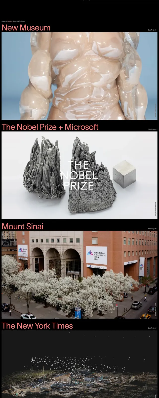
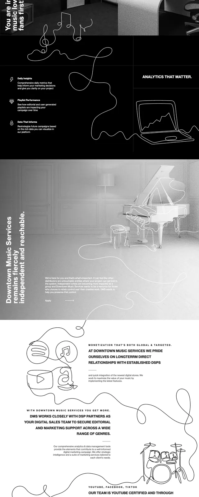
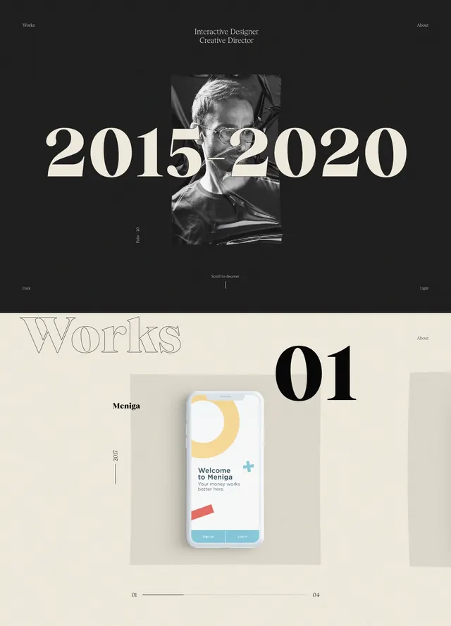
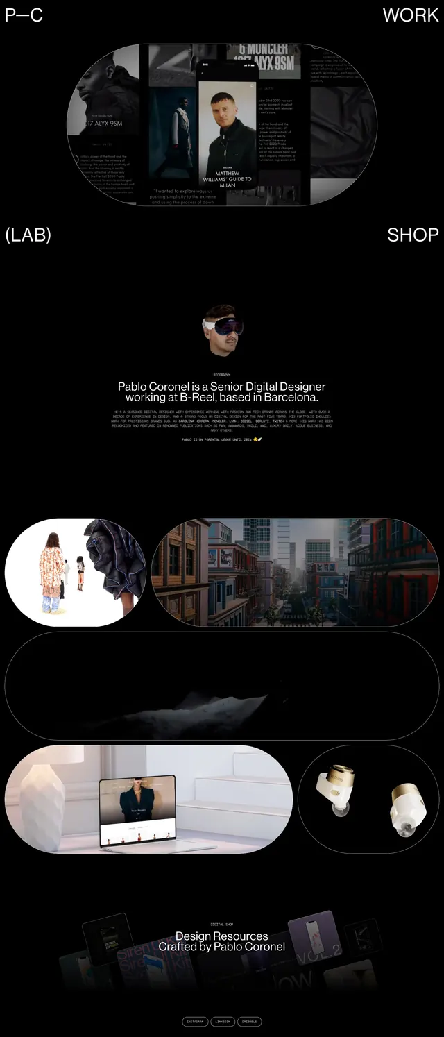
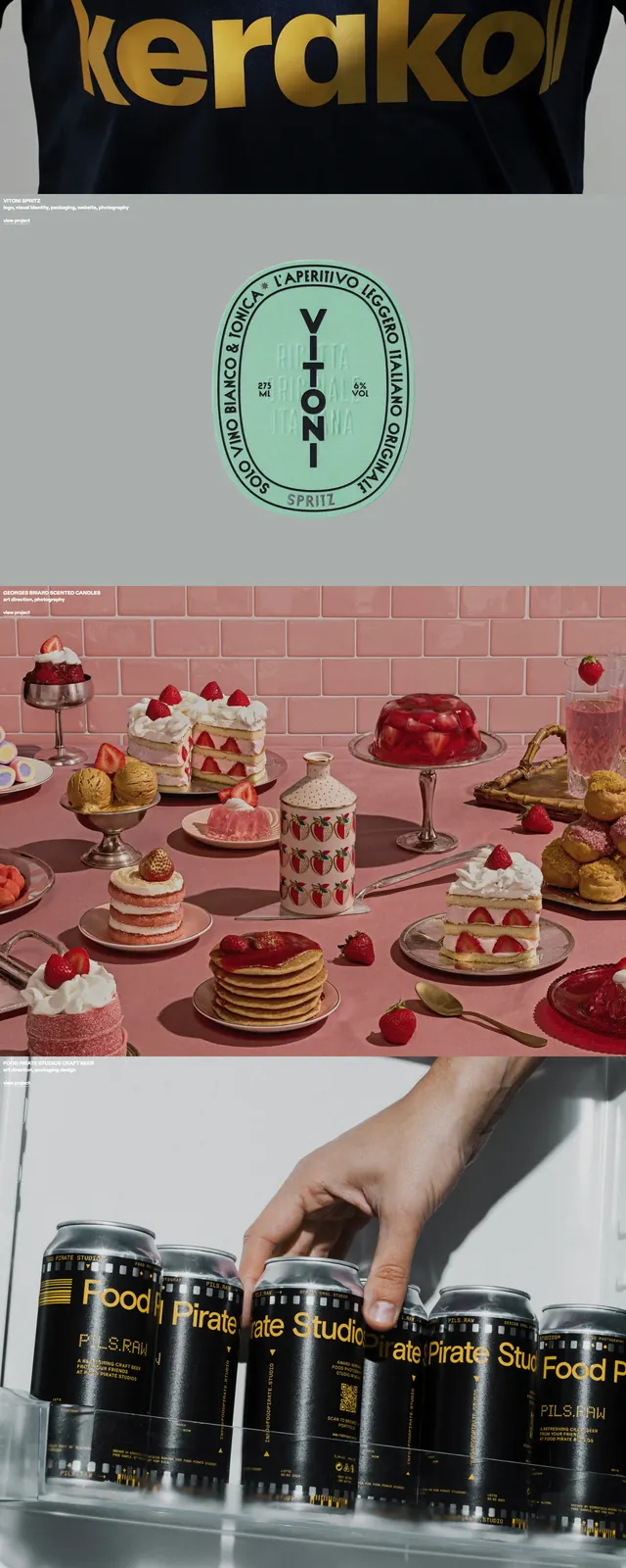
The page opens and closes with huge black CRSL lettering on an off-white background, creating a stark editorial frame. Between those bookends are stacked full-width visual sections: a dark photographic hero image, a pink dessert still life, and a lower strip of graphic tiles and small text. Navigation and utility text are tiny and minimal, leaving the imagery and typography to dominate the composition.
Key takeaway
Use oversized brand lettering as a recurring structural device rather than a one-time logo treatment. Pair that with restrained navigation and full-bleed imagery to make a portfolio or agency site feel curated and high-end.
Reuse notes
This pattern works well for creative studios, branding agencies, and portfolio sites that want a strong art-direction-led first impression. It depends on strong imagery and confident typography, so it is less effective for content-heavy or utility-first pages.