Preview image. Unlock full-res
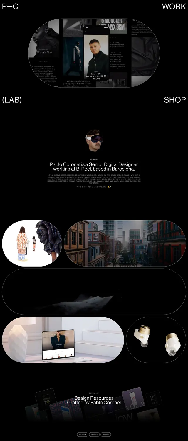
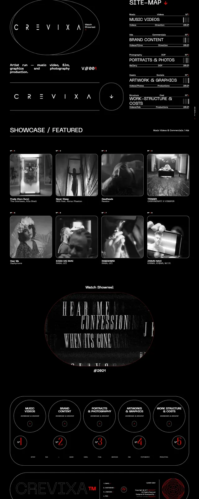
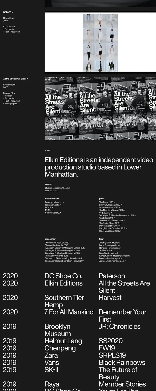
A dark, monochrome portfolio page built around oversized typography, a featured project image, and dense editorial information blocks.
Summary
A dark, monochrome portfolio page built around oversized typography, a featured project image, and dense editorial information blocks.
Visual description
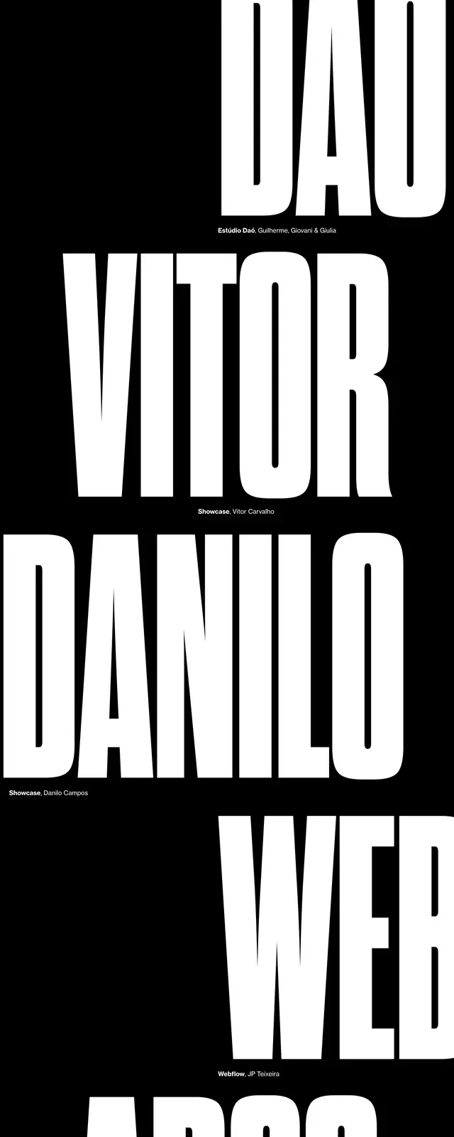
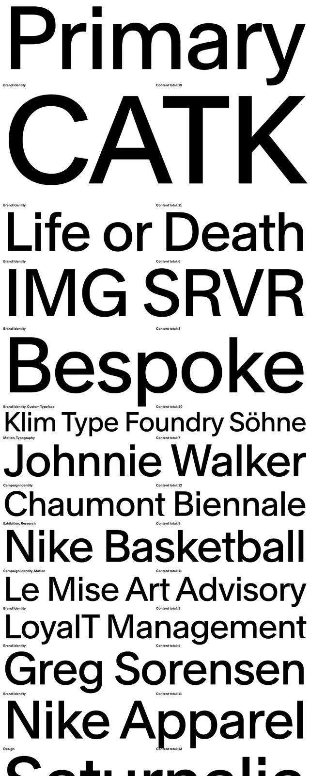
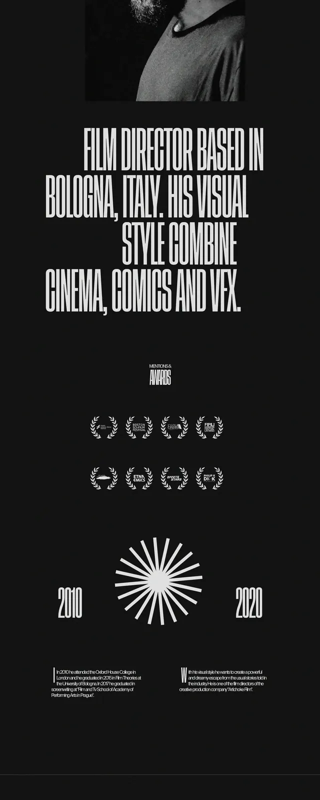
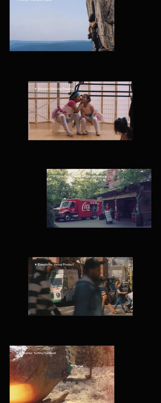
The page uses a black background with white text and a huge cropped wordmark that dominates the top of the screen. A thin navigation sits along the top edge, followed by a featured project area with a large grayscale image strip and a small project caption in the left column. Lower sections shift into compact editorial blocks: an about statement, contact and credits, lists of exhibitions and press, and a long chronological work index arranged in columns.
Key takeaway
The strongest move is the extreme typographic scale combined with tight editorial spacing, which makes the portfolio feel authoritative and art-directed. The monochrome treatment keeps the dense content readable while preserving a gallery-like tone.
Reuse notes
Useful for portfolio sites, studio bios, and art-direction heavy pages where the work needs to feel curated rather than sales-driven. It works best when you have strong imagery and a substantial amount of structured content to organize into columns.