Preview image. Unlock full-res
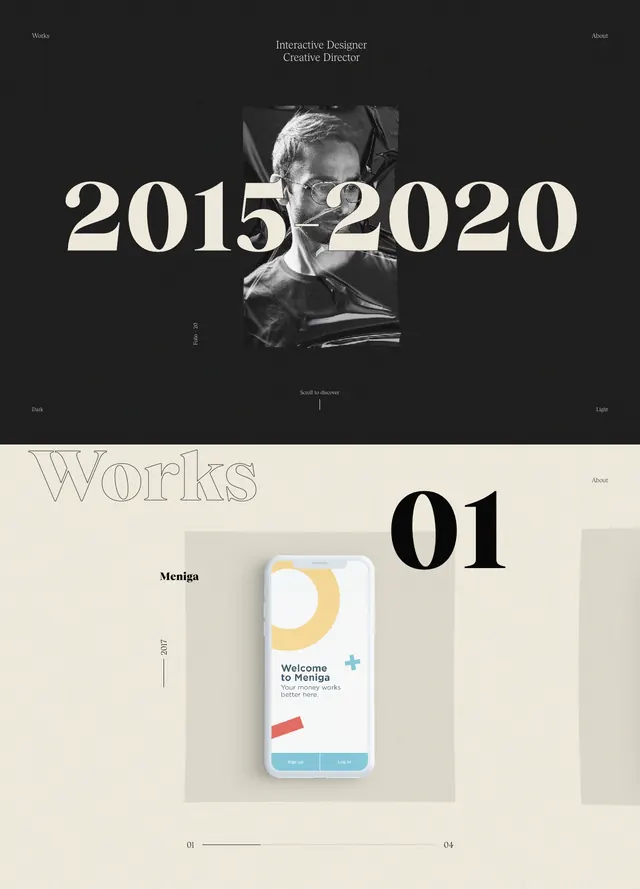
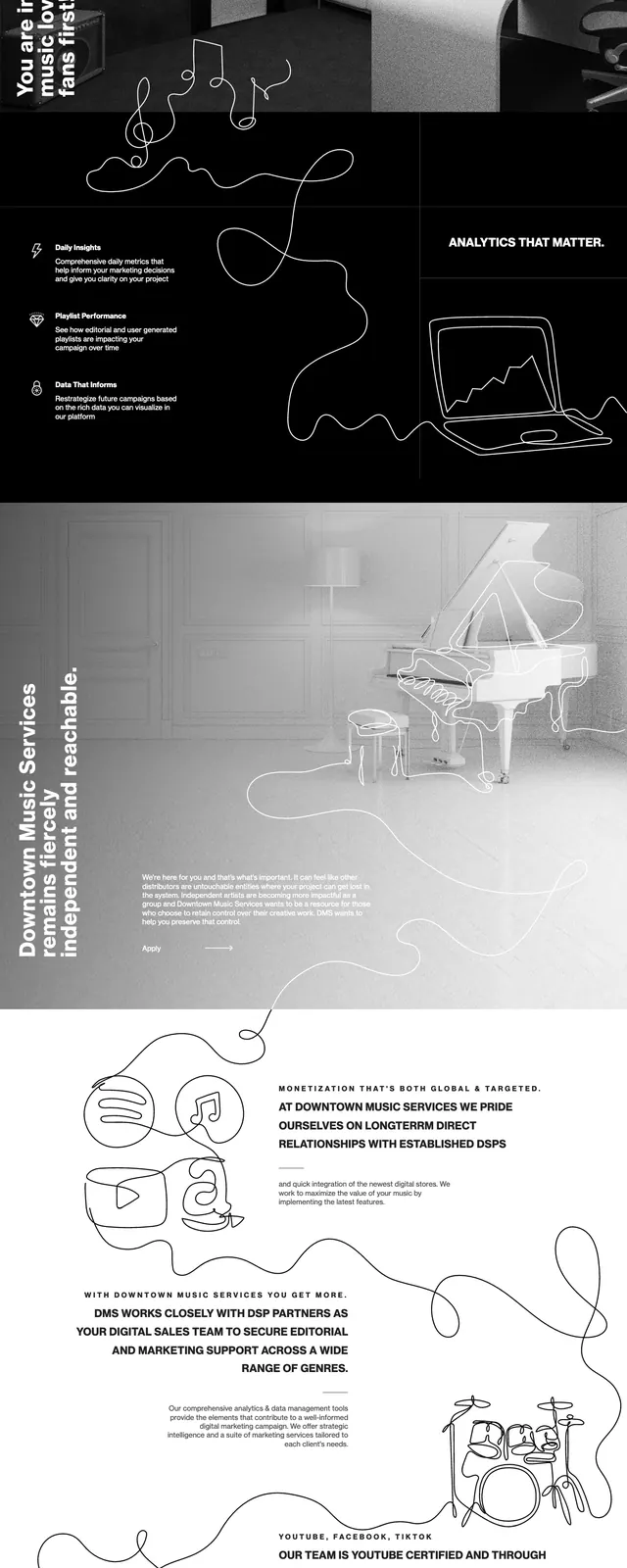
A stark editorial homepage with oversized custom typography, monochrome imagery, and magazine-style content blocks on a black-and-white canvas.
Summary
A stark editorial homepage with oversized custom typography, monochrome imagery, and magazine-style content blocks on a black-and-white canvas.
Visual description
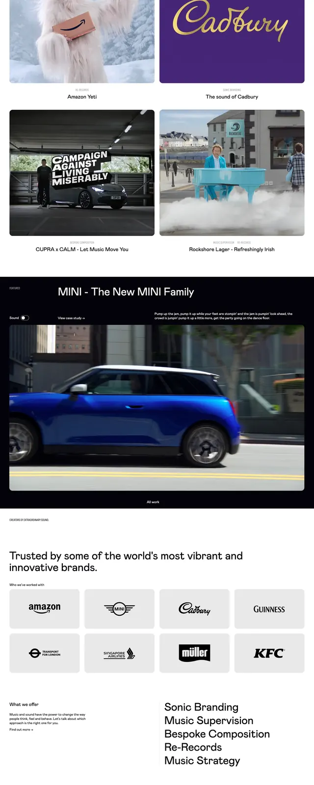
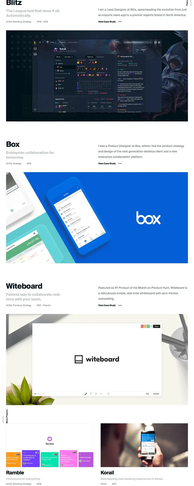
The page opens with a full-width black hero featuring a giant custom wordmark built from three blocky letterforms and an embedded architectural image. Below it, the layout shifts into a clean editorial structure with narrow text columns, large grayscale feature imagery, and spacious white margins. Further down, bold visual cards and article previews are arranged in a grid, followed by a dark footer-like sign-up area. The overall composition relies on strong contrast, cropped photography, and magazine-inspired hierarchy.
Key takeaway
Use oversized typography, minimal navigation, and dramatic image treatment to create a high-end editorial feel. The design depends on contrast and whitespace to make mixed media content feel curated rather than crowded.
Reuse notes
This pattern works well for publications, culture brands, or creative portfolios that want to feel selective and art-directed. Reuse the hero-plus-grid structure when you need to balance strong branding with multiple story teasers.