Preview image. Unlock full-res
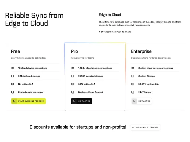
Light three-column pricing with a display heading, icon feature rows, and a gradient-bordered highlighted Pro plan.
Summary
A light three-tier pricing section with a bold left heading and a supporting blurb, where the middle Pro card is lifted by a soft gradient border.
Visual description
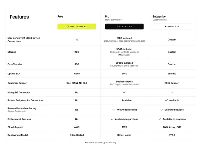
White background. The top-left holds "Reliable Sync from Edge to Cloud" in a bold technical display face; the top-right holds a smaller "Edge to Cloud" block with two lines of copy and an "INTERESTED IN PEER-TO-PEER?" text link with a small glyph. Below, three pricing cards sit in a row: Free, Pro, and Enterprise, each with a name, a one-line description, and four feature rows carrying small line icons (cloud device connections, included storage, uptime SLA, customer support). The Pro card is outlined with a faint blue-to-amber gradient border to mark it as recommended. CTAs differ per tier: a filled lime "START BUILDING FOR FREE" pill on Free, a black "CONTACT US" on Pro, and a light "CONTACT US" on Enterprise. A centered line below reads "Discounts available for startups and non-profits!" beside an outlined "SET UP A CALL TO DISCUSS" ghost button.
Key takeaway
The faint gradient border singling out the Pro plan instead of a filled background or a loud badge, keeping all three cards visually equal in weight but clear in priority. The standalone startup/non-profit discount line under the grid catches a whole audience the three tiers do not name.
Reuse notes
Good for a developer or infrastructure SaaS with a free entry tier, a team tier, and a contact-sales enterprise tier. The consistent line icons per feature row make the three plans easy to scan side by side. The gradient border is subtle, so it should be the only highlight cue rather than competing with badges.
More pricing sections
See all











More like this


Keep what you find
A free account saves references to boards and can send you a weekly email of picks based on what you save.
To see every result, go Pro.