Preview image. Unlock full-res
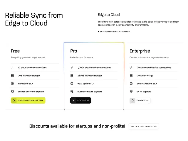
Light four-column pricing comparison table with sticky plan headers, CTA buttons, and a long feature-by-feature breakdown.
Summary
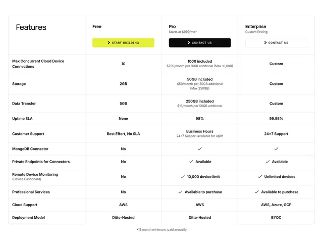
A light, detailed plan comparison table whose first column lists features and three plan columns (Free, Pro, Enterprise) carry their CTA buttons in the header.
Visual description
White background, thin row dividers. The header row has "Features" in bold on the left and three plan columns: Free with a lime "START BUILDING" button, Pro ("Starts at $999/mo*") with a black "CONTACT US" button, and Enterprise ("Custom Pricing") with an outlined "CONTACT US" button. Below run eleven feature rows: Max Concurrent Cloud Device Connections, Storage, Data Transfer, Uptime SLA, Customer Support, MongoDB Connector, Private Endpoints for Connectors, Remote Device Monitoring, Professional Services, Cloud Support, and Deployment Model. Cells hold either plain values (10, 2GB, AWS, Custom), tier notes ("$750/month per 1000 additional"), or check icons for boolean features. A centered footnote reads "*12 month minimum, paid annually".
Key takeaway
Placing each plan's CTA button directly in the comparison header, so a buyer can act from the moment they pick a column without scrolling back to cards. Mixing exact values, overage notes, and checkmarks in the same matrix keeps a dense feature comparison readable.
Reuse notes
This is the deep-dive companion to a card-based pricing block: reach for it when buyers need to compare quotas, connectors, and deployment options line by line. It pairs well placed below a simpler three-tier card section. Keep row labels short and reuse one accent color (here lime) only on the recommended free/entry CTA so the table does not get noisy.
More pricing table sections
See all


More like this

Keep what you find
A free account saves references to boards and can send you a weekly email of picks based on what you save.
To see every result, go Pro.