Preview image. Unlock full-res
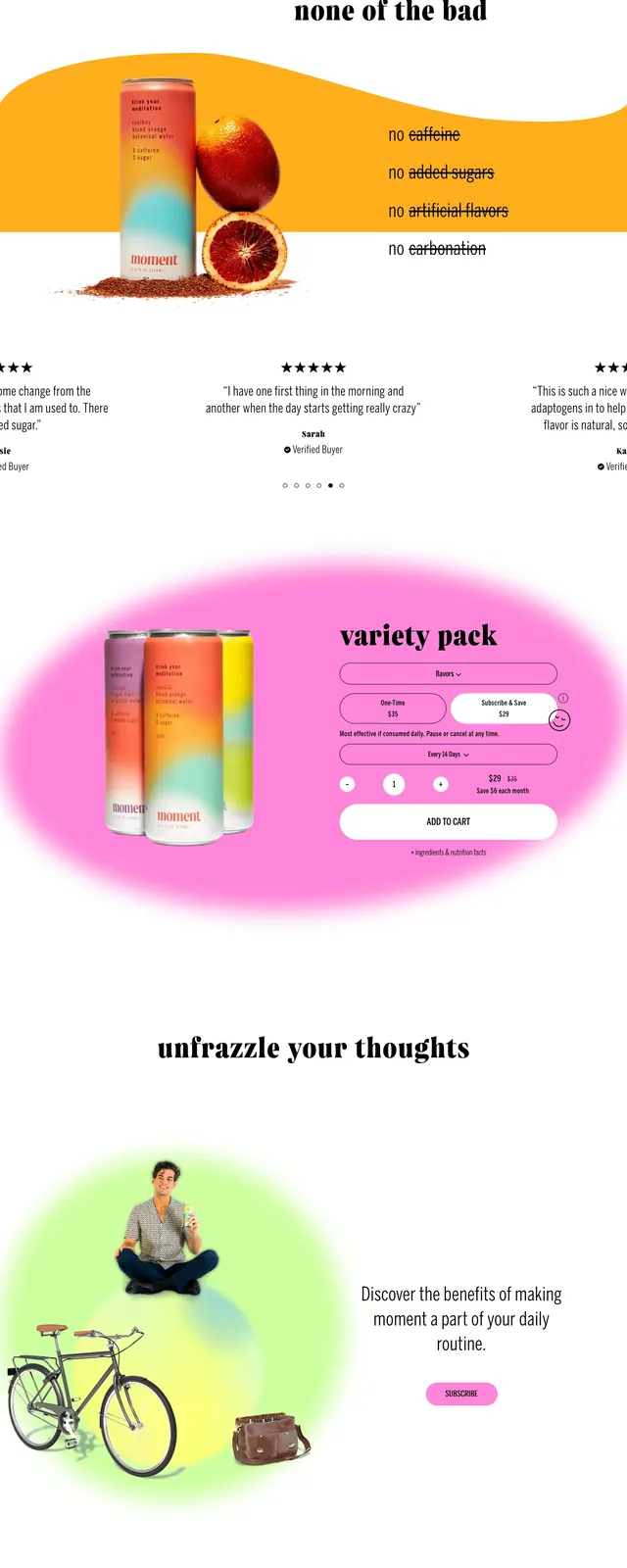
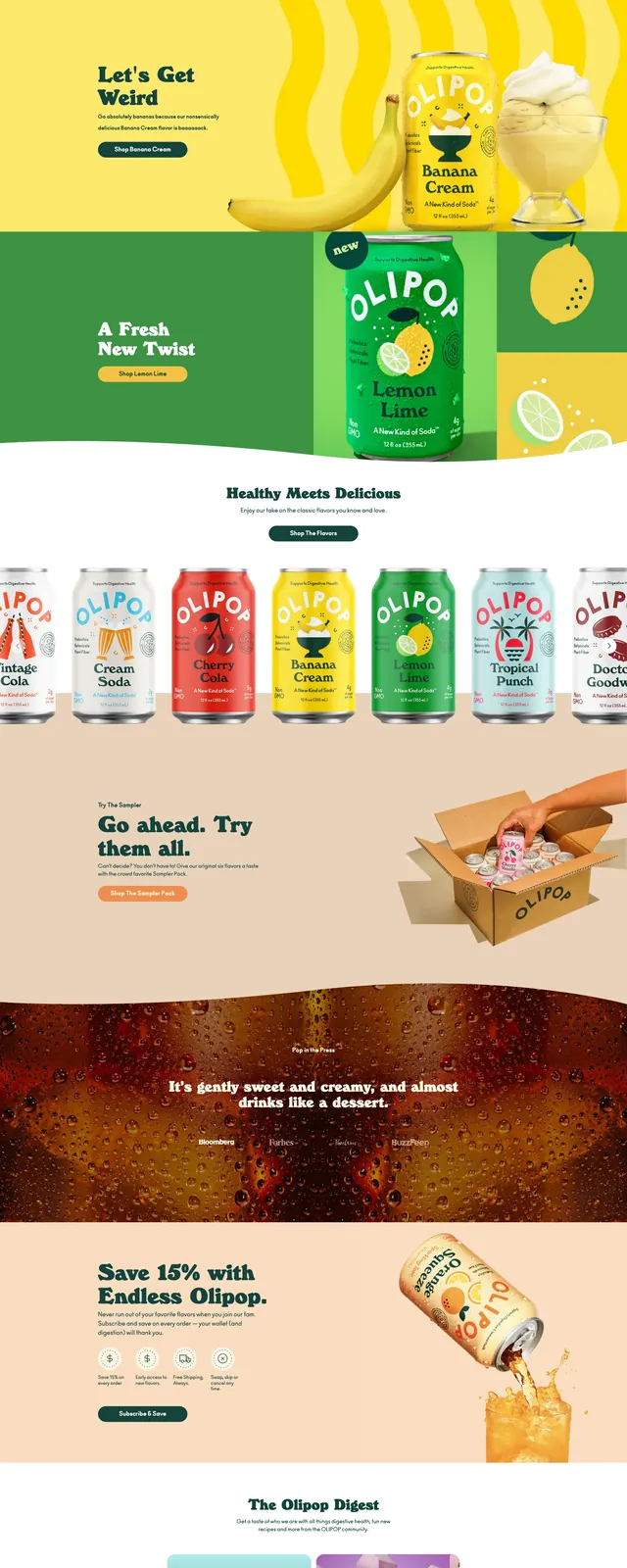
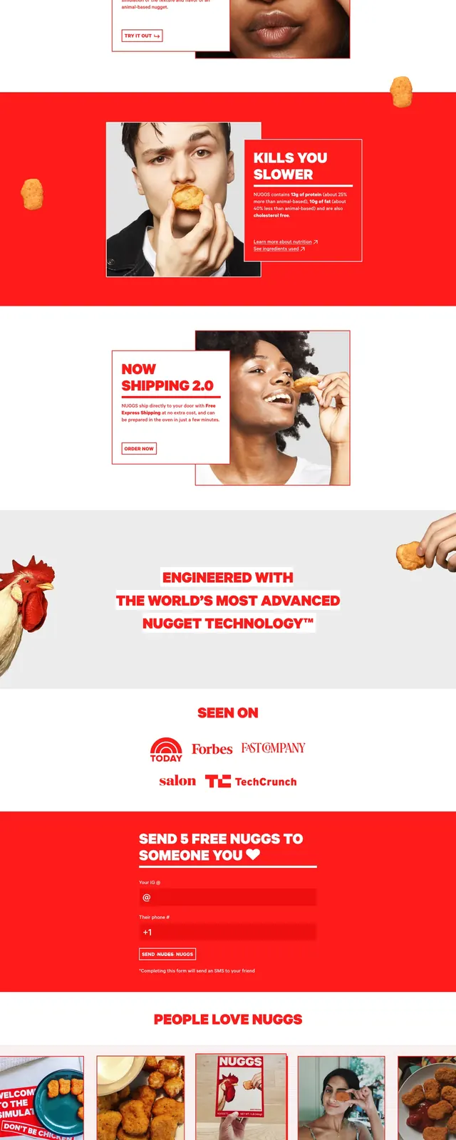
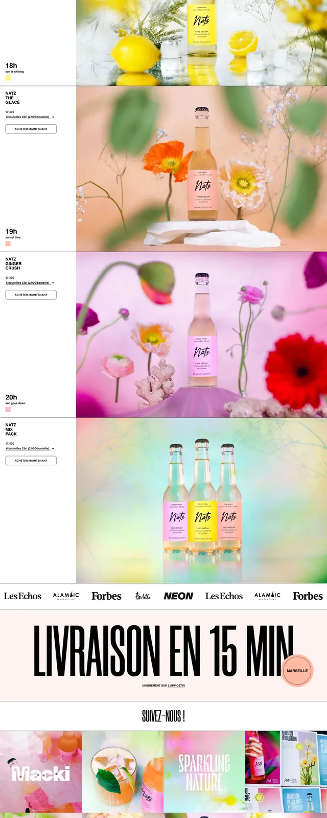
A tall landing page for Drinknatz combines oversized editorial typography, pastel product photography, and bold promotional sections for a playful beverage brand.
Summary
A tall landing page for Drinknatz combines oversized editorial typography, pastel product photography, and bold promotional sections for a playful beverage brand.
Visual description
The page opens with a giant all-caps headline over a clean white header and a bright floral product scene featuring several bottled drinks. Below, three centered stat counters highlight alcohol, calories, and sugar in a simple horizontal strip. Further down, the layout alternates between narrow text-and-button blocks on the left and large product imagery on the right, with pastel gradients, flowers, and bottle photography. A repeating banner and a recycling-focused section near the bottom continue the light, colorful editorial presentation.
Key takeaway
The design relies on oversized typography and luminous product photography to make a beverage brand feel fresh, expressive, and premium. It balances minimal structure with playful color and floral styling, making it easy to adapt for lifestyle consumer packaging pages.
Reuse notes
Reuse the oversized headline plus stat-bar pattern for a strong first-screen hero on product landing pages. The split layout with compact copy on one side and large imagery on the other works well for highlighting variants, benefits, or sustainability messaging.