Preview image. Unlock full-res
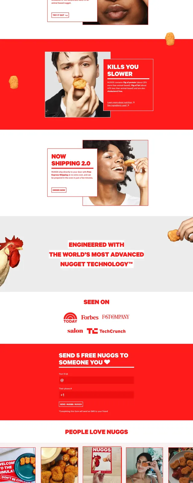
A playful full-page food brand landing page that uses oversized red type, cutout nugget imagery, and stacked content cards to market a chicken nugget product.
Summary
A playful full-page food brand landing page that uses oversized red type, cutout nugget imagery, and stacked content cards to market a chicken nugget product.
Visual description
The page opens with a mostly white hero area filled with floating nugget cutouts around a centered, oversized red headline and a bold red subheadline banner. Below that are overlapping content cards pairing short copy with close-up product photos of people holding nuggets near their faces. Further down, the page switches into a red section with a large centered statement, followed by a seen-on logo row, testimonial cards, a release-notes block, and a minimal footer.
Key takeaway
The strongest move is the absurdly literal product storytelling: floating food imagery, loud red typography, and boxed layouts make the brand feel memorable and self-aware. The design also shows how to mix playful hero art with structured marketing sections without losing clarity.
Reuse notes
Reuse this approach for consumer brands that want a quirky, high-energy identity with strong product emphasis and social proof. It works best when the photography is bold and the brand can support a saturated red-led visual system.