Preview image. Unlock full-res
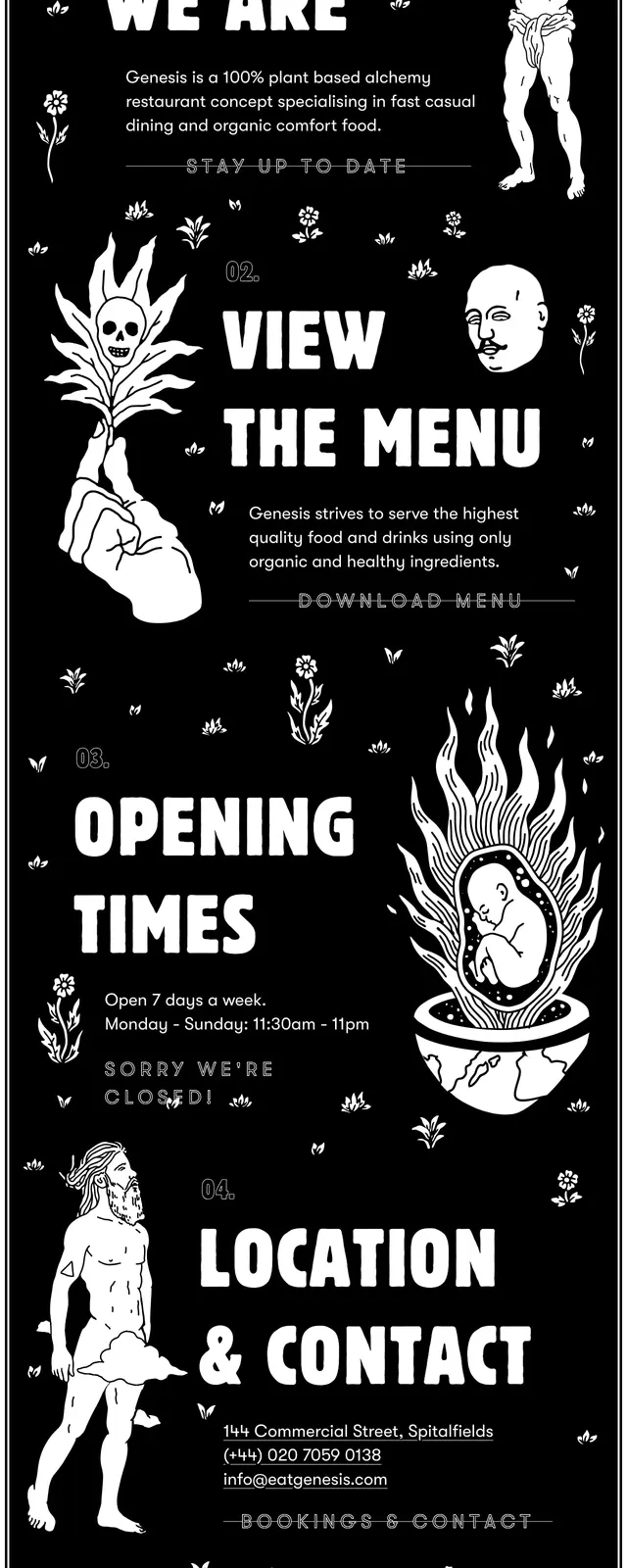
A tall black-and-white, hand-drawn landing page layout for a food brand with bold typography, surreal illustrations, and stacked informational sections.
Summary
A tall black-and-white, hand-drawn landing page layout for a food brand with bold typography, surreal illustrations, and stacked informational sections.
Visual description
The screenshot uses a stark black background with dense white line-art illustrations, including figures, plants, symbolic icons, and decorative motifs. Large distressed display lettering anchors each section, with oversized headings like the brand name, 'WHO', 'OPENING TIMES', and 'JOIN THE TEAM'. The page is arranged as a long, poster-like vertical composition with centered content and scattered ornamental details throughout. All visible content stays within a monochrome palette and feels highly handcrafted.
Key takeaway
This design leans into a memorable zine/poster aesthetic rather than a conventional restaurant website. The strong contrast, illustrated storytelling, and oversized type make it useful for brands that want a quirky, artistic, and alternative identity.
Reuse notes
Reuse this pattern when a page needs a striking hero-led narrative with lots of personality and simple black-and-white production. It works especially well for food brands, creative venues, or campaign sites that want to feel editorial and underground.