Preview image. Unlock full-res
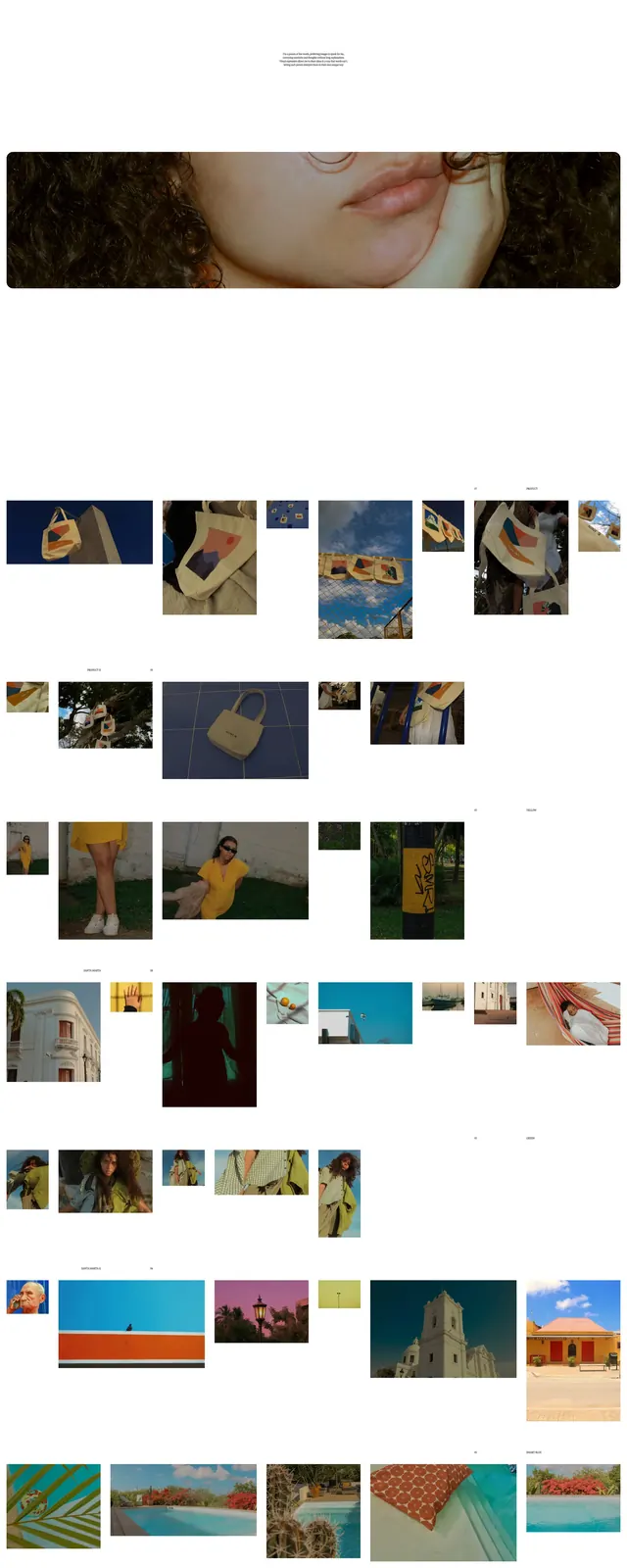
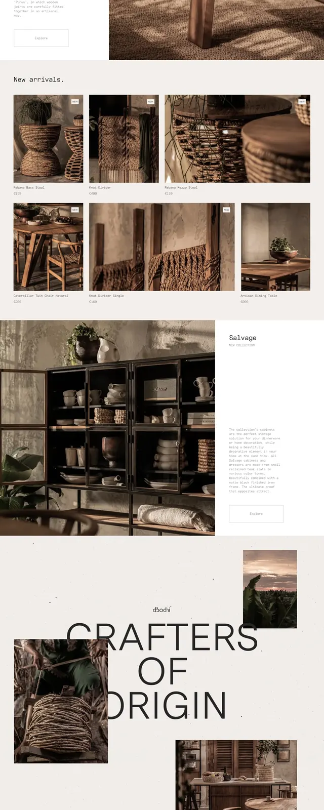
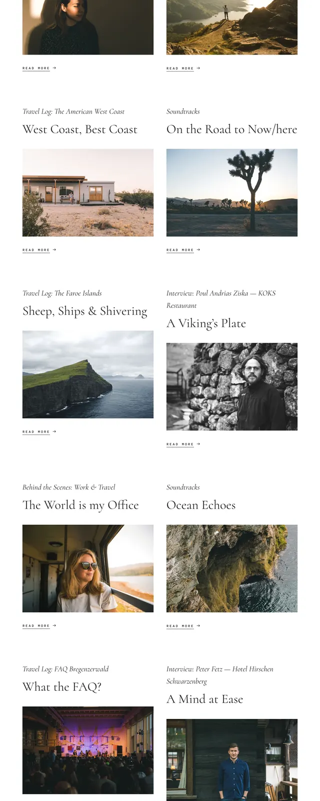
A minimalist editorial travel homepage with an oversized overlapping wordmark over a landscape image and a centered magazine-style article grid below.
Summary
A minimalist editorial travel homepage with an oversized overlapping wordmark over a landscape image and a centered magazine-style article grid below.
Visual description
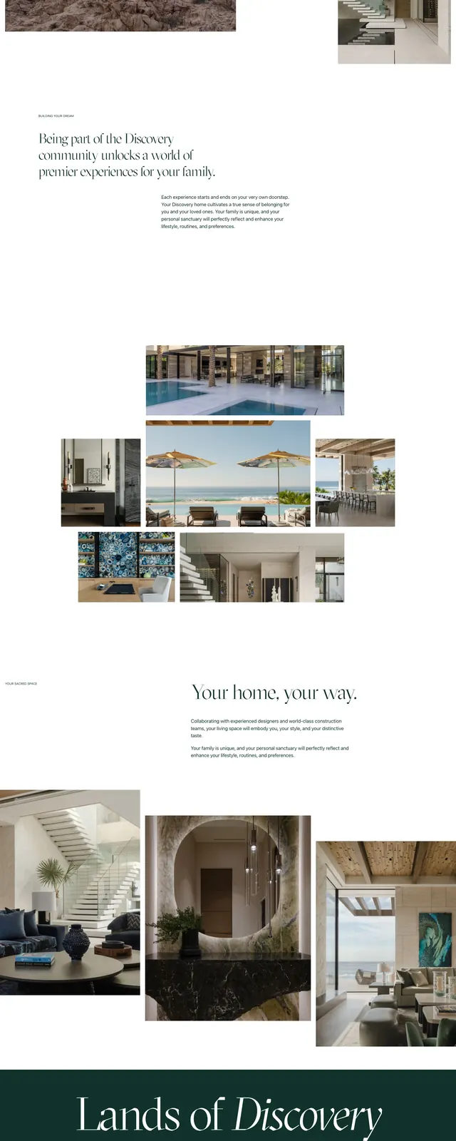
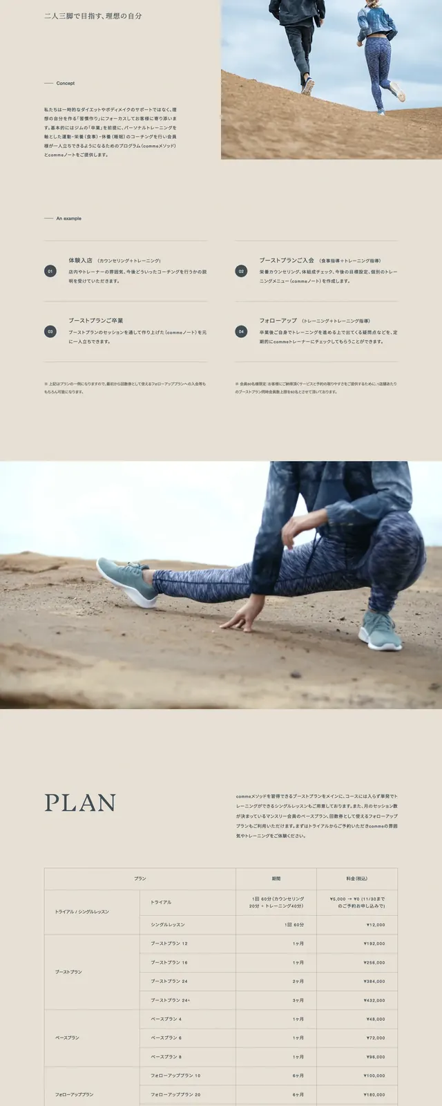
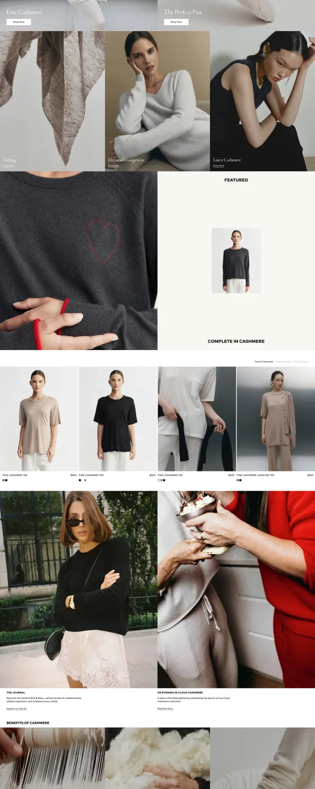
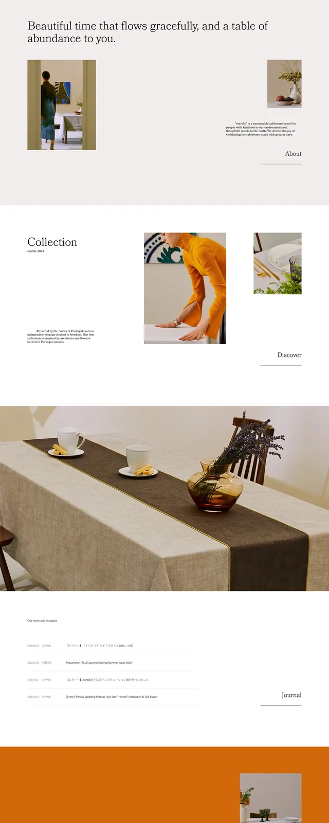
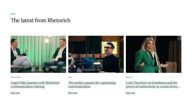
The page opens with a thin top navigation, a centered hero image, and a huge serif title set across the middle of the photograph. Beneath the hero is a short centered intro paragraph, followed by a two-column grid of article cards with section labels, large serif headlines, images, and small read-more links. The page ends with a simple footer on a pale background, keeping the overall layout airy and print-like.
Key takeaway
The main move is the oversized serif title overlapping the hero image, which gives the page a strong editorial cover feel. Wide spacing, restrained color, and small navigation text make the imagery and headlines feel premium and calm.
Reuse notes
Use this structure for travel, culture, or lifestyle magazines where the homepage should feel like a curated publication rather than a product site. It works best with strong photography, large serif display type, and a low-noise navigation system.