Preview image. Unlock full-res
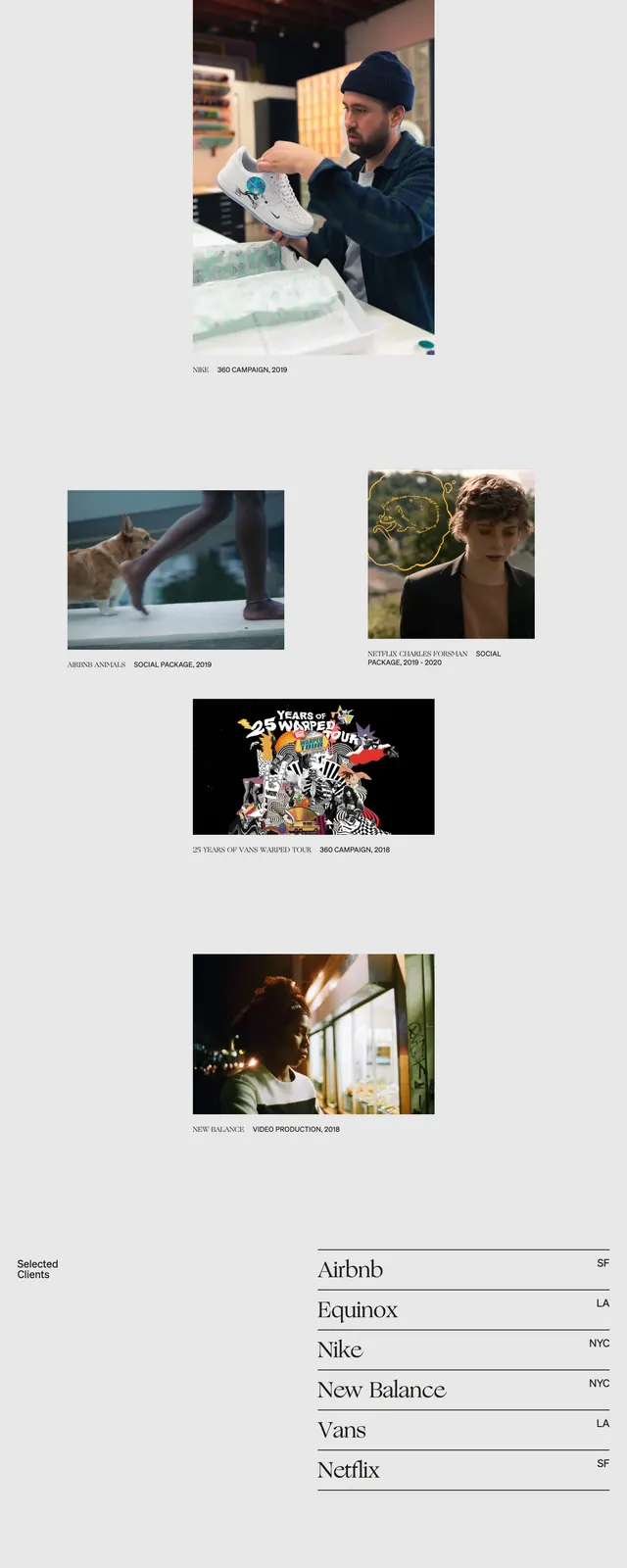
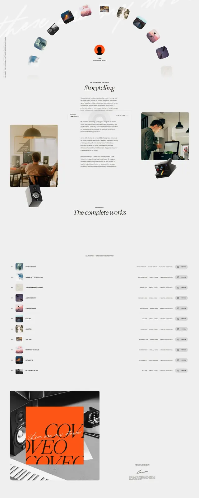
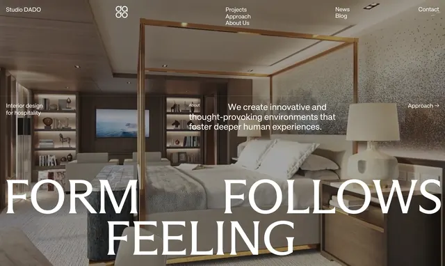
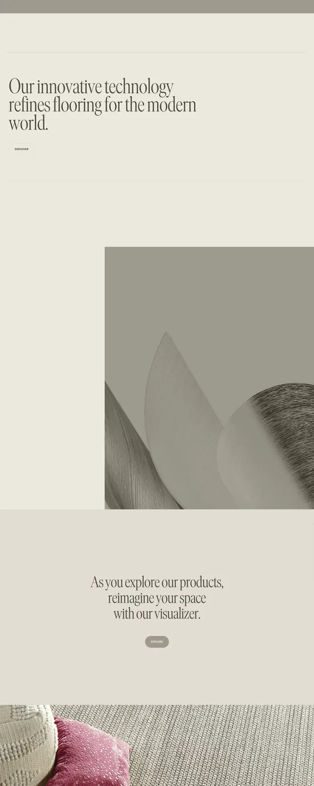
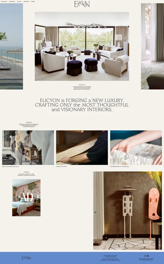
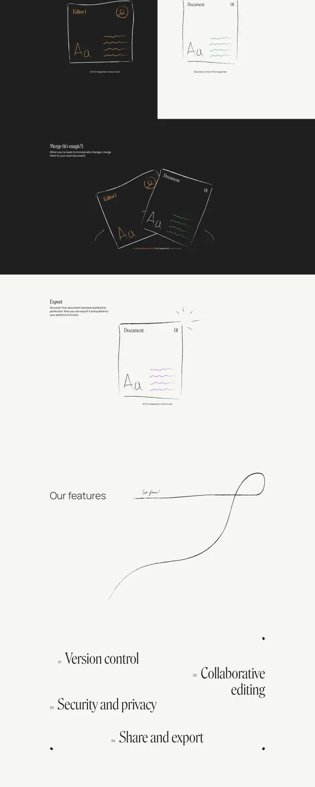
A sparse, editorial full-page landing page for Ellipsus with oversized serif headlines, delicate line-art accents, and large areas of warm white space.
Summary
A sparse, editorial full-page landing page for Ellipsus with oversized serif headlines, delicate line-art accents, and large areas of warm white space.
Visual description
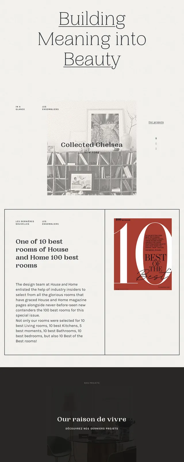
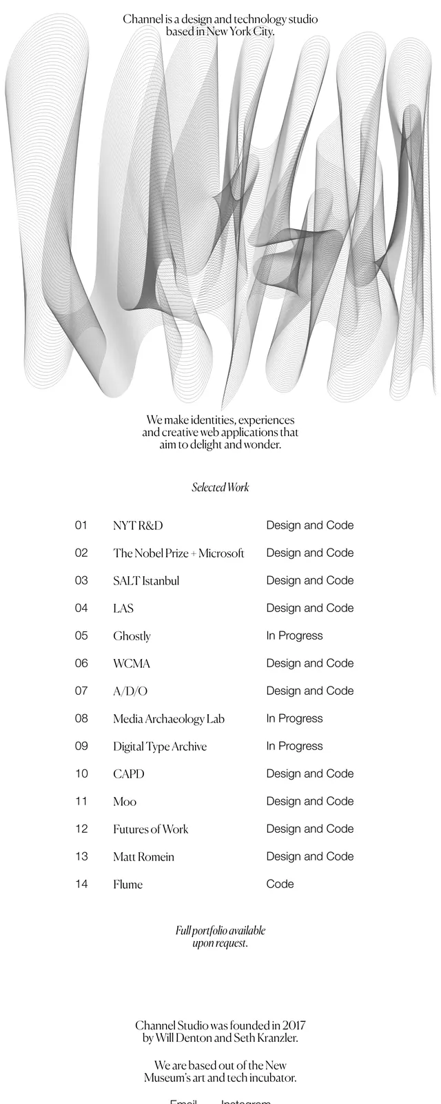
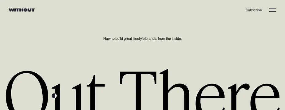
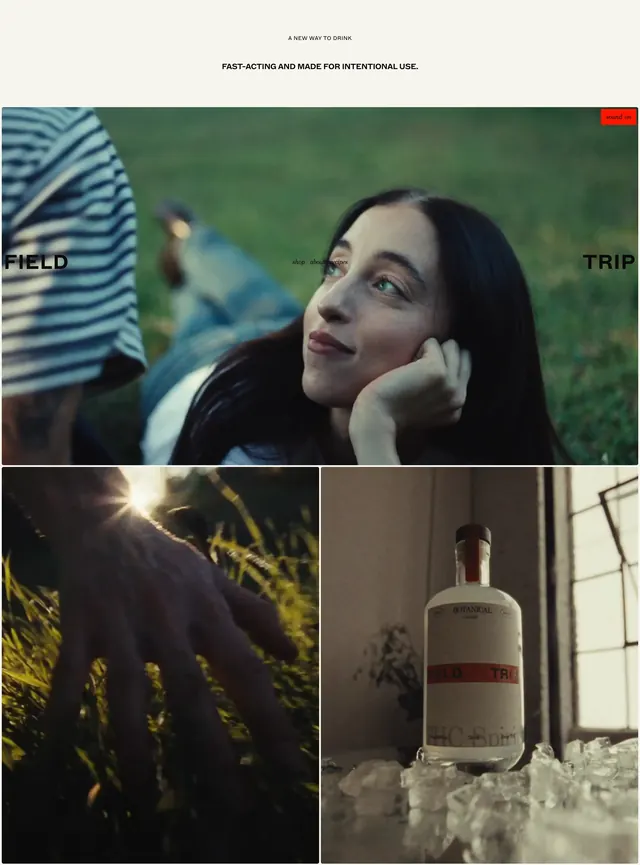
The page uses a cream background with a centered hero headline reading like a magazine cover, mixing coral and black serif type. A thin top navigation sits above the hero with a small outlined call-to-action button, while handwritten arrow details and sparse sketch marks add a personal, handcrafted feel. Lower sections continue the same minimal language with wide spacing, a dark divider band, simple feature callouts, and a large typographic wordmark near the footer. The overall composition feels airy, restrained, and art-directed rather than template-driven.
Key takeaway
The strongest idea is the contrast between refined editorial typography and loose hand-drawn accents. It creates a premium, literary brand feel while keeping the layout extremely simple.
Reuse notes
Reuse this approach for brands that want a quiet luxury or creative-editorial landing page with very little UI chrome. The mix of centered copy, generous whitespace, and sketch-like flourishes works best when the message is short and the typography can carry the page.